
From Daniel Ganowski and Gerd Kommer
The concept of All-time highs is ubiquitous in the financial media and blogosphere. Its presence always swells after the stock market has made a significant upward trend of two, three years or more. In times like these, news and headlines like the following rain down on the private investor community every day:
“DAX all-time high: Be careful, don’t buy now!” — Heiko Thieme, “international finance and investment expert” [own name] in an internet article from May 7, 2013.
"US stock markets are near all-time highs. The higher the prices, the higher the risk of a relapse." — Financial journalist Tim Schäfer in his stock market blog on January 2nd, 2015.
“The MSCI ACWI Index [a global stock index] has been hitting record highs since early November [2020].” — Newsletter from Thornburg Investment Management (USA) from December 22, 2020.
"It remains exciting. What comes after the all-time high?" — Robert Ertl, board member of Bayerische Börse AG in a market commentary from December 28, 2020.
If you enter “stock market all time high” into Google, the search engine returns a good two billion hits.
In our consulting practice, since we started our business four years ago, hardly a week goes by without another concerned client or new customer suggesting to us that “now” is not a good time to enter the stock market, since it is trading near its all-time high and is therefore expensive and highly valued.
In this blog post we want to show that the term all-time high (hereinafter referred to as “AZH” for the sake of brevity) is not only conceptually misconstructed in relation to the question of the valuation level of the stock market, but is also excellently suited to causing investment damage if you base your investment decisions on it. Investment damage here refers in particular to lost profits, or in economist jargon, opportunity costs.
Why is the AZH term a conceptual misconstruction? The term all-time high is used almost unanimously in private investor practice - as in the four exemplary quotes above Rating metric understood. This means that the AZH signals in relation to a stock index (or the “market”) that it is expensive or highly valued.
In reality, the AZH shows nothing of the kind. Neither that stocks are expensive nor a high valuation. Quite simply not because it's just one Rating metric can show and that is exactly what the AZH is not.
Valuation indicators for stocks or the overall stock market, in most cases, express the ratio of the share price to a certain “fundamental” (business) reference value. This reference figure can be, for example: earnings per share, cash flow per share or book equity per share. The associated valuation metrics are called price-earnings ratio/P/E ratio, price-cash-flow ratio/KCFV and price-book value ratio/P/BV. (In the case of a stock index, in contrast to an individual stock, these sizes are naturally added up for all stocks in the index, but this does not change the basic principle.)
In other words, even if it contradicts our gut feeling: the absolute index level alone, as a number without a reference value, says absolutely nothing about whether the market is expensive or cheap, highly valued, normally valued or lowly valued - regardless of whether the index level at that moment marks an AZH or is at some other lower level. If the AZH says nothing about valuation, then it is not only pointless but even harmful to base valuation-driven investment decisions on the AZH. So, for example, no new or additional investments near an AZH to be carried out.
A little thought experiment to illustrate: We assume that the profits of DAX companies grow steadily by 1% annually. (That would be far, far less than the actual long-term average profit growth of 3% to 4% p.a.) At the same time, the prices (including reinvested dividends) of DAX shares are rising steadily by 0.5% per year in the long term. (This is also far less than the actual number: the nominal DAX return was 6.3% p.a. from 1970 to 2020.) In this mental world, the DAX would reach a new AZH every year, strictly speaking even every month. However, its valuation measured by the P/E ratio – and the valuation is what matters here – would still continue to decline. In other words, the DAX stocks in our thought experiment would continually become cheaper and cheaper every year, while at the same time constantly climbing to new AZHs.
Such theoretical considerations are important, but should always be tested with empirical data. This is what we want to do below using the S&P 500 stock index. The S&P 500 is probably the most famous stock index in the world. It represents the 500 largest companies listed on the three major US stock exchanges and accounts for around 60% of the market value of all listed US companies.
The following table illustrates that the AZH in relation to the general stock market, here in the form of the S&P 500, is not only conceptual but also empirical nonsense if one interprets the achievement of an AZH as a “be careful, better not to invest now” signal - and that is how the financial industry and financial media market this pseudo key figure.
Table: S&P 500 Index returns from 1926 to 2020 (95 years): total period and average returns, after an all-time high was reached
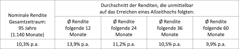
► Raw data: Dimensional Fund Advisors. ► All returns in USD, nominal, before taxes and expenses. ► During these 95 years/1,140 months, 346 month-end AZHs occurred (30% of all months). ► In all four “subsequent return periods” the average given is based on over 300 data points. Such a data point occurs whenever a given month ends with an AZH. This triggers the calculation of a “AZH successor return” in our small model. The four right columns of the table above show the average of the AZH successor returns. ► The AZHs towards the end of the overall period, for which there was no longer a complete subsequent return period by December 31, 2020, were not counted.
What can be seen from the table?
Almost a third of the 1,140 months (95 years) ended on an AZH for the S&P 500 index. What occurs in 30% of all months is not exceptional, but rather the rule and “normal”. The banal reason: stock markets have long-term average returns greater than zero. In other words, the stock market is constantly trending upwards - how steeply upwards doesn't matter. Because stock returns (here in the form of monthly returns) fluctuate somewhat strongly, around every third monthly return leads to a new high.
If the calculation in the table were based on the DAX, the MSCI World or another broad stock index for a sufficiently long period of time, essentially the same results would result. We chose the S&P 500 because its monthly return data goes back further than those of the DAX or the MSCI World and because the S&P 500 and its AZHs are particularly frequently covered in the financial media.
At first glance, it seems surprising that the short and medium-term returns following an AZH are actually the same in three out of four cases higher were than the average return over the entire period of 95 years. How is this explained? The main reason for this is probably the one we mentioned above. Not only is the all-time high not a valuation metric, it is also an almost completely arbitrary signal. Because this is the case, the returns immediately after an AZH are not systematically lower than all other returns or the return over the entire period.
It could be a coincidence that in our special S&P 500 analysis the post-AZH returns were predominantly higher than the average return. But it could also be with what has been scientifically proven many times over Momentum effect related to stock returns (for the momentum factor premium see here). This is also indicated by the additional return decreasing with the length of the subsequent period. However, we do not want to commit ourselves to this search for clues. Suffice it to say that historically the returns after an AZH have not been lower than usual. Period.
If the calculation in the table were not based on monthly returns but on daily returns, the result would not be fundamentally different.
All in all, we can now conclude:
An all-time high or the achievement of an AZH – understood as an “investment warning” for a specific stock market – is, firstly, conceptually absurd and, secondly, empirical nonsense.
The question still remains as to whether the AZH concept could play a useful role as at least a rough valuation signal, if not for stocks in the sense of broad indices or the stocks asset class, then at least for individual stocks.
However, the above-mentioned theoretical objections apply equally to individual stocks: Every stock with a long-term average positive return, even a particularly low positive return, generates new AZHs more or less constantly - depending on the stock and the time window examined, between 10% and 30% of the time.
If you want to determine the returns that have historically followed such AZHs for individual stocks in the short and medium term, you should only use data series that are at least 30 years long. In the case of shorter time periods, chance – or “noise” in statistical jargon – dominates or “floods” any existing data pattern. Overall, AZHs are likely to represent rather useless signals, even for individual values. However, since we do not invest in individual stocks, this hypothesis, which has not been thoroughly tested, has no practical significance for us.
All in all, our findings in this blog post are certainly not groundbreaking, new findings that were previously completely unknown. Why is the useless or harmful AZH concept still so surprisingly present and popular in the communication and thinking of private investors? In our opinion, this has the following four reasons:
First of all, the AZH concept is pretty simple - much simpler than real valuation metrics such as: B. those mentioned above. The person who produces the AZH data doesn't have much work to do with it. The person who consumes them does not have to think much. Secondly, if you come from a consumer goods perspective, the AZH seems to make sense as an indicator of “expensive”. Unfortunately, in this case that is the wrong way of thinking. Thirdly, with the ever-increasing spread of the AZH pseudo-concept, a nefarious financial industry can better sell its own high-priced, actively managed financial products and investment strategies. Fourthly: From the perspective of the financial media, with AZHs, which have the welcome ability to pop up very often, you can somehow tell exciting, easy-to-understand financial stories and thus increase circulation and click rates.
Finally, we want to show how the type of price graphic most widely used in the financial media perfidiously conveys the pseudo-valuation indicator AZH and contributes to the disinformation of private investors.
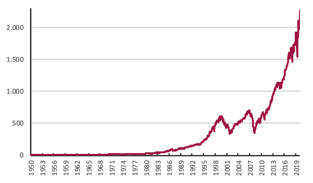
The following two figures 1 and 2 show the development of the S&P 500 index from the beginning of 1950 to the end of 2020. Both figures are based on exactly the same data. Over these 71 years, the index had a nominal return in US dollars before costs and taxes of 11.5% p.a. (real 7.8% p.a.). Figure 1 implicitly gives the impression that the US stock market only rose dramatically in the last third of those seven decades and therefore reached a spectacular, seemingly “expensive” all-time high at the end of 2020.
Figure 1: Development of the S&P 500 stock index from 1950 to 2020 (71 years), in USD before costs and taxes - conventional arithmetic vertical axis, starting value 1
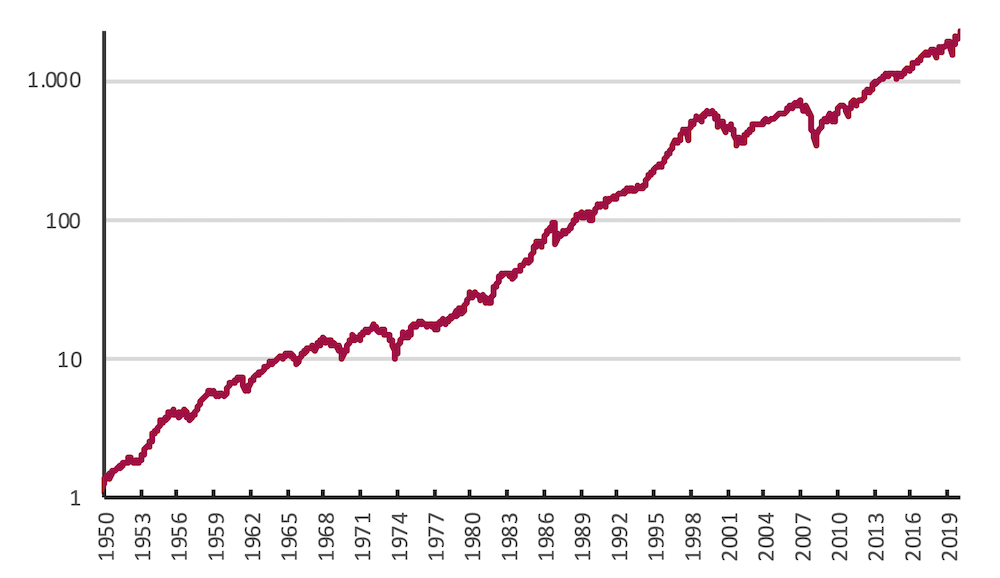
As mentioned, Figure 2 is based on the same data as Figure 1. Here, however, presented with a logarithmic, rather than arithmetic-linear, vertical axis. This correctly reflects that the percentage increase in the S&P 500 Index over these 71 years was fairly consistent from start to finish. There can be no question of a particularly small increase in the first 35 years and a particularly strong increase from 2009 onwards - as Figure 1 misleadingly suggests.[1]
Figure 2: Development of the S&P 500 stock index from 1950 to 2020 (71 years), in USD before costs and taxes - logarithmic vertical axis, starting value 1
The form of presentation of price graphics that dominates in the media and marketing material of the financial industry, as in Figure 1, creates the optical illusion in most cases - provided (a) there is a positive trend in price development and (b) a period of, say, more than five years. The majority of the return or wealth creation took place in the last third or last quarter of the overall period, even if that was not actually the case with regard to the annual returns relevant here. The compound interest effect creates an optical effect that intuitively leads to a false understanding of real market events for the vast majority of observers, even many professionals.
Based on a gut feeling, the typical observer concludes from this “upwardly bent” curve that a high valuation and thus an ultimately overpriced market (or an overpriced individual value) only came about in the recent past. This interpretation is understandable and yet completely wrong, as Figure 2 illustrates.
The logarithmic representation allows the actual situation to be seen much better and less confusingly. It always visually represents the same percentage increases over time, regardless of whether they occurred at the beginning, in the middle or at the end of the overall period. That's how it has to be. Unfortunately, this is not the case with an arithmetic-linear graphic, where a given percentage increase on the right, late side causes a steeper, stronger rise in the line than on the left, early side.
A price chart, rather than a table of numbers or an equation, is chosen as a display tool because it is a visual image. It must therefore be visually designed in such a way that it can be reliably and correctly understood by a normal, typical viewer based on the optics alone. However, the arithmetic representation on the vertical axis most likely prevents this and incorrectly suggests that the stock market has risen particularly strongly in the recent past.
Conclusion
When it comes to the question of whether a particular stock market is expensive, i.e. highly valued, or not, the concept of the all-time high is useless in answering this question and may even be seriously misleading. It belongs in the ash bucket of financial market history.
Private investors would be well advised to ignore any newspaper article or Internet publication that sells an all-time high in the stock market as somehow actionable information and to give the author of that publication the “Investment Clown of the Week” award via direct email.
Anyone who is seriously interested in the valuation level of the stock market must real Look at valuation metrics, not cheap illusions like the all-time high. However, real valuation metrics have the disadvantage that they require more thought than an all-time high.
As of December 31, 2020, the global stock market, measured by the broadest of all stock indices, the MSCI ACWI IMI Index, is trading around a fifth above its historically average P/E and around a third above its historically average P/B. [2] This is far from a record valuation, let alone an “all-time high” valuation. Anyone who changes the USA submarket from approx. 60% weight (according to market capitalization) to e.g. B. Reduced weight by 30% (as we do), which also eliminated this moderate increase in valuation. Especially if part of this 60% is reallocated into emerging market stocks. Likewise, the emphasis on currently exceptionally low-priced “value stocks” has a significantly lowering effect on valuation.
However, more important than the valuation relative to the own historical average of the respective asset class or index is the valuation relative to the specific investment alternatives in question. The two main investment alternatives to stocks for most private investors in the DACH region (DE, AT, CH) are: (a) high quality bonds (bonds from issuers with a high credit rating) and (b) residential real estate in the DACH countries. Compared to the valuations of these two asset classes, the Global Stocks asset class is currently unusually attractive.
High quality bonds are very expensive. When it comes to bonds, expensive is another way of saying that their real interest rates are unusually low. Residential properties in the larger cities in German-speaking countries are currently largely valued at extremely high levels. To speak of a residential real estate bubble in relation to these cities should not be an exaggeration - at least that is how the major Swiss bank UBS and (somewhat more cautiously) the Bundesbank see it. [3]
Bank deposits, the most popular financial product among Germans, are not an alternative above the state deposit guarantee of 100,000 euros, as they are unacceptable risky. For the second most popular financial product among private households, endowment life insurance, the same applies due to the insurance company's risk of default. In addition, with the exception of policies in the classic format taken out before 2005, KLVs also have unattractive returns.
Endnotes
[1] With a conventional linear vertical axis, this expresses the increase in absolute monetary units (even if it is a stock index rather than a price chart for an individual stock). With a logarithmic vertical scale, however, it expresses the percentage (i.e. relative, rather than absolute) increase. Basically, a logarithmic scale is always preferable.
[2] According to Fact Sheet MSCI ACWI IMI Index, Forward P/E (P/E) and P/BV (P/B). The historical P/E also shown there is currently not meaningful in this case due to the temporary reduction in recent book profits of many companies due to Corona. A “forward P/E ratio” would not have this weakness.
[3] UBS Global Real Estate Bubble Index 2020; September 2020; Internet source: UBS https://www.ubs.com/global/en/wealth-management/chief-investment-office/life-goals/real-estate/2020/global-real-estate-bubble-index.html and the Bundesbank’s monthly report from February 2020 (p. 53 ff.).