The post Portfolio Evaluation for Passive Investors: Eleven Simple Rules appeared first on Gerd Kommer.
]]>In this blog post, we formulate eleven simple rules of thumb to help a private investor evaluate the performance (return and risk) of his or another passively managed portfolio. Such an evaluation is often referred to in financial jargon as: Benchmarking referred to when a comparison is made with a reference size, e.g. B. with an index (market return, asset class return) or with another objectively comparable investment.
Some of the following basic evaluation and benchmarking rules do not apply to actively managed portfolios/portfolios or only apply with additional assumptions.
(1) Short periods of time are usually useless and often even misleading for evaluating the performance of a portfolio
Periods of less than three to four years are not meaningful if you want to draw reliable, robust conclusions from the observed portfolio performance (return, risk). When looking at shorter periods of time, there is a risk of drawing conclusions that are harmful for the future.
Judgments derived from history tend to become more reliable the longer the data series being analyzed. The returns of listed and unlisted investments over short periods of less than three to four years are heavily influenced by “statistical noise”. These are influencing factors that are often random in nature or are in any case beyond the control of the portfolio holder or his advisor and their specific characteristics could not be predicted (expected) ex ante. Because this is the case, little or nothing can be derived from “noise-influenced results” for the future. Drawing decision-making conclusions from short series of data can actually be downright harmful.
An example: A depot has existed for six years. Over this period, the performance is satisfactory from the portfolio holder's perspective. But isolated only in the last twelve months, it is significantly worse than an underlying benchmark and also less satisfactory than over the entire period. What can be inferred from the poor performance over the immediate past twelve months? Most likely nothing, even if that seems unsatisfactory to the portfolio holder.
In the following table we show how long it would take, from a purely statistical point of view, until under normal circumstances one no longer has to consider a given outperformance (excess return) of an actively managed fund or other portfolio relative to its correctly chosen benchmark to be “possibly coincidental”.
Table: How long does it take until you can reliably distinguish random outperformance from non-random outperformance (excess return) in an actively managed investment fund?
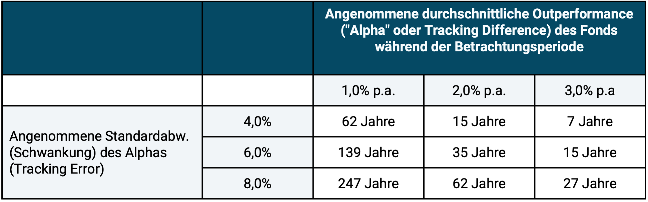
► “Alpha” or tracking difference is the average return difference of an investment A compared to a benchmark B over a sufficiently long measurement period. This return difference will fluctuate around its mean from year to year with some volatility. Three typical example values for this fluctuation intensity are given in the second column from the left. An alpha of an average of one percentage point p.a. after all costs over a period of ten years is generally considered to be a significant performance for active portfolios (e.g. investment funds). ► "Tracking error is the volatility of the periodic tracking difference in an overall period. This is highly dependent on the active strategy and is usually higher, the higher the desired "outperformance" compared to the benchmark is. ► The calculated annual figures are based on a significance level of 95%. After this number of years, the probability that the “alpha” was just a coincidence is only 5%.
Also, the return of a portfolio or investment Anyone who, without a hard, objective reason, gives greater weight to performance in the recent past in the analysis than to performance in the more distant past is subject to the common, dangerous error of reasoning: “recency bias”. [1]
(2) Return alone is not meaningful
The fact that two portfolios A and B should not be compared solely on the basis of their (hopefully correctly measured) return, but that the comparison must also take risk and liquidity level, taxes and costs into account, is a trivial statement that no one will dispute. Nevertheless, according to our observation, “one-dimensional” portfolio or financial product comparisons are constantly made solely on the basis of the return and often enough on the basis of the return in far too short periods of time, e.g. B. 12 or 24 months. We will address the common mistake of not taking into account the different degrees of liquidity between two investments being compared in the next rule of thumb.
(3) Illiquidity or liquidity should be taken into account in the ex post evaluation of the individual components of a portfolio
The parallel/comparative evaluation of the performance (return, risk) of liquid and illiquid investments (e.g. stocks, bonds, gold, cryptos as liquid investments on the one hand and real estate or private equity as illiquid investments on the other) during a period of time There are two insights to consider:
A rational assessment of the risk, especially the risk of fluctuations in the value of illiquid investments over a given historical period, is complex because these investments are not listed on the stock exchange, i.e. there are no daily updated market prices for them. Concluding from the absence of daily updated market prices and the resulting apparent stability of value that the illiquid investment in question has relatively stable prices over time will often be an incorrect and potentially very damaging conclusion. When evaluating a portfolio, an investor should ask himself at what price he could sell the illiquid investment at that moment in a maximum two-month window. In the majority of cases you will find that immediate sale is not possible or only via a “secondary market” with a presumably considerable discount compared to the “reported price” from the provider.
The illiquidity disadvantages of individual investments should be underestimated or even ignored in their performance assessment because they ex post - as will usually be the case in a specific case and even statistically has to be the case - did not play a role is a common mistake among private investors that can have a very damaging effect at some point.
(4) The individual components in a consciously and systematically diversified portfolio should not be evaluated purely individually in isolation
If a depot consists of several individual components, e.g. B. several ETFs and other financial investments, which were originally consciously chosen as part of the definition of the overall structure of the portfolio, then the portfolio performance should primarily be evaluated “as a whole”, so to speak as a “team performance”.
So it usually happens not on the individual return of an individual investment in isolation, but on the portfolio structural role of this individual investment “in the team”, in the overall portfolio. For example, it is a mathematical necessity that even among ten individually excellent, but also different, individual investments within a portfolio, there must necessarily be one that produces the worst individual return among these ten in a given period of time (whether 12 months or 12 years).
The analogy of a Bundesliga soccer team: what counts in terms of its success in an individual game or in a season (34 games) is primarily the team's game result, the collective performance of all eleven players, i.e. how these eleven players played together in different roles and tasks. For example, a defender
(5) When evaluating a portfolio, one should avoid hindsight bias
A not uncommon mistake when evaluating the performance of a portfolio during a period of time This is called “hindsight bias” in technical jargon. [2]
In most situations, one should judge the past performance of a portfolio or the performance of the person managing the portfolio based primarily on only the information that one had before the start of the period. This approach ensures that there is no “confusion between strategy and result”, which means: the quality of a strategy - including an investment strategy - can ultimately only be meaningfully assessed on the basis of the information and goals that were known/available at the time the strategy was chosen and defined. The result of the strategy alone - regardless of whether it is pleasant or unpleasant - is an inadequate and often even very poor quality criterion for a strategy.
The following simple example should make this clear. The goal is to get from Berlin to Munich by train in the shortest possible travel time. Therefore the Sprinter is chosen, which is supposed to be around half an hour faster than the normal ICE. In statistical terms you should be faster. In fact, on the specific journey, this Sprinter train is delayed by an hour, while the normal ICE arrives on time. Nevertheless, hardly anyone can doubt that it is ex ante The right strategy was to book the sprinter, even if the specific result was disadvantageous.
(6) The valuation level of an investment at the end of the evaluation period should be taken into account
Here is an example to illustrate what is meant: Two stock portfolios A and B generated the same, satisfactory return over a period of eight years (i.e. an evaluation period that tends to be sufficiently long). They also had similar fluctuations in value (volatility) during this time and there were no serious differences in other risk types (e.g. maximum drawdown, diversification contribution in the portfolio, etc.). However, at the end of the observation period, stock portfolio A is now valued significantly higher (more expensive) than portfolio B - measured by a common and reliable valuation indicator, here the P/E ratio.
What are the conclusions? Portfolio B was or is now the better investment because it has a higher expected return in the future (all other things being equal). The superiority of Portfolio B exists even if the assessment of the valuation of the two investments is based on an (identical) uncertainty factor.
(7) Non-materialized cluster risks should be taken into account when evaluating the portfolio return
A good portfolio is structured in such a way that it does not contain any concentration or default risks, except for those that the investor has recognized, understands and is aware of - e.g. B. temporarily – were accepted. Typically, the materialization of cluster risks is a rare black swan event. Black swan events may only occur once every 20 to 50 years. [3]
It can be assumed that such a cluster or default risk did not occur in a given evaluation period. This is exactly what was to be expected ex ante. However, this “normal non-occurrence” does not mean that these unmaterialized cluster risks should be ignored in the ex post evaluation of a given portfolio.
From a conventional, so to speak “vulgar” risk perspective, which consists in basing risk evaluation solely on volatility, a portfolio A in which cluster risks have been well diversified away cannot be directly compared with a portfolio B in which a cluster risk exists.
Here is an example: Portfolio A consists of 100 different high-yield bonds from 100 different issuers from different industries and countries, so it is well diversified in terms of default risk. Portfolio B consists only of one high-yield bond. The two portfolios are identical in all other important characteristics (current yield, currency, duration). Portfolio B is very likely to outperform over a normal long period of time (e.g. one year or five years) because the probability of this one bond defaulting is low for these periods. In Portfolio A, on the other hand, one of the 100 bonds is almost guaranteed to default, which lowers the A portfolio return. Only if the small risk of default for the individual bond in B occurs will A perform better (and then dramatically). Therefore, if B outperforms as expected, one cannot conclude that it was the better portfolio (investment). The B investor was simply lucky, but luck that will occur in the majority of cases. However, if luck does not occur, the consequences for Portfolio B are extremely negative.
Examples of further cluster risks include the decades-long under-return of assets in a country (stocks, bonds, real estate) due to political factors. Examples of such default risks include the bankruptcy of an account-holding bank or the provider of capital-forming life insurance.
(8) The benefit of a mediocre investment may have been ex post to prevent an even worse investment
The financial benefit from an investment A - in addition to its return - often also consists in the fact that the investment A prevented the investor from making a worse investment B. This statement is not sophistry.
When evaluating the past performance of a given investment, an investor should always ask himself, "If I'm being honest, did Investment A stop me from making an even worse Investment B?" Investment success is not only the result of smart, positive decisions and actions, but also the result of avoiding harmful, negative decisions/actions.
We have this unusual evaluation perspective in a separate blog post entitled “Via Negativa – an unknown concept for more success when investing” shown. The via negativa concept is based on the obvious, but often overlooked, insight that the economic success of most wealthy households relative to less wealthy households is due in large part to the fact that they have made fewer investment mistakes than other households over a long period of time. One such avoided mistake could be avoiding a “disaster investment” by making another investment that may be individually suboptimal.
(9) When evaluating a portfolio, you should also think about “negative parallel universes”.
A portfolio should be structured to provide a minimum level of financial resilience even in “negative future worlds”. Here are some examples of negative “future worlds”, negative “future scenarios”:
- The general level of interest rates in the Eurozone is rising noticeably above the current level. As a result, real estate prices fall sharply and the real estate market “freezes”: the transaction volume (purchases/sales) shrinks by more than half. Sellers no longer want to sell at the sharply reduced price. Buyers do not want to buy as they wait for further price declines. I won't be able to implement my short-term wish to sell for two years and after that only at a lower price than expected today.
- The German state is tightening the existing rent cap. As a result, the value of rented and owner-occupied residential properties only increases below inflation over 13 years, i.e. falls in real terms.
- The USA is experiencing a national debt crisis due to its high national debt. US dollar interest rates (as well as bond interest rates in other countries) are therefore rising sharply. As a result, bond prices fall by 40% in a short period of time. There are reports in the media about a possible haircut on US government bonds. The US dollar is depreciating sharply. My daily money in US dollars experiences a drawdown of 35%.
- There is a systemic banking crisis in the Eurozone. At the same time, many banks are running into serious liquidity problems and are restricting their customers' account withdrawals. [4] According to media reports, my bank, where I hold 700,000 euros in a current account, is potentially insolvent and will no longer allow withdrawals until further notice. It has been unclear for months whether there will be a bailout by the state for my bank above the statutory deposit protection limit of 100,000 euros.
- Due to their high valuation today, tech stocks will significantly underperform the general stock market over the next ten years, as was the case for around ten years from the beginning of the noughties. Tech stocks have a weight of around 60% in my portfolio. This pulls the portfolio return below the general market return for years.
- My own company, which I own, is in crisis. Its estimated value is halved and no distributions are possible for several years. My financial peace of mind as an entrepreneur and as a person decreases significantly because of this.
The structure and distribution of a household's assets, if they have already accumulated significant assets, should ideally be designed in such a way that no such black swan scenario has an individually catastrophic financial impact on the household, i.e. that the household assets will suffer, but "the very worst" is still prevented, even if that costs return points "in good times". This is called “financial resilience.” The question of the correct asset allocation and portfolio structure should be addressed by the household at greater intervals.
(10) When evaluating the performance of a passively managed portfolio, one should consider which goals can be achieved rationally and realistically and which cannot
From our point of view, the primary financial goal of a passively managed portfolio is to be in the top quintile (the top 20%) of all comparable investor households in terms of final assets achieved or the average return measured correctly in financial mathematics after ten, 20, 30 or 40 years. A secondary but also very important goal is to avoid disaster performance, i.e. not to be among the worst - let's say - fifth of all meaningfully comparable investors (see previous point).
“Factually comparable” requires taking into account the risk taken during the period in question (e.g. volatility risks, counterparty risks, cluster risks, liquidity risks, default risks).
For an investor with a passively managed portfolio, a rational, realistic goal with regard to the portfolio cannot be “to have the most profitable investment” or to “be among the most successful 2% of all comparable investors”. By definition, this cannot be realistically achieved with a passively managed portfolio in periods of less than, say, 20 to 30 years (it is possible for longer periods). If it is not achievable, then later introducing the claim “why did I underperform the best investment Y in the ten years this portfolio has existed?” makes no sense in performance evaluation.
(11) For a portfolio managed by a service provider: Be careful when comparing your own portfolio with the portfolios of other asset managers or banks
When asset managers and banks want to acquire a new customer B. based on a securities account statement. Then they benchmark this portfolio Naturally, strategy Y has paid better in the past than portfolio on average were no better or even worse than X.
In this case, does the historical outperformance of Y compared to X prove that the new asset manager/bank has more investment skills than the one who managed the previous portfolio X?
No, because to do this you would have to compare all existing strategies of the new asset manager/bank with portfolio But this will not happen on the part of the new asset manager/bank.
Conclusion
Successful investing is a long-term process, a marathon. In order to be able to judge for every kilometer covered during this marathon whether or not one is sufficiently promising in terms of the desired performance, evaluation criteria are needed. We have formulated eleven simple criteria or rules of thumb here. Anyone who uses them during the annual portfolio review (much more often will not be necessary) increases the likelihood of actually achieving the marathon goals they have set for themselves.
Endnotes
[1] See article Recency effect in the German Wikipedia or article Recency Bias in the English Wikipedia.
[2] See article Hindsight bias in the German Wikipedia or article Hindsight bias in the English Wikipedia.
[3] What is characteristic of black swan events is that they have a very low probability of occurrence, which is often not even quantifiable, but which cause particularly great damage if they occur.
[4] Depots (as opposed to accounts) cannot and must not be blocked for legal reasons.
The post Portfolio Evaluation for Passive Investors: Eleven Simple Rules appeared first on Gerd Kommer.
]]>The post From rich to poor happens more often than you think appeared first on Gerd Kommer.
]]>The book The Missing Billionaires – A Guide to Better Financial Decisions by two American asset managers Victor Haghani and James White contains a fascinating calculation on the subject of “The rich become poor again much more often than we think”. We reproduce this calculation below in a slightly modified form.
In 1900, there were around 4,000 people in the United States with assets of $1 million or more. In the absence of more precise data, Haghani/White simply assume that a quarter of these 4,000, i.e. around 1,000 people or households, had assets of at least five million dollars. Inflated with the average US inflation rate over the 122 years from 1900 to 2022, five million dollars from 1900 in money in 2022 (the end date of the calculation in the Haghani/White book) corresponds to about $180 million, and when inflated with the growth of the American economy (and thus roughly the growth of US household incomes) corresponds to around $6 billion. The correct inflated value of this “truth” is probably somewhere in between (see the following info box “Inflation”).
Infobox: The correct method of inflating historical amounts of money
Typically, prices, incomes or assets from the long-ago past are transformed (“inflated”) into today’s monetary values using the average consumer goods inflation rate. It is doubtful whether this is correct. There is much to be said for using the generally higher nominal growth rate of household income instead, or, as a replacement that is easily available to everyone, the nominal growth rate of gross domestic product per capita (Williamson et al. 2026). This method results in higher values in today's money.
It is on these 1,000 people – just over 0.001% of the then US population of 78 million – that we focus. We call this wealth elite our “MB Group” for “Missing Billionaires” based on the Haghani/White book. Why we talk about Missing Billionaires will become clear immediately.
Let us now make the following simple, obvious assumptions: The 1,000 people were each part of a couple, i.e. a family. To date, these families have continued to grow in membership at the same rate as the entire U.S. population. In 1900, all members of the MB Group invested their total assets in a broadly diversified portfolio of US stocks (a representative sample of, for example, 40 stocks). Families withdrew 2% of their assets each year in real terms for subsistence purposes. [1] Given the high level of wealth, this is a generous assumption. This rate of withdrawal would have allowed for a standard of living that would have been many times more demanding than that of the average American, without any further professional activity on the part of the people concerned.
“Real withdrawal” means that the corresponding absolute withdrawal amount from year 1 (i.e. 1900) was increased every year with the inflation rate, so that the consumer goods purchasing power of the withdrawal remained unchanged. Over time, the families paid taxes on dividends and any realized capital gains, taking a buy-and-hold approach, taking into account their withdrawals, that helped effective To reduce the tax burden significantly below the statutory (legal) tax rate. (We explain how this works - in practically every national tax system - in a separate Blog post)
At the end of 2022, the original 1,000 families would have become around 4,300 families, each with an average Minimum assets of around 2.3 billion dollars. Minimum assets because we expected a starting value of five million for all families, whereas in reality this value was probably only the lower limit of the wealth of the 1,000 families in question.
In their book, Haghani/White even come up with 16,000 families for the year 2022 with a minimum wealth of one billion dollars per family, because their calculation was overall less conservative than ours when it comes to the assumed effects of costs, taxes and withdrawals.
In fact, in 2022 there were only 730 families in the USA with assets of a billion dollars or more. Haghani/White write that presumably not a single one of these families is closely related to the original MB group. In other words: Probably none of the 1,000 super-rich families in our MB group from 1900 managed to stay in the top group of super-rich over these five generations.
Asset collapse among the super rich
The apparently surprisingly universal and rapid decline in wealth of the super-rich can also be illustrated with other figures. The first Forbes 400 list of the super-rich in the USA was published in 1982, over 40 years ago. [2] Of the 400 families in the 2022 issue of Forbes magazine, less than 10% were included in the first list in 1982, according to Haghani/White.
The short “half-life” of the wealth of the super-rich in the USA is analyzed even more comprehensively and clearly in the scientific study “The Rich get poorer – The Myth of Dynastic Wealth” by Arnott/Bernstein/Wu 2015.
To our knowledge, there are no such complex studies on the extent of the wealth collapse of “normally rich” families with assets of “only” a few million euros, but we see no reason why these wealthy, but not super-rich, families should be subject to other rules.
Why do we regularly read “the rich are getting richer” in the media and in populist books on economic inequality? This has two main causes. The first is that there is a lot of cherry-picking in the underlying time frames and regional units (e.g. a single country versus the entire world) in order to get to the sensationalistic desired result of many journalists: “Economic inequality is increasing and the rich are getting richer.”
Research on economic inequality is incomplete
The second main cause: Practically all academic research on the distribution of income or wealth over time, i.e. on the question of economic inequality, which is important in socio-political discourse, is methodically based on viewing “rich” as an abstract statistical Aggregate to be viewed as a small percentage group at the upper end of the income or wealth distribution, e.g. B. 10%, 1% or 0.1%. However, this way of looking at the rich population segment must be distinguished from the completely different analytical approach “rich people as a non-abstract group of specific natural persons” - a difference of importance that can hardly be overestimated.
If inequality research were to be carried out systematically on the latter methodological basis (rich people as specific natural persons) in addition to the “conventional method” (rich people as an abstract percentage group), the resulting headline would almost invariably be: “The rich from 10 or 20 or 30 or 50 years ago have become relatively and often enough even absolutely poorer” or “the rich families of today are hardly the rich families of 20, 30 or 50 years ago years”.
This is the case because the... composition According to all we know, the group of rich people changes surprisingly strongly and quickly over time. There is a constant migration into this group (“from bottom to top”) and out of this group (“from top to bottom”). It is not a “closed club of rich people” or rich families who are, so to speak, forever at the top financially and everyone else is forever at the bottom.
Back to the traditional, conventional and, in our opinion, incomplete or even misleading measurement of inequality (riches as a statistical aggregate): Despite the different impression that the media has been giving us about it for years, even this form of economic inequality is in the respect that matters most, namely global level, decreased in the relevant past. The so-called GINI coefficient of disposable income, a mathematical measure of income inequality, shows more economic equality or less inequality at a global level (i.e. including all countries) today than in 1960. Compared to 1990, inequality has fallen particularly sharply. The main reason: household incomes in developing countries have grown faster overall than in industrialized countries. This is primarily due to market economy reforms in China, India and other large and small emerging countries.
If one looks at after-tax income and not - as is usually the case in most such inequality statistics - pre-tax income and income including state transfer payments ("social assistance", unemployment benefits, etc.), then income inequality has also decreased or moved sideways in most western countries (i.e. not just at a global level) since 1990.
Fake news in the media about “The rich are getting richer”
A considerable part of the reporting on the alleged increase in economic inequality (with the implication “the rich are getting richer”) even cites figures and developments as “evidence of increasing inequality” that clearly do not say or can say anything about inequality, e.g. B. the increase in absolute Number of billionaires in a single country or worldwide over time. Such an increase would occur over a given extended period even if the inequality would remain unchanged or fall simply because it is the necessary consequence of the combined effects of population growth, economic growth and inflation.
Interim conclusion: The fact that economic inequality is increasing and, by implication, the rich are getting richer and the poor are financially stagnating or becoming poorer are clearly false statements in this generalization. (a) Globally, economic inequality has trended down relatively consistently over the last 50+ years, (b) it has also fallen in rich Western countries since a peak in the early 1990s, especially when after-tax income and government transfers are taken into account. (c) Specific Rich families don't always get richer, but as a group they probably get poorer (relatively and/or absolutely) in the long term. At least that is what the few available data and studies that inequality research has provided so far indicate.
Another cognitive deception at the level of the individual observer plays a role in this complex and ethically and sociopolitically charged topic: Why do we hear in the media and in our personal social environment much more often about specific people becoming rich than about rich people becoming poor? Because the former are proud of it, some even brag about it, while the latter almost always keep it quiet because they see their financial decline as a defeat and/or shame.
But whatever. What is crucial here is that the composition of the richest 10% or 1% changes surprisingly dramatically over time. It is not always the same people or families who are in this top group today as they were ten years, 25 years or 50 years ago. Not clearly communicating this factually and socio-politically important fact, barely researching it empirically, and literally keeping quiet about it can be seen as a systematic failure of sociological and economic inequality research. [3]
The reasons for this failure are obvious. By using the narrative “inequality is increasing and the rich are getting richer,” you as a researcher will receive much more attention in the media, in the public and in politics, you will be more likely to increase your own research budget and, moreover, you will not encounter any opposition anywhere. The same applies to journalists who, of course, achieve more circulation and clicks with the clickbait headline “inequality is increasing” than with the actually correct headline “according to the most important criteria, inequality is decreasing and most of the rich from 20+ years ago are poorer today”.
At the level of the individual household, the false narrative reinforces the false belief: “Once rich, always rich” and complicates the fundamental mind shift that a household that has become rich needs to transition into a truly functioning asset protection mindset.
What novels tell us about the collapse of wealth
Perhaps instead of relying on obviously incomplete or activist statistical methods and data, academic wealth and inequality researchers should evaluate the fiction literature of the last 200 years. It probably tells more “rich-to-poor” than “poor-to-rich” fates – the fates of specific people. Of course, these are initially fictional fates, but we can confidently assume that they are based on the real life reality in their society observed and experienced by the authors. Here is an example from the novel The green Henry by Gottfried Keller (1819-1890): [4] "The division of property [in the small Swiss town where the novel is set] changes a little from year to year and with every half century almost beyond recognition. The children of yesterday's beggars are today the rich in the village, and tomorrow the descendants of these are struggling to get around in the middle class in order to either become completely impoverished or rise up again." [5]
Thomas Manns (1875-1955) Buddenbrooks (Publication 1901), the most important social novel ever in the German language, is another example of a specific super-rich family that becomes poor again in two generations through a combination of materialized cluster risk (too little diversification), incompetence, wastefulness and laziness. (The laziness in the second generation of the family is glorified in various euphemistic terms, for example as “sensitivity” or “artistic inclination”.)
Otto von Bismarck (1815-1898) is said to have once said - in politically incorrect terminology from today's perspective - "the first generation creates wealth, the second manages it, the third studies art history and the fourth goes to waste." There are many popular variations of this observation. The Anglo-Saxon proverb “from rags to riches and back again in three generations” expresses the same point. [6]
The question now arises as to why rich families are apparently so bad at the discipline of “long-term asset protection”. Anyone who takes a closer look at this interesting question is likely to come to conclusions similar to ours. Seven possible individual causes of becoming poor are particularly striking in relation to rich people in Western countries:
(a) distribution of assets among an “excessively large” number of descendants,
(b) Distribution and reduction of assets through divorce (for the financial implications of divorce and separation, see our separate Blog post),
(c) too high taxes,
(d) excessively high, wasteful living standards,
(e) additional costs of liquid investments that are too high, [7]
(f) too many bad business investments (“your own company”),
(g) excessive philanthropic wealth transfers/donations.
The family in question has complete control over factors (b) and (d) to (g). It can influence factor (c) (high taxes) at least to a certain extent. Only factor (a) is de facto beyond the control of the actors, because here non-economic goals (many children want) take precedence over economic goals.
In a specific rich-to-poor case, more than just one of these seven causes will usually have been at work. However, the single most important cause here is – there is little doubt in our minds – cause (f): Too many bad business investments. (Please note that the five causes [a] to [e] have already been fully or partially taken into account in our Missing Billionaires calculation described at the beginning.)
In other words: The rich become rich because in the wealth accumulation phase they typically make very profitable, concentrated investments in the form of their entrepreneurial activities over a longer period of time.
The main cause of wealth loss for the rich
Rich families then become poor again mainly because at some point, as rich people, they make bad investments - again in the form of entrepreneurial activities - or, to put it more precisely, they make too concentrated (too extensive) loss-prone entrepreneurial investments in relation to their total assets and do so again and again over a long period of time. Very often, on the financial path down, investments are made in the same companies or industries as before on the path up. Sosner explains the theoretical logic of this asset decline process in 2022 (bibliography below).
The research of the American economist Bessembinder, which caused quite a stir among academic economists, also confirms this logic. Bessembinder's empirical analyzes show that the stock market's high long-term average returns compared to other asset classes ultimately come from only around 4% of all listed companies (stocks). The remaining 96% of all listed companies only contribute returns that are below market average and in many cases even 100% losses (Bessembinder 2018). The main cause in statistical jargon: stock returns are distributed in a strongly “right-skewed” manner. These results are likely to be transferable one-to-one to unlisted companies. When it comes to new companies (startups), around 50% fail in the first five years if you define “failure” as forced or voluntary liquidation and over 90% if you define failure as “the company did not meet the founder’s original financial expectations” (see our separate Blog post).
The famous American Vanderbilt family is a concrete, well-known example of the rich-to-poor phenomenon in the United States. Cornelius Vanderbilt died in New York in 1877 at the age of 80. At his death he was the richest person in the world. He had built up this fortune on his own without the initial advantage of a significant inheritance. In 1973, almost 100 years after the patriarch's death, the 120 direct descendants met at one Family reunion in New York. At this point in time, there was not a single millionaire left among the descendants - in money from 1973. The three main reasons for this almost unbelievable implosion of family wealth over about four generations: (1) concentrated investing that went wrong (materialized cluster risk), (2) splitting of wealth among many descendants in combination with an above-average birth rate in the family, (3) lavish lifestyles among too many family members.
Reason No. 1: The Vanderbilts had left most of the family fortune in the US railroad sector, where Cornelius had become fabulously rich through cleverness and hard work until his death. Shortly after Cornelius' death, however, the US railway sector went into permanent decline due to overcapacity and economic structural change combined with political decisions (which of course was not so easily visible in real time). [8] The Vanderbilts invested a smaller portion of the family fortune in the real estate sector on the American East Coast, with overall equally disastrous results.
If the Vanderbilts had started, from the first inheritance in 1878, to invest the existing gigantic family capital little by little in US stocks and to a smaller extent in government bonds, i.e. systematically reducing the enormous, as it turned out, fatal concentration risk in the family assets and instead diversifying broadly across hundreds of companies and all industries, some Vanderbilt descendants would still be billionaires and most would be multimillionaires today.
Preventing the Vanderbilts' addiction to extravagance, which is hardly believable, from the first generation after Cornelius onwards by setting up a family foundation (in the USA, a family trust) would also have helped.
The spectacular family fortune founded by John D. Rockefeller (1839-1937) developed not quite as catastrophically, but also remarkably negatively. Rockefeller, like Vanderbilt, was the richest American and probably the richest person in the world when he died. Relative to the value of its property in 1937, the Rockefeller family has managed to “eliminate” 97% of it in about 90 years (measured by the respective share of the US gross domestic product).
The fundamental difference between the “money mindset” and investment techniques, which is huge but not really understood by many (still) rich people get rich (wealth creation) and stay rich (Asset preservation and use of assets) we have here described in more detail.
Conclusion
Entrepreneurial cluster or concentration risks - often in connection with the attempt to increase returns by using the credit leverage effect (through debt-financed investing) - are the or one of the main destroyers of large family fortunes - either while the founding generation is still alive [9] or even stronger after the founding generation has transferred its ownership to the first subsequent generation. Because this is the case, reducing these cluster risks after the wealth accumulation phase has been completed is part of the “compulsory financial program” of a wealthy family if they want to maintain the wealth they have achieved across generations. The best way to do this is to invest an increasing percentage of total assets in globally diversified stock and bond investments, possibly supplemented with an optional moderate mix of gold and crypto investments.
Anyone who is additionally worried that their descendants will not be able or unwilling to handle the existing family assets responsibly could reduce or even completely eliminate this risk or concern with the vehicle of a family foundation.
Endnotes
[1] In bad years for the family wealth, the withdrawal was reduced (a common belt-tightening policy). Any withdrawals that were not made were made up for in the good years that followed.
[2] See entry “Forbes 400” in the English language Wikipedia.
[3] The now 96-year-old American economist Thomas Sowell drew attention to this failure in his publications decades ago. Apparently without success.
[4] The Green Heinrich is one of the most important educational and developmental novels in German literature of the 19th century.
[5] The book was published in its final version in 1879.
[6] “From rags [literally “rags”] to riches in three generations and back.”
[7] “Liquid investments” are investments in stocks, bonds, precious metals, raw materials, crypto currencies, bank deposits and financial products derived from these, such as. B. investment funds.
[8] These include the political decision not to charge tolls for the use of the highway system, which was greatly expanded in the first half of the 20th century.
[9] The former Austrian billionaire René Benko is a recent example from the German-speaking world.
literature
Arnott, Robert/William Bernstein/Lillian Wu (2015): “The Rich Get Poorer: The Myth of Dynastic Wealth”; Cato Institutes; Internet reference: www.cato.org
Bessembinder, Hendrik (2018): “Do Stocks Outperform Treasury Bills?”; in: Journal of Financial Economics 129 (3); pp. 440–457
Haghani, Victor/James White (2023): "The Missing Billionaires. A Guide to Better Financial Decisions"; Wiley Publishing (book)
Sosner, Nathan (2022): “When Fortune Doesn’t Favor the Bold – Perils of Volatility for Wealth Growth and Preservation”; in: The Journal of Wealth Management; winter 2022; Volume 25; No. 3
Williamson, Samuel H. et al. (2026): “Defining Measures of Worth – Most are better than the CPI”; Internet reference: https://www.measuringworth.com
This blog post is a slightly modified version of a section from our book, which will be published in June 2026 “Protecting assets intelligently: Effective strategies for reducing risk – a practical asset protection guide”.
The post From rich to poor happens more often than you think appeared first on Gerd Kommer.
]]>The post Precious metals as an admixture – does that make sense? appeared first on Gerd Kommer.
]]>Over the last ten years, gold has had an extraordinarily high return, which significantly exceeds the historically high return of the global stock market. Silver has outperformed both stocks and gold over the past decade.
Not surprisingly, media reports about gold and silver as investments have recently increased significantly.
At the end of January 2026, there was a brief price drop of 15% for gold and silver and almost 40% for silver (measured in euros). But both break-ins were only a short “scare moment”. So far they have remained lower than the price increases in the previous three weeks.
Reason enough for us to examine the question of the attractiveness of gold and the other three most important precious metals from an investor's perspective - silver, platinum and palladium - in this blog post. The focus of our analysis is on long-term historical data, supplemented by central factual arguments.
As we will see, the parallel analysis of the four most important precious metals in terms of investment alongside each other provides interesting insights and findings that an isolated examination of just gold or just silver would not have provided. (For gold individually, we already have a similar consideration, including a literature review, in an earlier one Blog post made.)
Before we start presenting the return data, here are some general real economic facts about the four precious metals that may not be known to everyone:
Table 1: Selected key real economic data for four precious metals
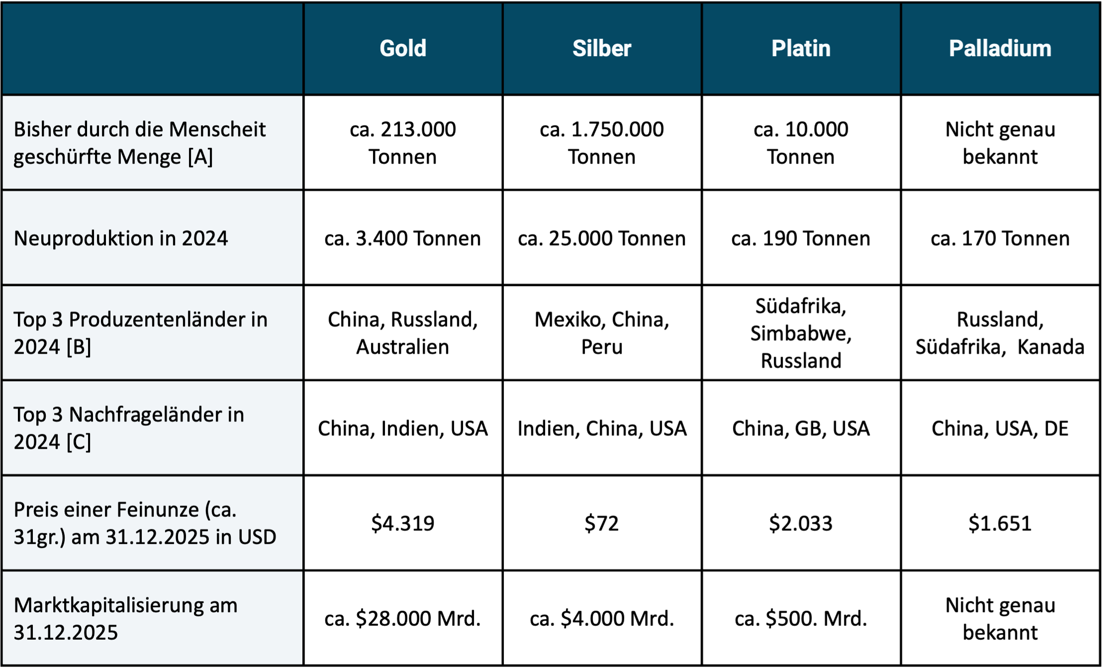
► All weight figures given are rough estimates from a number of different sources. ► [A] The volume that exists worldwide today and has been removed from the earth's crust by humans (“above ground stock pile”). ► [B] In order of production volume. ► [C] In order of demand volume.
There are a total of 15 precious and semi-precious metals. Curiously, according to Wikipedia, these two terms are not exactly the same in different cultures and languages, so they sometimes include different metals.
In investing practice, gold is the most important precious metal, which will surprise no one. In addition to gold, silver, platinum and palladium, the eleven other precious and semi-precious metals not discussed further in this blog post only play marginal roles in the investment market. [1]
Institutional investors and central banks essentially only invest in gold and little or no investment in silver, platinum and palladium.
The market capitalization of precious metals is small compared to that of the stock market and the bond market (see bottom row of Table 1). At the end of 2025, the global stock market had a market capitalization of approximately $130,000 billion (more than four times that of gold), the bond market had a market capitalization of $140,000 billion. At the end of 2025, Bitcoin had a market cap of approximately $1,700 billion (approximately one percent of that of the stock market).
As a private investor in Germany, you can easily invest in the four precious metals via ETFs, more precisely “ETCs” (Exchange Traded Commodities). The advantage of precious metal ETCs relative to direct investments is lower transaction costs (additional costs for buying and selling) with investment amounts (quantities) that are normal for private investors. Furthermore, with ETCs there are no costs for locker rental and insurance. They also offer greater convenience and operational security relative to direct investments. For example, the risk of loss due to theft or negligence is lower in the case of precious metal ETCs than with direct investments. Trading also takes place faster, which makes rebalancing in the overall portfolio easier. The costs (Total Expense Ratios/TERs) of the cheapest ETCs are reasonable. In the case of gold ETCs, they are particularly low.
Taxes on precious metal investments
For tax purposes, direct investments in all four precious metals in Germany are treated equally for private investors. There is tax exemption after a holding period of one year (“private sale transaction” according to Section 23 EStG); if sold before the end of 12 months, the normal income tax rate applies.
ETCs that physically hold the respective precious metal and include a so-called delivery claim (which is the case with many, but not all, precious metal ETCs sold in Germany) are treated just as favorably for private investors for income tax purposes as a direct investment.
Purchases of direct investments by private investors in silver, platinum and palladium are (unlike gold) subject to sales tax, i.e. 19% sales tax is due on the purchase. Precious metal ETCs do not have this disadvantage. (When selling direct investments, a private investor does not have to collect sales tax from the buyer.)
Silver, platinum and palladium are used industrially on a large scale, so they are real “raw materials”, not just pure investments. Apart from its use as a decorative metal, gold has virtually no commercial use. However, it is doubtful whether “jewelry” can be classified as “commercial/industrial use” at all, since in the two main demand countries for gold jewelry – India and China – it tends to play the same role in the population that gold bars and gold coins have in Western countries.
All three industrially used precious metals and gold are so valuable per unit of weight that the quantities once produced (mined) no longer disappear (e.g. in the trash), but remain permanently in circulation (stock) through recycling.
The historical returns of the four precious metals
Let's move on to the investment aspect. Figure 1 shows the inflation-adjusted increases in the value of the four precious metals and the MSCI World stock index over the 49 years from the beginning of 1977 to the end of 2025. We chose the starting point in 1977 because monthly return data for palladium are only available from this point on. But even for gold, a historical investment analysis couldn't go back much further than 1977. Return data for gold before 1975 is ultimately not meaningful, as it was only at the end of 1974 that the decades-long Gold ban [2] was repealed in the USA. The corresponding gold bans in the countries China and India, which are extremely important for global gold demand, remained in place for a number of years after 1974. (Until the end of 1971, the price of gold in US dollars was set by the American government in the context of the so-called Bretton Woods monetary system, which resulted in a return in dollars of close to zero.)
Figure 1: Inflation-adjusted indexed price development of gold, silver, platinum, palladium and stocks (MSCI World Index) from 01-1977 to 12-2025 (49 years) in USD
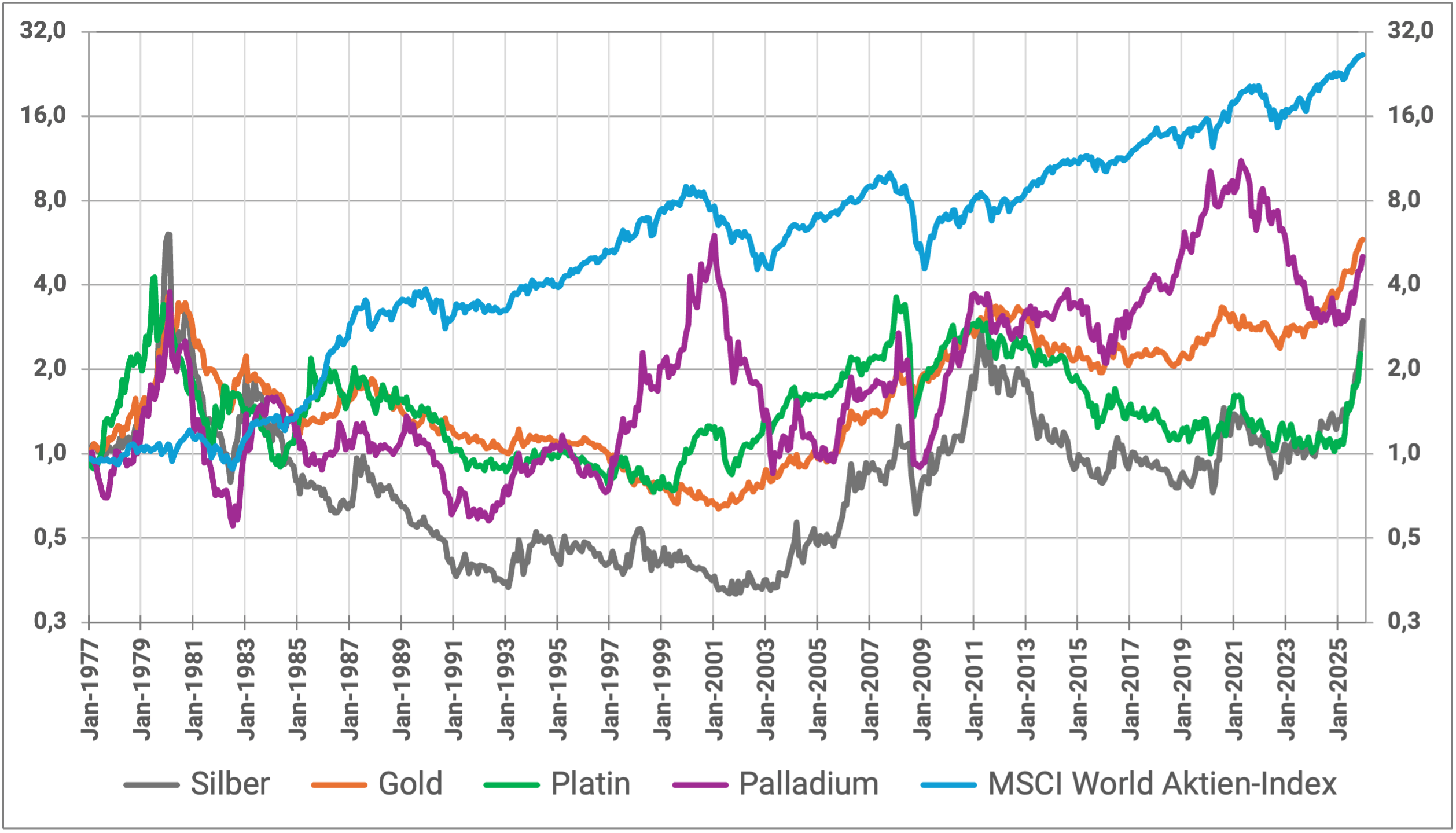
► Data sources: Bloomberg, www.macrotrends.net, Dimensional Fund Advisors. ► Without costs and taxes.
In Figure 1 we use a logarithmic vertical scale. This ensures that a given percentage change in value from one time interval (month, year) to the next appears to the viewer to be the same size across the entire period (horizontal axis), which would not be the case with a linear vertical scale. If the goal is to analyze percentage returns and wealth gains over subperiods of a long overall period, logarithmic plots are less ambiguous.
The two main conclusions from Figure 1 are: Over the entire 49-year period, the MSCI World significantly outperformed the three precious metals. The numerical average returns are listed below in Table 2. The compound interest effect means that an average return advantage of stocks over gold of 3.3 percentage points per annum over these almost five decades results in a drastic final value advantage for stocks over precious metals (26.5 monetary units for stocks versus 6.6 monetary units for gold as the most profitable precious metal).
Risk indicators for the four precious metals in comparison with stocks
In addition, the return development of the stock portfolio was more consistent, both in the short and long term, and less volatile than that of the four precious metals. Table 2 illustrates this with three risk indicators and the risk-weighted return (Sharpe Ratio).
Table 2: Selected performance metrics for the four precious metals and stocks (inflation-adjusted returns in USD)

► Stock Global = MSCI World Index. ► [B] Simplified Sharpe Ratio = risk-weighted return (defined as arithmetic Ø return ÷ standard dev). ► [C] Maximum drawdown = maximum cumulative loss in the observation period. ► [D] Maximum drawdown date. ► [E] Maximum zero return period = longest period within these 49 years over which there was a real zero return. ► All data source: See Fig. 1. ► Excluding costs and taxes.
Table 2 provides further interesting insights:
Over the 49-year period, gold has been the best-performing of the four precious metals, but not in the last ten years. If further multi-year sub-periods were shown (which we do not do for reasons of space), the gold return would only be in first place in a minority and in second place or further down in a majority.
In the case of palladium, the relatively high long-term return within the group of four seems remarkable. It was only slightly below that of gold. What stands out about silver is its spectacular returns over the last decade.
In terms of risk, gold tends to rank first (best) among metals. However, the relative risk balance of gold does not appear to be “flawless”: First of all, gold (like the other precious metals) is noticeably riskier than the global equity investment class.
Gold's volatility of returns and maximum drawdown (MDD) are better than those of the other three metals, but at the Maximum Zero Return Period metric [3] Gold performs worse than palladium.
The periods listed in Table 2 for precious metals at the maximum zero return period may seem shockingly long to some observers. However, the numbers are correct. The reason for the high MNRP values is the inflation adjustment of returns combined with the high volatility of precious metal returns. Let's take gold as an example: Gold had an all-time high of $850 per ounce in January 1980, which in today's money (monetary value at the end of 2025), i.e. "inflated", corresponds to around $3,500. However, gold did not actually exceed this price again until August 2024 after 45 agonizingly long years. The situation was similar with the other three precious metals. Only palladium performs noticeably better here with a maximum zero return period of “only” 20 years (1980 to 2000).
Precious metals for diversification in an equity-heavy portfolio
In Table 3 we take a look at the correlations. We want to use them to measure how well the four precious metals are suitable for diversification in an equity-heavy portfolio.
The quality of the inflation can be determined from the correlation with inflation (far right column). Inflation hedging-Derive characteristics of individual investments. [4]
Table 3: Correlation of precious metals with stocks, with inflation and with each other
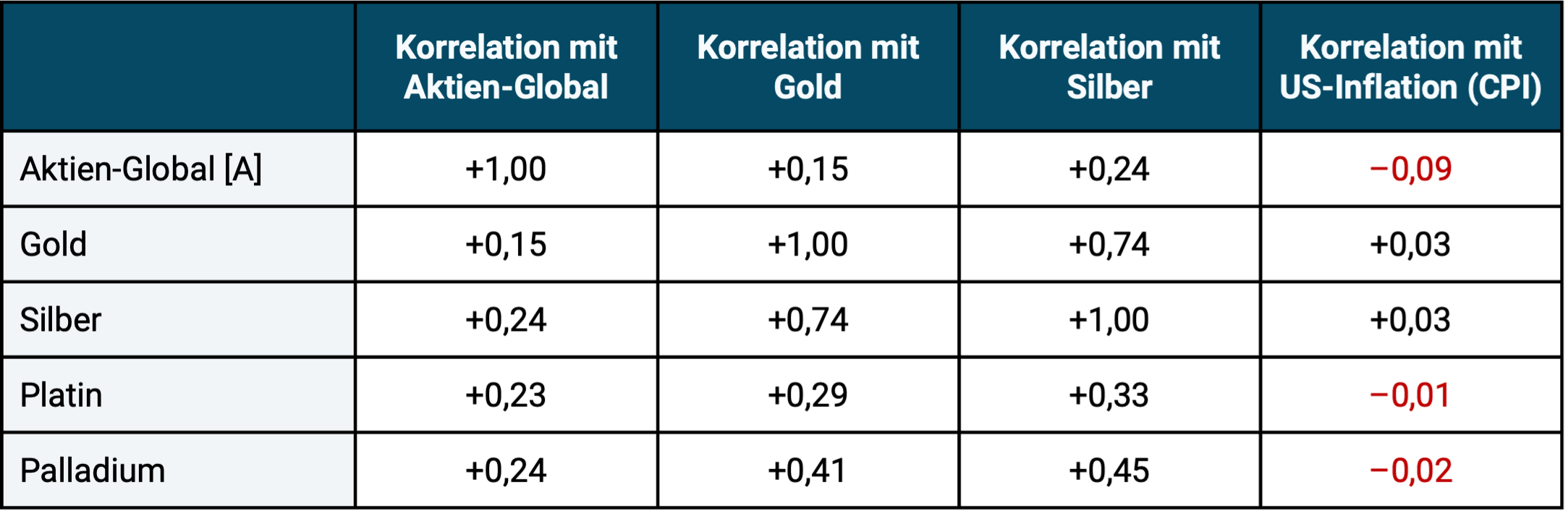
► Global stocks = MSCI World Index. ► Data source: See footnotes to Figure 1.
What insights emerge from Table 3? All precious metals have a low correlation with the equity global asset class. From a pure diversification perspective, all four metals tend to be well suited to reducing the risk (volatility) of a pure stock portfolio. However, to be considered a “good diversifier” you need low correlation and attractive returns.
Platinum and palladium correlate relatively moderately with gold and with silver. Palladium therefore appears suitable for diversifying the risk (volatility) of gold (low correlation with almost the same long-term return). Platinum shows an even lower correlation to gold, but has a weak historical return.
In addition to pure correlation analysis, we also looked at the seven periods between 1977 and 2025 in which the MSCI World Index suffered an inflation-adjusted drawdown of 20% or more [5] and checked which of the four precious metals was the best stock hedge overall in these seven stock market declines, i.e. which fell less than the stock market or perhaps even had positive returns. Even in this diversification test, which is not shown separately using figures, gold performed best among the four metals.
One reason for gold's overall better performance in times of crisis could be that the three other precious metals each have extensive industrial commercial uses. When economies in major industrialized countries weaken (as is often the case during negative stock market returns), their industrial demand also tends to suffer.
The supposed inflation protection of precious metal investments
All four precious metals as well as Equity Global have a correlation close to zero with consumer goods inflation. Therefore, on average over the last 50 years, none of these investments was a good inflation hedge (hedge = protection). The statement that has been heard over and over again in the financial industry, by financial journalists and by finfluencers since time immemorial, that gold and stocks offer “good protection against inflation” is ultimately nonsense. We are not the first in the professional world to notice this. Many believe that an investment that produces a higher nominal return than inflation over the long term therefore offers “inflation protection”. However, this long-term “inflation beating” that every asset class provides is not what scientists understand by “inflation protection” or “inflation hedging”. Inflation hedging and inflation beating are two different things.
In Table 4 we illustrate how well each of the four precious metals performed as an admixture (diversifier) for a global equity portfolio over the period under review.
Table 4: How well do the four precious metals work as diversifiers for an equity-heavy portfolio (inflation-adjusted returns in USD)

► [A] Vola = annualized standard deviation of monthly returns. ► [B] Simplified Sharpe Ratio: See footnotes to Table 1. ► Data source: See footnotes to Figure 1.
The conclusions from Table 4 are also interesting:
A precious metal admixture of 10% with regular mechanical rebalancing has either slightly improved, left unchanged or only moderately worsened the absolute return relative to a 100% stock portfolio for all four precious metals over the period under review from 1977 to the present. In the last 10 years, the diversifier balance sheet was a little better than in the entire period.
The differences in returns for the entire period in Table 4, which may seem implausible at first glance, are correct, e.g. B. that the 90/10 palladium portfolio has a higher return than the 100% stock portfolio, even though palladium's return individually was quite significantly lower than that of gold. The respective differences between the four 90/10 portfolios are also correct. These effects result from the low correlation of the four precious metals to stocks and probably also from the specific historical return profile over these 49 years. The effect is known in the literature as “diversification return” or “rebalancing premium”. For very low correlated assets and widely varying component weights (here 90% versus 10%), the return of the mixed portfolio can be slightly higher than the return of the larger component. [6]
The additions resulted in slight improvements across the two risk indicators (volatility and maximum drawdown).
In terms of risk-weighted returns (simplified Sharpe ratio), the mixed portfolios also consistently performed slightly better than the 100% equity portfolio.
Although the differences in Table 4 seem rather small at first glance, gold still crosses the finish line as a relatively clear winner in the “Best admixture among the four precious metals” competition for the following reasons:
- When it comes to long-term returns, gold is well ahead of silver and platinum. Only palladium comes close to gold here.
- When it comes to risk, the differences between the four precious metals appear to be rather small. All four also perform similarly in terms of their diversification properties in an equity-heavy portfolio. Only the addition of gold shows slightly lower volatility and a slightly better maximum drawdown.
- Gold's market capitalization is by far the largest, which could potentially be an advantage relative to the three other metals in a truly severe global crisis.
- All four precious metals have tax advantages for private investors in Germany, both as a direct investment and as an ETC (provided the ETC is physically replicating and includes a “delivery claim”). In the case of a direct investment, however, there is only no sales tax on gold. (However, it is uncertain whether the tax exemption for gold according to Section 23 EStG will remain in place in the future.)
- Gold ETCs predominantly have lower ongoing costs (TERs) than ETCs on the three other metals.
For precious metals enthusiasts among retail investors, a palladium ETC could be a worth considering diversifier for a gold investment (replacing part of the gold investment with palladium) based on data from 1977 to today. However, this assumes that the investor is not afraid of the additional complexity that comes with it.
In our analysis, it should not be forgotten that the fundamentally high price volatility for all four metals means that the rather small differences in returns could also have been a coincidence. Given the high volatility, a statistician would complain that gold's return advantage is not “statistically significant”, i.e. not sufficiently reliable. For example, if you were to split the 49 year data into two halves, the picture would look quite different in the two half periods, which is why caution is required when interpreting.
The current valuation level of precious metals
For investment assets that do not generate current income (no current cash flows), such as precious metals, conventional raw materials, collectibles and Bitcoin, the fundamental valuation methods commonly used in economics are not applicable. An alternative valuation indicator for such non-yielding assets is the ratio of their current price to the inflation-adjusted historical average price. We show this rough evaluation indicator in Table 5.
By this standard, two of the four precious metals are expensive today, namely gold and silver. One thing is very cheap: platinum. Palladium is moving relatively marginally above its historical average real price. Looking forward, high valuations tend to lead to lower future returns.
Table 5: The current valuation level of the four precious metals – multiple of the inflation-adjusted average price since 1977 (in USD)

► “Current valuation level”: Ratio of the price for one troy ounce on January 31, 2026 relative to the average inflation-adjusted (“inflated”) price since January 1977. Reading example: On January 31, 2026, the gold price was 165% above its inflation-adjusted historical average since 1977. ► Data sources: See footnotes to Figure 1.
Naturally, such considerations (taking into account the current valuation level) are irrelevant for anyone who believes that they can predict the price development of these precious metals in the relevant future with sufficient reliability or for someone who believes that due to future economic or political developments, the already very high prices of gold and silver will continue to rise sharply. We consider such a forecast claim to be unrealistic and, if implemented in the form of market timing, ultimately detrimental to returns. We also do not believe that the high returns of gold and silver over the past 15 years will be achieved on average over the next 15 years.
Reasons for the high price increases of gold in the recent past
For gold, the very high price increases in recent years are usually justified by high and rising national debt ratios, extensive gold purchases by central banks (because they are reducing dollar bonds in their reserves and partially replacing them with gold) as well as a “new distrust” of a growing part of the population in “the elites” and the “FIAT monetary system” (this distrust is expressed with gold purchases). However, even if this is a correct identification of the main price-driving factors, the information and knowledge about these factors are probably already priced in today. From our point of view, how they will develop in the short and medium-term future and thus how the gold price will develop in the short and medium term is unknown today.
The fact that the current weakness of the dollar should be a relevant advantage for the returns of gold and other precious metals is a common misconception that we here (see “Question 9”) and here refute.
Conclusion
None of the four precious metals examined here have historically had long-term returns as high as stocks.
Of the four precious metals, gold was the most profitable in the roughly 50 years from 1977 to 2025. When it comes to long-term returns, palladium – which may come as a surprise – came in a close second.
Gold and silver currently appear to be highly valued, i.e. expensive, while platinum is cheap and palladium is close to the average price. From a statistical perspective, a high rating reduces the forward trend expected return relative to the high returns of recent years.
Overall, gold was the lowest-risk precious metal during the period under review. It also has the lowest correlation to the global stock market and was the best stock diversifier overall in the seven strong stock market down periods since 1977.
For private investors, there is a sales tax disadvantage relative to gold in the case of direct investments (not in ETCs) for silver, platinum and palladium.
Gold also performs best on balance among the four precious metals when it comes to the additional costs of investing.
So gold goes in the competition “who is the (relatively) best admixture?” clearly emerged as the winner. In our opinion, second place is not silver, as some might have expected, but palladium.
In the long term, a gold admixture is unlikely to increase the return relative to “100% stocks” and may even lower it somewhat, but it can moderately improve the risk profile of the overall portfolio.
Anyone who looks at precious metals individually, i.e. not at the aggregated effects in an overall portfolio with a precious metal admixture, must be able to cope with their high drawdowns and extremely long periods of zero returns as an investor. This is only likely to work long-term for most private investors - i.e. not result in harmful panic selling - if the percentage of (all) precious metals in their total asset portfolio is relatively low - e.g. B. a maximum of 10 percent.
Endnotes
[1] See German Wikipedia, article “Precious metals”. In addition to the four metals shown here, the following are among the 15 precious and semi-precious metals: iridium, osmium, mercury, polonium, rhodium, ruthenium, bismuth, technetium, rhenium, antimony and copper.
[2] The ban on private households owning gold existed for several decades in many capitalist and communist countries in the 20th century. A violation was usually punished with harsh and, in some states, draconian penalties. See article “Gold ban” in the German Wikipedia.
[3] Maximum NRP = Longest period within these 49 years in which there was a real zero return.
[4] A brief explanation of the “correlation” metric can be found at the end of this blog post.
[5] These include the crashes in October 1987, the dot-com crash (beginning of the noughties), the Great Financial Crisis (from 2007), the Covid crash (2020), the Ukraine war and interest rate change crash (2022).
[6] See e.g. B. Hallerbach, Winfried (2016): “Disentangling Rebalancing Return”, December 10th. 2016, Internet reference: Social Sciences Research Network/SSRN.
Infobox: Correlation – a quick explanation
Correlation is a key figure from statistics that measures the degree of parallelism in the development of two variables (series of numbers), for example the price changes of two securities or two asset classes over time. Correlation is measured in the form of the correlation coefficient, which ranges between +1.0 and -1.0, where +1 stands for complete correlation (exact parallel development), 0 for completely independent (or random) development and -1 for exactly opposite development. The lower the correlation between two financial assets, the more suitable they are for diversification in a portfolio, all other things being equal. Just like returns, correlations also fluctuate over time, but to a lesser extent.
The post Precious metals as an admixture – does that make sense? appeared first on Gerd Kommer.
]]>The post “Homeowners are wealthier than renters in old age” – lies with statistics appeared first on Gerd Kommer.
]]>In this blog post we look at a specific old wives' tale about the financial attractiveness of owner-occupied residential properties, which has been re-proclaimed "twice a year" by most media in Germany and by the real estate industry for decades with headlines such as the following:
- „Property owners have significantly more money in old age than tenants“ – Headline of an article in the news magazine Spiegel from January 13th, 2025
- „Pensioners who own their own home are particularly wealthy“ – Headline of an article on the news portal t-online.de from December 17th, 2025
- „Homeowners accumulate more wealth than renters“ –Press release from the Association of Private Building Societies in 2025.
However, the statement “own-occupied home leads to higher wealth in old age than renting” is not far from the truth. The statement is a picture-perfect case of “lying with statistics.” [1]
Lying by concealing essential information
As we know, you can lie in many ways. One of them is that person A (the liar) formulates a statement B correctly, but deliberately omits essential information in order to cause a false understanding or error on the part of addressee C. So A lures C into a comprehension trap by omitting crucial information from statement B. That is the lie. Children can already master this method. In English it has a nice compact name Context Dropping used.
Context dropping – lying by deliberately omitting, i.e. suppressing crucial additional information – happens when the statement “Pensioner with his own home [2] are statistically wealthier than pensioners who rent.”
Below we show how this deception actually works. The claim that home ownership is among older households causal for a higher net worth (as conveyed in the exemplary publications cited at the beginning through manipulative context dropping), we will henceforth call “the real estate lie”. [3]
At first glance - without the correct context - the real estate lie in question appears to be true: homeowners actually have a statistically higher net worth in old age than renter households. This is shown by the relevant data and no one doubts its formal correctness.
But the crux of the matter: the statistical wealth advantage of homeowner households (EHBs) over renter households has nothing to do with owning their own home. It is entirely due to other causes. So here correlation is confused or swapped with causation. Yes, EHB households are generally wealthier as they get older than renter households, but they Caused This asset advantage is not the home.
Here is an illustration of the manipulative swapping of cause and effect Real estate lie: The wealth of the average Ferrari-owning household in Germany (around 14,500 households) naturally exceeds that of the average non-Ferrari-owning household (around 41 million). Now the question: Was the Ferrari the cause of this wealth advantage? Of course not. The Ferrari has statistically reduced this wealth advantage - without it, the wealth advantage of the Ferrari households would be even greater. Either way, Ferrari ownership was the result of the income and wealth advantage, not its cause. It's the same with home ownership. It is the consequence, not the cause, of a number of actual causal factors.
The real causes of homeowners' wealth advantage
The “real estate propagandists” are betting that their recipients will fall for the manipulated statement and misunderstand correlation as causality.
However, as scientific research shows quite clearly, the actual causes of the wealth advantage of EHB households are as follows: [4]
1) EHB households have a higher lifetime income, i.e. h. the sum of their net income over the entire period of earning capacity is statistically higher than for renter households. The proportion of households with two incomes is higher among EHB households than among renter households.
2) EHB households have a higher percentage propensity to save. A higher percentage of their net income, which is already higher in absolute terms (see number 1), goes into wealth creation than is the case with renter households. This higher propensity to save is also expressed in the willingness to submit to a “positive compulsory savings contract” that is linked to the loan-financed purchase of a home. More on that below.
3) EHBs are more risk-averse in their investment behavior and therefore achieve statistically higher long-term returns in their wealth creation away from their own home. This increased willingness to take risks is also reflected in the higher entrepreneurial rate among EHB households than among renter households (starting a business and entrepreneurship are very risky). The higher risk affinity is probably due, among other things, to the proven higher average financial literacy of EHB households.
4) EHBs receive more frequent, larger and earlier wealth transfers from their parents and grandparents through gifts and inheritances. This often happens by “subsidizing” the equity share when the EHB household first purchases property when it is young.
5) EHB households have lower divorce rates than renter households. Divorces often cause serious financial losses for those involved. We show why and how these asset losses happen here.
6) If a home investment fails individually - for example due to a combination of unemployment and excessive debt - the affected households often lose their home through seizure or forced sale and become renter households again. Paradoxically, particularly poor home investments contribute to the “home ownership lie” analyzed here.
Note that in the list and description of the six main causes of the higher wealth of EHB households, we did not say anything about Why These households have higher incomes, higher savings rates, greater willingness to take risks, higher financial literacy or lower divorce rates. Quite obviously, a large part of these wealth-promoting factors lies in the socialization of the people concerned; a small part could also be genetically determined.
Would you compare tenant groups with EHB groups where the six causes listed above no If there were a difference, it would be shown that renters statistically achieve higher or similar levels of wealth in retirement. [5]
Why higher wealth? Quite simply because renting in conjunction with other forms of wealth creation - above all with a simple, broadly diversified stock portfolio on a buy-and-hold basis - leads to a higher net final wealth than an owner-occupied property in the majority of time frames if the financial-mathematically correct comparison is made. Furthermore: The relative final asset advantage of the “rent + capital market investment” constellation will tend to be greater, the higher the loan share (“leverage”) is in the comparison EHB. We at GKI have shown this for Germany and others for other countries - see here and here.
We probably don't need to explain in detail at this point why the real estate lie has been spread again and again by real estate agents, property developers, real estate influencers and banks for decades. These parties earn directly or indirectly from real estate purchases or their financing.
The “compulsory savings contract” for real estate
In connection with the correlation phenomenon of the higher net wealth of EHB households in old age relative to renters, it is often even said that not People with conflicts of interest, i.e. “people without a real estate agenda”, argue that the higher net assets of EHB households are based to a large extent on the phenomenon of the “positive compulsory savings contract”. This means that an EHB household that, for example, has taken out a loan for 80% of the acquisition costs is obliged to pay the corresponding expenses (loan installments, property tax, insurance, maintenance) month after month until it has been completely repaid - typically after 25 years or more. Otherwise there is a risk that the property will be seized by the bank. Above all, the repayment element in debt service contributes directly to wealth creation: with every euro of repayment, the percentage of equity in the property increases.
A tenant household is not under a comparable pressure to save, according to the theory of the positive compulsory savings contract. As a result, tenant households will often save less overall or temporarily interrupt their savings over a 25-year period for consumption purposes.
Here too, the confusion/swapping of correlation and causality probably plays a role. People with a naturally high tendency to save are represented more frequently among EHB households than among renter households. This is probably because their pre-existing strong willingness/inclination to save makes it easier for them to accept the long-term reduction in consumption that comes with the “compulsory home savings contract”. These EHB households would not have been able to purchase their own home for certain reasons [6] or if they had viewed a home as a comparatively unattractive investment, the majority of them would have been just as disciplined and saved for the long term in other asset classes. So if you look behind the façade of formalities, you can't even speak of "compulsion" for most people or households who submit to the supposed "compulsory" savings contract, because they would save even without real estate.
What does the development of the “homeownership ratio” tell us?
If you realize that in almost all countries in the world and especially in Germany, wealth creation through owner-occupied residential real estate is financially supported by the state more strongly through taxation and transfer payments (cash benefits) than any other form of private wealth creation, and if you assume for a moment - incorrectly - that owner-occupied real estate systematically produces high returns on equity, then the homeownership ratio (HOR) in most countries would have to continue to rise over time. [7]
But that is not the case. In the USA, the HOR is now at 65%, the same level as 30 years ago, although every American president during this time announced during the election campaign that his administration would increase the HOR. The HOR average of the 38 OECD countries has essentially moved sideways over the last 20 years. [8] There has also been stagnation in Germany over the last decade (current level 47%). Before that, the HOR had risen moderately - probably due to the special and one-off effect of reunification in conjunction with significantly falling interest rates at the time - since in the eastern federal states the HOR was only 24% before reunification (today around 33%).
Wealthy Switzerland is probably the only economically developed country in which, compared to other forms of private wealth creation, home ownership has not yet been systematically favored or subsidized by the state - neither through taxes nor in any other way. [9] The HOR there is only around 40% - probably the lowest value globally. This is a strong indicator that the “natural” HOR in a rich country with a functioning, deep, liquid rental market and a high level of tenant protection (as is common in Western Europe) is in the 40% to 60% range, but certainly not 80% or higher - where politicians and the real estate industry would like the HOR to be.
In this context, many politicians and of course the entire real estate industry have been claiming for decades that a high HOR is a sign of national prosperity. This is also the view of most citizens. Nevertheless, this idea is probably wrong. Empirically, poor countries have higher HORs than rich countries, with rare exceptions. Romania and Bulgaria are among the poorest states in the EU, but have HORs of 86% and 95%, well above the level of the other, richer European states. In general, poor developing countries worldwide are more likely to have higher HORs than rich industrialized countries. One of the richest countries in the world, Switzerland, has – as mentioned – the lowest HOR globally. [10]
Trying to increase the HOR through state measures “with all financial force” is therefore likely to be – as in most countries over the last 25 years – a waste of taxpayers’ money, which is also economically detrimental to tenant households, and is therefore socially regressive and tends to increase wealth inequality.
The future development of residential property prices in Germany
How will residential property prices develop in the future?
In order to answer this question, one should first look at their development in the long-term past. In the 55 years from 1970 to the end of 2024, residential property prices in Germany rose by a paltry 0.1% p.a., adjusted for inflation. Yes, in the eleven and a half years from mid-2010 to the beginning of 2022, prices had risen sharply, but in the approximately 40 years before that and in the three and a half years since March/April 2022, the increases in value, adjusted for inflation, looked poor - even in the largest cities of Berlin, Hamburg, Munich and Cologne. Since spring 2022, residential property prices in Germany, adjusted for inflation, have fallen from their peak at the time by 26% (Greix index) by September 2025 and by 17% (Europe index) by December 2025 - the most recent figures available. [11] (We show the long-term historical price development in Germany and twelve other western countries since 1970 here.)
We already know with great certainty that the population in Germany will begin to shrink from around 2030. Slowly at the beginning, then faster and faster. This means that a demographic headwind that will continue to affect the development of residential property prices for decades will continue. This demographic “price suppression effect” is further intensified by the fact that those who leave the real estate market due to death occupy particularly large areas per person at this time due to their age and wealth. So we will not only have a decline in population and a resulting dampening effect on demand, but - in addition to the net new construction - an indirect increase in the supply of space, since the owners and tenants who leave the real estate market occupy far larger areas per person than the young people who enter the real estate market after moving out of their parents' house. This increases the supply of space relative to demand.
It is possible that real estate prices in Germany, which have fallen since 2022, are already the front end of this demographic supply and demand effect. Asset markets generally already price in the developments expected for the future in the present.
Another long-term effect on increasing the supply of living space, although its strength is difficult to estimate, could result from the conversion of vacant office space into residential space. (It is also conceivable that in the next few years an AI-related loss of administrative jobs will lead to a second wave of reductions in the need for office space after Corona.)
Government actions to combat climate change will also tend to have a detrimental impact on housing prices and returns in the future. At least that's what Allianz writes in Allianz Global Wealth Report 2024. [12] We consider this assessment to be plausible.
Conclusion
There are many over-optimistic myths circulating about the financial attractiveness of residential real estate as an investment class that do not stand up to a rational comparison with reality - e.g. B. Research results from independent scientists and empirical value increase data from the last 30 to 50 years.
One of these myths is “property owners have more wealth than renters when they get older.” Anyone who formulates this statement “without context” in such a way that the recipient of the statement will probably conclude that real estate ownership has produced this wealth advantage is lying.
Although EHB households are wealthier on average than renter households, the reasons for this wealth advantage are other than the property: (a) higher long-term incomes, (b) higher propensity to save, (c) more risk-taking investments, (d) more wealth inflows via gifts/inheritances (e) fewer divorces.
If the EHB households in question had not invested in an owner-occupied property, but would have remained renters and - without spending a cent more (but not less) on housing and building wealth - they would have invested in more profitable forms of investment such as. For example, if global equity ETFs were invested, they would be invested on a fixed date, e.g. B. the age of 60, was even wealthier.
How beautiful the world would be if everyone who professionally deals with investments for others pursued the goal of spreading as little disinformation as possible in their communication and marketing, including no disinformation through context dropping.
Endnotes
[1] There are numerous books about how this works in general. One of them is “How to lie with statistics” by Prof. Walter Krämer (Amazon link here).
[2] In this blog post, “home” means any type of owner-occupied residential property, including both houses and apartments.
[3] Net worth = Gross worth (total of all assets) minus liabilities.
[4] At the end of this blog post we mention some of these academic studies.
[5] Such studies that neutralize all six causal factors in the study design may not yet exist. They would be very complex and expensive.
[6] For example, because for professional reasons they (have to) live in a place where they do not want to live permanently.
[7] At the end of this blog post in the appendix we show in Table 1 the tax preference for wealth creation through home ownership relative to wealth creation through e.g. B. Shares by the German state.
[8] The OECD is a supranational organization of which, by and large, the 38 wealthiest countries in the world are members. The main task of the OECD is to reach agreement on national tax and economic policies between member states.
[9] The abolition of the so-called Imputed rental value taxation In Switzerland from probably 2028 onwards, this will also lead to state subsidies for wealth creation through one's own home in relation to other forms of wealth creation. For information on imputed rental value taxation, see the keyword “imputed rental value” in the German-language Wikipedia.
[10] Of course, almost all Swiss residential properties still belong to Swiss citizens or Swiss companies (which in turn belong to Swiss citizens), but around 60% do not belong to the households that live there.
[11] It is normal that different property price indices sometimes differ greatly from one another over short periods of time.
[12] "The long-term impact of climate change on housing prices comes mainly through transition risk i.e. the energy consumption of buildings, particularly for heating. Projections of the House Price Index (HPI) in the UK under different climate scenarios up to 2050 show declines between -9.3% and -13.1%. For Germany, cumulative HPI declines could be as high as -24.5%. This would imply per capita losses of EUR32,380. Applied to all markets under consideration, homeowners could face losses of up to EUR30 trillion.” (Allianz Global Wealth Report 2024, p. 5).
appendix
Table 1: The drastic tax incentives for homeownership in Germany compared to Building wealth with capital market investments

► Assumption: Stock ETF is part of private tax assets. ► [A] The current income from a home is the rent saved for the owner. In various countries, this “fictitious” income must be taxed by the owner. ► [B] Stock ETF: 18.5% with 30% partial exemption (70% × 26.375%). ► [C] Inheritance and gift tax exemption for the home. If children or grandchildren are the recipients, then the exemption limit is 200 sqm, for spouses there is no sqm limit. ► [D] Property tax: The effective taxation is property-specific. A rough approximation is given here as a percentage of the current value of the property. ► [E] The stated value results from a property transfer tax of e.g. B. 5% and a holding period of 40 years: 5% ÷ 40 = 0.13% p.a. ► Saver's flat rate of 1,000 euros per person per year for capital market investments is ignored here for the sake of simplicity. It also ignores overall low state subsidies for Riester savings and capital-forming benefits (VL) and the retirement provision portfolio that will exist from 2027.
Literature references
Allianz (without author): Allianz Global Wealth Report 2024; Allianz Insurance Group; Allianz Research; Internet reference here
Birkjaer, Michael et al. (2019): The GoodHome Report 2019 - What makes a happy home?"; Kingfisher plc and the Happiness Research Institute; June 4, 2019; Internet reference here
Bracke, Philippe et al. (2014): “Homeownership and Entrepreneurship: The Role of Mortgage Debt and Commitment”; Working Paper No. 5048; Ifo Institute; Internet reference here
Braun, Rainer (2024): “You build tomorrow’s empty property today”; Interview with Rainer Braun from Emprica in Der Spiegel from July 5th, 2024; Internet reference here
Dräger, Jascha et al. (2024): “The Keys to the House – How Wealth Transfers Stratify Homeownership Opportunities”; German Institute for Economic Research/DIW; October 12, 2024; Internet reference here
Fagundes, Dave (2017): “Buying Happiness”; In: William & Mary Law Review; 58, 2017; Internet reference here
Krämer, Walter (2015): “How to lie with statistics: About the risks and side effects of non-statistics”; Campus Verlag 2015 (book)
Goetzman, William/Matthew Spiegel (2000): “Policy implications of portfolio choice in underserved mortgage markets”; SSRN; 02 Nov 2000; Internet reference here
Moussouni, Oualid et al. (2023): “Does Owning a Home Build More Wealth?” Canada Housing and Mortgage Corporation/CHMC; Internet reference here
Shlay, Anne: (2006): “Low-Income Homeownership: American Dream or Delusion?” In: Urban Studies 43, No. 3, pp. 511-531; Internet reference here
Wong Bucchianeri, Grace (2011): "The American Dream or the American Delusion? The Private and External Benefits of Homeownership for Women"; July 3, 2011; SSRN; Internet reference here
The post “Homeowners are wealthier than renters in old age” – lies with statistics appeared first on Gerd Kommer.
]]>The post Financial forecasts – why they do more harm than good to investors appeared first on Gerd Kommer.
]]>There is no longer any need to prove that active investment management in capital market investments consistently produces worse long-term returns than passive, broadly diversified buy-and-hold investing. Since around 1960, the superiority of passive strategies has been empirically confirmed again and again by scientists in countless studies. Nevertheless, here are a few numbers. Using current data, they illustrate the “active investing disaster” for actively managed equity funds (UCITS funds) sold in the EU. [1]
Table 1: Proportion of European-domiciled, actively managed equity funds that underperformed their passive index benchmark in two periods
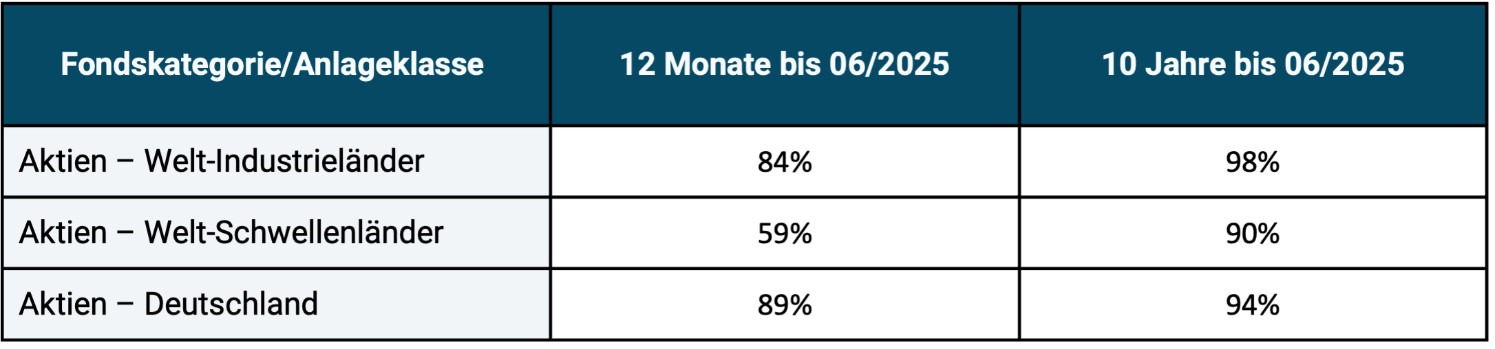
► Source: S&P Dow Jones Indices “SPIVA Europe Scorecard Mid Year 2025” (Equal Weighted Funds). ► Returns in euros. ► Without taking costs into account in the benchmark, but also without taking into account any costs for any issue charges of the actively managed funds. ► Original data rounded to whole numbers.
Table 2: Comparison of the average returns of the funds from Table 1 with the returns of the correctly selected passive benchmark for the period 06/2015 to 06/2025 (10 years)

► For explanations, see information below Table 1. ► Original data rounded to one decimal place.
Given the depressing results in the two tables for active fund management, an investor might object: "Maybe so, but I'm not interested in that, I'll just invest in a fund from the small minority of active funds that beats its passive benchmark." However, this obvious consideration does not help us in practice. Reason: The minority of outperforming funds that exist for each time window can be ex ante cannot be identified reliably enough, because the composition of this mostly small group probably changes randomly from time window to time window. However, due to space limitations, we do not show any data on this in this blog post.
In this blog post, we want to answer the question of why active investing performs so consistently poorly, as is selectively suggested here using actively managed UCITS funds in the equities asset class. [2]
Strangely, the answer to this question is rarely given in financial advice books, mainstream media print articles, YouTube videos, and other social media posts by finfluencers. This answer has to do with the question of the predictability of financial market sizes. Active investing is always forecast-based Invest.
Active investment management ultimately fails because the underlying forecasts are too often wrong.
These can be forecasts about the future prices of securities, the level of dividends, securities indices, interest rates, foreign exchange rates, slumps in the stock market, inflation rates, company profits, the completion or lack of company mergers, the course of restructuring measures in companies, real estate prices, precious metal prices, the Bitcoin price, economic growth rates, unemployment rates, the number of bankruptcy filings in the economy, regulatory measures, tax changes, important political ones Decisions – anything that investment managers believe will significantly impact the forward economic prospects of a particular investment asset, such as a listed company.
Forecast-based investing and its problems
Now the question arises: If forecast-based investing – as we have seen in Tables 1 and 2 – is economically damaging, i.e. works poorly, why do forecasts continue to be created, used and followed by the majority of all private investors or the service providers they commission (e.g. asset managers or fund managers)?
Below we list the six most important cognitive, social and institutional reasons for this particular form of human irrationality.
(1) The misinterpretation of the small number of actually correct forecasts
Of the millions of economic and financial forecasts made by someone somewhere around the world every year, a small number will later turn out to be correct. In most cases, these correct forecasts can be easily and plausibly explained by the law of large numbers, the operation of chance. So these are probably lucky hits from which nothing can be derived for the future, especially not that they can be reliably repeated. And yet these are repeatedly misinterpreted as evidence of forecasting ability.
If 100 million people each roll the dice ten times in a row, then statistically there will be one or two people (1.65 to be exact) who roll a six ten times in a row, even though the probability of this for a single person is only 0.0000000165 (that is less likely than six numbers in the lottery). The number of people who invest in the capital markets significantly exceeds 100 million, many make more than ten investment decisions per year and the capital markets have existed for over 100 years. Because so many of us individually do improbable things, the insight of statisticians, which only seems paradoxical at first glance, applies: “The improbable is probable.” [3]
(2) Failure to recognize “One Trick Ponies”
We all know the names of “financial experts” who supposedly or actually predicted an extremely rare major financial event, a “black swan,” and are therefore considered “great foretellers,” investment gurus, and who seem to prove that correct predictions are systematically possible. One of these gurus is Nouriel Roubini, an economics professor at New York University (NYU). In 2006 he correctly and surprisingly precisely warned of an impending major financial crisis. This actually began in early 2007 with a sharp price crash in the US housing market, which then dragged down a large part of the global banking industry and the global stock market.
Does this provide evidence that Roubini can reliably predict important macroeconomic reversals or financial catastrophes? No. Roubini is actually what American parlance calls a “one trick pony,” a horse that can only do one trick.
There are two types of forecasters in the financial industry. Type A: Someone who repeats a certain forecast over and over again for years, but is constantly wrong. However, no one in the media is interested in this failure, since forecasts from unknown people that do not come true are not worth reporting. But then the same forecast, which has been wrong several times over, comes true and is now picked up as a huge sensation by the media and literally spread worldwide. Headline: “He/she knew beforehand, but no one listened to him!” The public is not informed that one correct forecast follows many incorrect ones. No one pays any attention to the few who investigate and uncover the scam.
There is also variety 2 of the One Trick Pony. Here the actor actually makes a prediction for the first time about an important event that is considered very unlikely and promptly hits the mark. Our guru is now experiencing a tsunami of media attention. The media begs him for new forecasts, which he subsequently makes because he has recognized the marketing value he now has. The new forecasts no longer come true. But it will take years before this becomes clear enough.
This is the Roubini one-trick pony variant. His list of false predictions from late 2008 to today is too long to be expanded upon here.
But the same thing: In both one-trick pony cases, the media and the investment community are hoping for the “guru” for a few years, when in reality this was simply a case of “more luck than sense”. As it becomes apparent over a longer period of time that the guru can no longer deliver correct predictions, the media loses interest in him. The media entourage is now moving on in search of a new, fresh guru.
(3) The unwillingness of the media and many investors to recognize “manipulative forecasts.”
Manipulative forecasts (“MPs”) are those that look like “honest” or “real” forecasts, but are not. Honest, real forecasts are formulated in such a way that both their occurrence and non-reality can be unequivocally recognized. This does not apply to MPs. With MPs, only the arrival can be clearly determined, but not the non-arrival. They fulfill the philosophy of science Falsification criterion not. [4]
In most cases, the lack of falsifiability (theoretical or fundamental refutability) results from the author of the prediction deliberately omitting a clear indication of the time. A simple example of such an MP: “It will rain.” It is obvious that this forecast can only either (a) not have happened yet or (b) have happened (i.e. true) but (c) can never not have happened (i.e. false). If such an MP turns out to be true at some point, it says absolutely nothing about the competence of the author of the forecast. A reliable statement about competence would require a falsifiable prognosis.
MPs are logically pointless and statistically overwhelmingly harmful as the basis of an investment strategy. Nevertheless, the MPs that arrive are often interpreted as evidence of competence in favor of the forecaster.
Seven MP examples from the investment world:
(a) “The S&P 500 Index will continue to rise strongly.”
(b) “We see a price target of 41 euros for Deutsche Bank shares.”
(c) “The Bitcoin price will come back in the medium or long term.”
(d) “Samsung stock is undervalued and a Strong Buy.”
(e) “The US stock market is heading for a sharp correction.”
(f) “The Eurozone will break up.”
(g) “E-cars will prevail.”
In all of these cases there is no verifiable time indication. Since it is missing, the predictions can come true (become true), but they can never not come true (become false). In (c), (d), (e), (f) and (g), the predicted event is only described ambiguously. Here, the forecaster cleverly left open a second non-falsifiability loophole in addition to the non-specific time period/point in time. That's doubly clever and doubly cynical.
The following basic rule applies to the marketing of MPs to the audience: If the prediction is correct, the forecast author will claim spectacular foresight and competence and market it lucratively. If it doesn't happen, he has an almost unbeatable excuse for the first five years or so after the forecast was made. After that, no one remembers it anyway. The Anglo-Saxons call something like this a “one way bet” – a bet that you can only win.
Another MP variant is “flexible” or “vague” forecasts. They can contain a time indication, but are still not falsifiable. Example: “We see a correction potential of 20% for Tesla shares by the end of this year.” A period of time is given here, but the term “potential” is so vague that one can still only speak of one MP. In addition, the forecast is true even if Tesla first rises 50% by the end of the year and then falls 20%, i.e. has increased on balance.
If such a flexible or vague forecast has not materialized after the specified time period, the author of the incorrect forecast - in the rare cases that someone remembers the forecast - will make the protective claim that he was simply talking about a "potential" that depended on specific, but now not realized, secondary conditions or assumptions. If he was right by chance, all vagueness and all occurrence of alleged secondary conditions will be forgotten.
(4) Cleverly marketing the small number of correct predictions
Virtually all forecasters are “big talkers,” making hundreds of direct and indirect, explicit and implicit forecasts over the years. Because of the sheer volume of their chatter, talkers are bound to at some point say something that will later prove to be an impressively accurate prediction. One could speak here of the “prognostic law of chatter”. But because the big talkers are dishonest, they market their few correct forecasts loudly and intensively, but ignore their many more false forecasts. This is a cheap and easy-to-see sleight of hand, but the media and the public mostly fall for it anyway. Quite a few particularly cynical media outlets are even complicit in this manipulation.
A big reason why the big talkers among financial forecasters get away with their trick so easily lies in “Brandolini’s Law,” also known as the “Bullshit Asymmetry Principle”: “The amount of energy required to refute bullshit exceeds the amount required to produce it by orders of magnitude.” [5] The effort required by a third party to provide clear proof that this is a prognosticator who makes many estimates and who, in total, made many more incorrect forecasts than correct ones, is higher than the effort that the big talker had to put his nonsense into the world. In addition, there is little commercial gain from such proof for those who provide it. (Here an example of a complex proof of four such chatterboxes that we once undertook ourselves.)
(5) Accept the absurd world of “revised forecasts”.
In the so-called “serious financial industry”, especially in the banking sector, for example, stock price forecasts or forecasts of macroeconomic variables such as interest or inflation rates that turn out to be incorrect are routinely “revised”, i.e. replaced by new forecasts. That sounds professional, but it's the opposite. A prediction either comes true, then it was correct, or it doesn't, then it was wrong. A “revised forecast” is a new forecast that typically follows an incorrect one. The sleight of hand of “revised forecasts” doesn’t bother anyone in the financial community. Rather, it is a ritual core part of what investment banks communicate to the public about their investment recommendations day in and day out and the media readily parrots them, giving them a professional flair. Why? Because the media – especially in the business sector – constantly need new content. “Revised forecasts” provide this financial junk food for an information machine that has to be “on air” 24/7.
(6) Naively applying the laws and rules of other disciplines to the financial sector
For many people, it is part of their economic worldview, a fundamental economic belief that has never been questioned, that the advantage in specialist knowledge that financial specialists have over non-financial specialists includes the ability to predict future developments of important financial market players. Just as a doctor can often correctly and accurately predict the future course of an illness, or an engineer can often precisely predict when a machine will fail or a component will break.
Yes, there is the ability to make predictions in many areas of life, but not in the financial market, at least not systematically exploitable As far as forecasts are concerned. “Systematically exploitable” here means that the implementation of these forecasts as part of an active investment strategy produces reliably better performance after costs, taxes and risk than a technically correct, forecast-free investment on a buy-and-hold basis with broadly diversified, low-cost index funds/ETFs.
If the existence of “predictability on financial markets” is part of a person's economic worldview, personal experience with forecasting errors, even painful forecasting errors, usually does not change one's opinion. If forecast-based investing causes harm to these investors, they generally do not conclude that forecast-based investing is bad, but rather that better forecasts are needed, either better forecasts from themselves or from a financial service provider they use. In still other cases, the damage is not even recognized.
In view of all this, the question naturally arises as to why economically reliably exploitable predictions in the financial sector necessarily fail on balance.
Three structural causes for the majority of financial forecast failures
Cause 1: The information efficiency of the capital markets, which is within the framework of the Efficient Market Hypothesis is examined and documented. This information efficiency means that new information that influences the price of listed securities is reflected (priced in) very quickly in the price, faster than the vast majority of investors or analysts can react to it. Based on this “estimated” public information, no price forecasts can be made that can reliably beat the market after taking costs, taxes and risk into account. The increasing spread of artificial intelligence will further increase the already very high information efficiency of the capital markets. We have our own for this purpose Blog post written.
Cause 2: Markets are “complex, dynamic, non-linear, non-stationary systems”. Even small changes in the initial conditions of such a system often cause extreme differences in the final results, so-called butterfly effects. [6] Such “complex adaptive systems” are not the same as “complicated systems.” A gas power plant is a complicated, but not complex, system. The behavior of complicated systems is easier to predict than that of complex systems. Although we can say a lot about the general properties of a complex system, we cannot make specific, reliable and economically exploitable predictions about its behavior over a clearly defined period of time.
Cause 3: Forecasts in social systems, including markets, are even more so more self-referential (more circular), the more people there are - e.g. B. based on positive past experiences – consider this to be true. The prediction then affects the object of the prediction and thus deprives the prediction of its starting point and thus reduces its accuracy. In short: the more people believe a forecast, the more likely it is to lose its validity. Systems that are not exposed to human intervention in this sense, such as a volcano, a swarm of bees, a machine or a diseased human organ, are subject to this Self-referentiality of social systems and therefore rather meet the basic requirement for predictability. Benjamin Graham, Warren Buffett's famous mentor, put it this way: "A moment's thought will show that there is no such thing as a scientific prediction of economic events under human control. The very 'dependability' of such a prediction will cause human actions which will invalidate it." [7] Because this is the case, the use of artificial intelligence will not bring about any fundamental improvement in terms of forecasting ability. If anything, AI will contribute to the opposite, because its gradual spread and further improvement will mean that more and more people will become better informed about a given issue at an ever faster rate. In doing so, it further increases the self-referentiality and information efficiency of financial markets.
The empirical evidence that following financial forecasts leads to avoidable damage to returns over the long term, absolute losses or opportunity costs (lost profits) relative to comparable buy-and-hold investments, is overwhelming. The rational conclusion from this: practice prediction-free, passive investing as the financially more attractive and accessible alternative.
The future in social systems cannot be reliably predicted beyond useless “open”, here called “manipulative” forecasts. It is not so because of real predictability structural There are obstacles in the way that cannot be overcome by ultimately childish “prediction-repair strategies” such as the following:
- make even more, even more frequent forecasts,
- Use forecasts from other still “unburned” forecasters
- look for a better mathematical forecasting algorithm (e.g. in the form of AI).
- incorporate more comprehensive data analysis into the forecast
Conclusion
From our point of view, do-it-yourself investors would do well to make as few financial forecasts as possible, i.e. to invest on their own without any forecasts.
Anyone who has delegated their investment to a third party should give up the hopeless search for a “capable financial forecaster”.
Anyone who accepts this has excellent chances of achieving higher net worth as an investor and finding greater financial peace of mind as a person.
On the other hand, rational members of the financial industry, including the now large group of finfluencers who are involved OPM (Other People’s Money) Make money, don’t give up making predictions. Her “street smarts” made her realize that you can make good money with forecasts – even those that are mostly false and/or manipulative. This has been the case in the past and will continue to be the case in the next ten years. We dare to make this prediction. 
Endnotes
[1] UCITS funds are typically simply called “investment funds”. “UCITS” stands for “Undertakings for Collective Investments in Transferable Securities”. UCITS funds may essentially be freely distributed to private investors (consumers) within the EU. In addition to UCITS funds, there are other types of funds that may not be freely marketed to private investors, e.g. B. Hedge funds and other types of institutional funds.
[2] “Active underperformance” also exists in do-it-yourself private investor portfolios or in other fund categories, such as. B. Hedge funds. However, UCITS funds have the most comprehensive database.
[3] See the book by David Hand (2014): The Improbability Principle: Why Coincidences, Miracles, and Rare Events Happen Every Day; Scientific American/Farrar, Straus and Giroux.
[4] See the articles “Falsificationism” in the German Wikipedia or “Falsifiability” in English.
[5] See the article “Brandolini’s Law” in the English Wikipedia.
[6] See the book by Nassim Taleb (2007): The Black Swan. The Impact of Highly Improbable; Penguin Books. German edition: “The Black Swan”.
[7] If you think about it for a moment, you will quickly realize that economic events controlled by humans cannot be predicted scientifically. The very reliability of such a prediction will cause people to act in such a way that the prediction becomes inaccurate.
The post Financial forecasts – why they do more harm than good to investors appeared first on Gerd Kommer.
]]>The post Can stock prices rise forever? appeared first on Gerd Kommer.
]]>When the stock market has risen sharply over a long period of time - as has most national stock markets in the 16-plus years from mid-2009 to today - some investors ask themselves the question "can stocks rise forever"? The intuitive answer to this seems to be “no”, because actually – according to our gut feeling – neither a natural organism nor a man-made institution can “grow forever”.
Despite this gut feeling, the answer to the question “Can stocks go up forever?” (i.e. have permanently positive returns): Yes, they can. We will show this in this blog post and examine it from the most important perspectives.
Stocks can “rise forever”, i.e. in principle generate positive (inflation-adjusted) returns for an unlimited period of time, if two simple assumptions are made.
Condition 1 for the statement “Yes, stocks can rise forever”
To be true with sufficient certainty, the statement “Yes, stocks can rise forever” must refer to the global stock market, not smaller national markets or individual industries. Individual national stock markets and individual industries may well have negative nominal or real (inflation-adjusted) returns for decades and, in rare cases, even ultimate total losses. [1] The latter took place z. B. from 1917 in the Russian stock market and 1949 in the Chinese stock market - in both cases due to communist revolutions and the associated expropriation of all shareholders without compensation. From mid-1989, when the Japanese bubble began to burst, the Japanese stock market produced a cumulative zero return for around 20 to 30 years, depending on the currency in which you calculate. (In the 30 years before 1989, however, the Japanese stock market had the highest returns of any national stock market in the world.)
The situation is different for the much better diversified global stock market. Since there are around eight billion people on earth who literally need goods and services every day for their very survival and who, for the most part, want to improve their standard of living for their children, there has to be someone who produces these goods and services and produces them in increasing quality. This is what companies in the global economy do. Of these, listed companies (the stock market) only make up a small proportion (less than 0.1%). However, due to their size, they generate around 30% of all global corporate profits and probably a similarly large share of goods and services.
Condition 2 for the statement “Yes, stocks can rise forever”
The global economy will continue to grow in the long term - just as it has done over the last 200 years since around 1800 with the emergence of the modern market economy, despite countless wars, civil wars, currency crises, economic crises, state bankruptcies, [2] Stock market crashes, natural disasters, pandemics and major demographic changes. Figure 1 illustrates this growth since the emergence of the modern market economy at the beginning of the 19th century.
Fig. 1: Global gross domestic product growth in trillion US dollars from 1820 to 2023 (204 years) – adjusted for inflation (in 2022 USD)
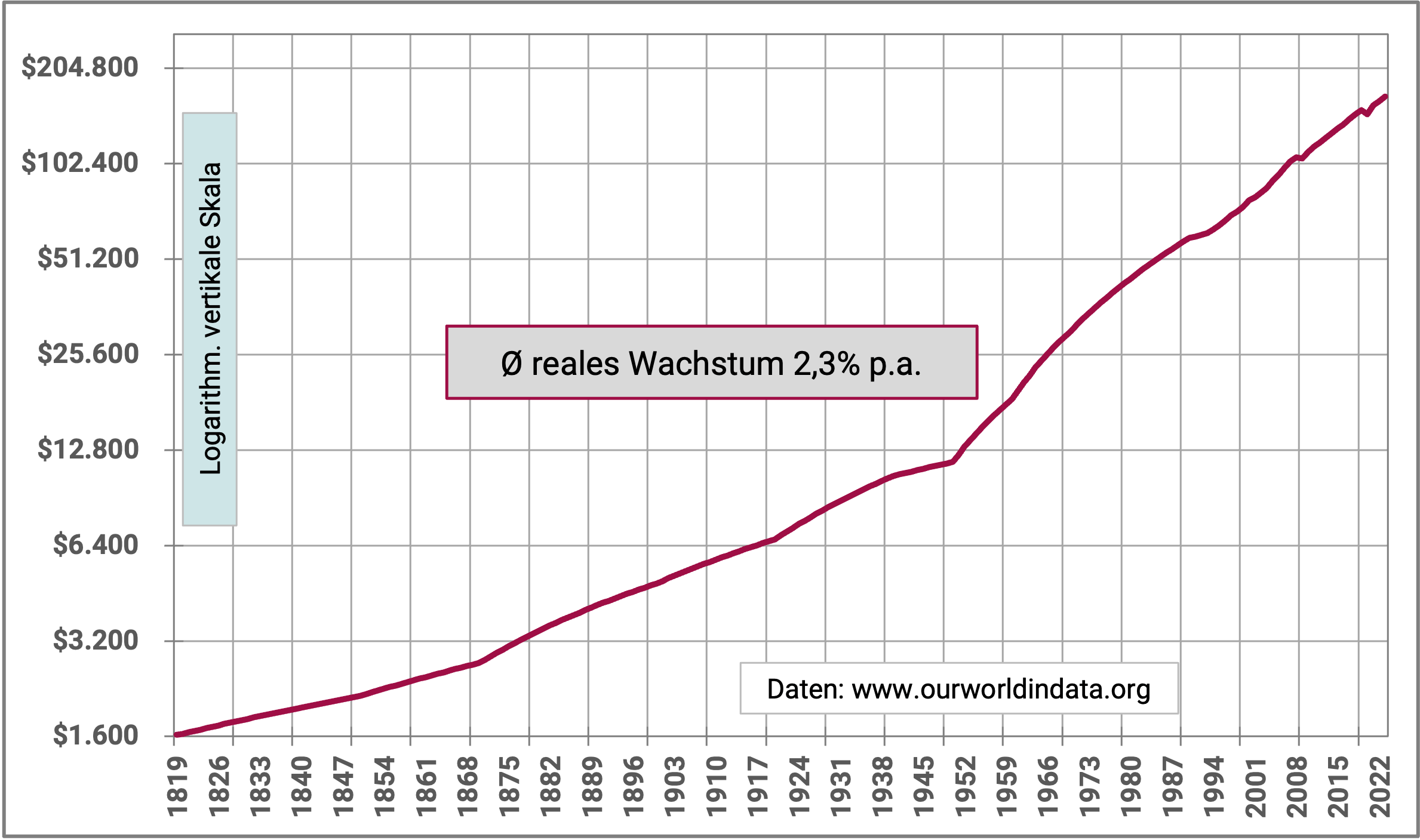
► 1 trillion = 1,000 billion. ► The gross domestic product (GDP) of a country is the sum of all domestic income within a calendar year: wages, salaries, entrepreneurial income (e.g. profits) and capital income (e.g. interest, dividends).
In the 1,800 years from the birth of Christ to 1800, in the pre-capitalist period, the world economy only grew at an average of 0.1% p.a. and four fifths of this low growth resulted from the increase in population alone, not from growth per capita.
The modern market economy in its current form emerged, as mentioned above, from around the year 1800. At this time, religiously legitimized feudalism (absolutist monarchism), an anti-market social order in key aspects, began to gradually die out in western countries over 100 years until the end of the First World War. Although markets existed before 1800 as places for the exchange of goods and services, the essential legal and institutional basic elements of the modern market economy were only limited to a tiny part of the total population in previous centuries: freedom of occupation and freedom of movement for private individuals, freedom of trade, freedom of movement of capital and freedom of establishment for companies. [3] The right to property existed for large parts of the population, e.g. B. women and serfs, also only limited before around 1800.
Radical ecological movements with a “degrowth” agenda have existed in most Western countries for several years [4]. These pursue the political goal of significantly reducing economic growth. If the “degrowthers” were to establish themselves on a large scale across national borders - which is not to be expected - and if this were to lead to a politically motivated permanent zero growth in the global economy, this would also lead to a zero return on the global stock market in the sense of the global equity investment class. [5] This is because the world stock market only generates a long-term positive real return if corporate profits at a global level also increase in real terms in the long term, i.e. economic growth takes place. Constant (stagnant) corporate profits (zero growth) would not be sufficient for positive returns.
As we have now seen, the fundamental conditions for positive returns in the global stock market are likely to be met in the long-term future. Nevertheless, doubts about the possibility of such a “perpetual rise in the stock market” are often encountered in traditional and social media. Most of these doubts are based on misunderstandings or errors in thinking. We address the most important three below.
Mistake 1: Misunderstanding exponential functions
Figure 2 shows the development of the US stock market over the last 155 years in the form of a conventional stock market graph. Due to the compound interest effect (a simple mathematical exponential function) in conjunction with a linear vertical appreciation scale (the cumulative return), the development of this national stock market appears to us as if it is "unsustainable" over time, as in the last 20% or so of the time window shown, the increase in value seems to literally explode.
Figure 2: Indexed performance of the US stock market from 01-1871 to 10-2025 (154.8 years), adjusted for inflation - linear vertical scale
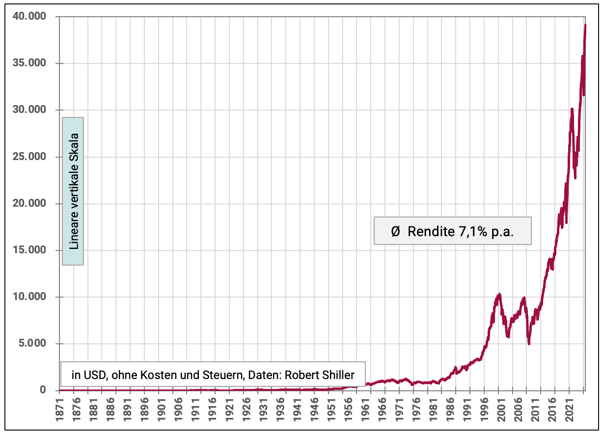
► Longest possible period for which the data series is available. ► Total returns = price increases + dividends. ► The US stock market is shown because monthly returns for the global stock market (which are the basis here) are only available from 1970.
However, this return or growth “explosion” in Figure 2 is merely an optical illusion. This can be seen if you compare Figure 2 with Figure 3. The two graphics are based on the same data. Figure 2 has a “normal” linear Y-axis (vertical scale), whereas Figure 3 has a logarithmic scale. The logarithmic scale means that a given percentage increase in an interval - e.g. B. 10% per year - visually always corresponds to the same slope of the curve, regardless of whether this 10% increase occurs at the beginning of the horizontal time axis or at the end. This is not the case with the linear vertical axis in the case of long-term positive returns. Therefore, it misleads our intuition because it gives the impression that the stock market returned much more strongly in the last fifth of the period than in the rest of the period, i.e. that somehow an “unhealthy development” or “bubble formation” took place.
Figure 3, on the other hand, shows that there was a high degree of stability and “uniformity” in the return development of the US stock market over these 155 years with respect to the long-term trend. There is – correctly – no sign of a concentration of the increase in value in the last third or fifth of the period. The overall development now appears much more continuous, “sustainable” and in some ways “harmless”.
Figure 3: Indexed performance of the US stock market from 01-1871 to 10-2025 (154.8 years), adjusted for inflation - logarithmic vertical scale
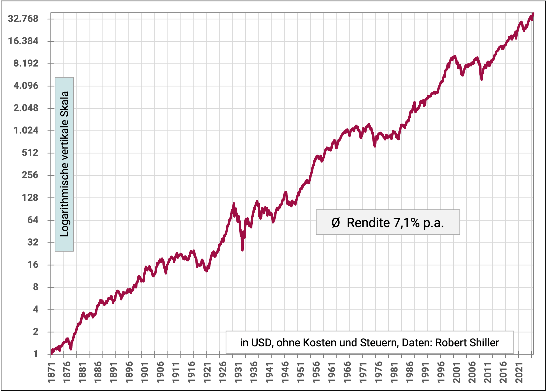
The 45-degree slope in the trend cumulative return seen in Figure 3 is ultimately “arbitrary”. If we had let the vertical scale not end at 32,700 points, but at a higher value, then the red line would be flatter and the growth shown (return) would visually appear more moderate.
By the way, market capitalization, i.e. the market value of the equity of all listed companies (the market value of all stocks), increases much more slowly than the nominal or real cumulative return of the stock market, as shown in the figures, suggests. Reason: Stock returns are typically expressed as Total returns (price increases + dividends), as in Figures 2 and 3. However, these total returns exclude investors' "withdrawals" to finance taxes, incidental costs of investing and - most importantly - consumption not with one. The actual net returns in terms of the increase in market capitalization after deducting these expenses are likely to be noticeably lower. Maybe not even half as high.
Mistake 2: “Reaching an all-time high in the stock market signals that the market has ‘heated up’ and you now need to be careful.”
One of the most important reasons in investor practice why private investors, after the stock market has been rising for a long period of time, worry that the market can actually no longer continue to rise like this is the almost constant “all-time high” propaganda in the media. All-time highs in the stock market are reported by media and finfluencers [6] as a signal: “Attention, the stock market is overheated. Be careful now!” abused. In reality, an all-time high says nothing about whether a stock market is "expensive" or "highly valued" - simply because the all-time high is not a valuation metric, not even close.
All-time highs occur all the time. In the four years from November 8th, 2021 to November 7th, 2025 there were e.g. For example, the MSCI World Index (in euros) reached an all-time high on 108 trading days (working days). That was about every tenth day. Even if stocks only had a paltry nominal average return of 1% p.a. for over 100 years (i.e. about one-ninth of the actual nominal average return and far below average corporate earnings growth), there would still be new all-time highs all the time.
Because the media has been spreading the “all-time high as a warning signal” nonsense more frequently and more shrilly in recent years in order to increase views and circulation, we have it in a separate one Blog post analyzed.
Mistake 3: “The global stock market cannot grow faster than the global economy in the long term”
A technically more sophisticated false claim about the viability of historical stock returns, which is heard less frequently than the all-time high nonsense, goes like this: The global stock market returns observed in the past (long-term average inflation-adjusted 5% to 6.5% p.a.) cannot be continued in the future because these returns significantly exceed the growth of the global economy. Regarding the numerical background: Real growth in the global economy over the last 60 years has averaged around 3.0% p.a. (approx. 1.5% p.a. on a per capita basis). However, the global stock market produced a real return of over 6% p.a. during this time.
An academic essay states: “Financial assets cannot outperform the economy indefinitely because financial assets would ultimately become the economy itself.” [7] Similar statements are repeatedly made by financial journalists critical of growth.
Fortunately, this is also a mistake in reasoning, one that is based on two technical errors:
Misconception 1: A significant portion of the income from stocks or other investments is used by their owners for consumption purposes and to cover costs and taxes (as mentioned above). In other words, the “net return” of stocks after consumption is anyway much lower than the gross return before withdrawals and costs. This means that the gap between (net) stock market returns and economic growth is shrinking significantly.
Misconception 2: Gross domestic product consists of several components that could be called "asset classes" in a sense: wages/salaries (human capital), various forms of capital income, including equity income, debt income and rental income (while avoiding double counting). Since equity income is the riskiest of all these types of income, it must also have the highest long-term return, while the other types of income must have correspondingly lower returns. We have the exact logic of this economic situation in one of our own Blog post explained.
What are the current ratings?
Finally, in the following table we take a quick look at the current valuations of the global stock market and some of its smaller sub-segments.
Table: The forward P/E ratios as of October 31, 2025 in the world stock market and in some large sub-segments of the market
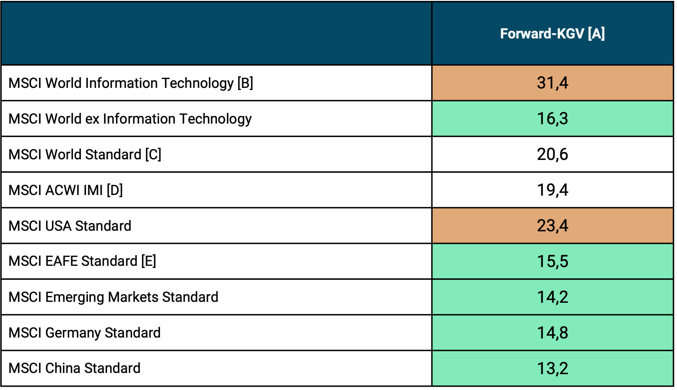
► [A] P/E ratio = price-earnings ratio, a valuation indicator. The P/E variant “Forward P/E” is not based on the historical profit from the last 12 months, but rather the forecast profit for the next 12 months. In our view, forward P/E ratios tend to be more meaningful than conventional, historical “trailing” P/E ratios. Trailing P/E ratios would be higher for all indices shown here. ► [B] “Tech Stock Sector”. ► [C] The MSCI World Index currently consists of 73% US stocks and 29% tech sector stocks. ► [D] ACWI IMI = All Country World Index IMI = industrialized countries + emerging markets including small caps = 99% of the market capitalization of the world stock market. ► [E] EAFE = MSCI World ex USA and Canada (EAFE = Europe, Asia, Far East). ► Source: MSCI Index Fact Sheets.
The P/E table illustrates that, with the exception of the global tech sector and the US stock market, current valuations for countries and regions outside the US and outside the tech sector are relatively close to their historical average (“normal”) valuations. These averages vary from index to index and depending on whether you go back 20 years, 50 years or even longer. However, for the sake of simplicity, a benchmark of 17 for industrialized countries and 15 for emerging countries can be assumed to be somewhat “normal”. In practice, deviations of plus/minus 10% from the historical average can be ignored.
Against this background, a globally diversified stock portfolio in which care is taken not to weight US stocks and tech stocks very highly is likely to currently have a historically normal valuation and therefore not be “expensive”.
Conclusion
This blog post attempts to answer the question: “Can stocks go up forever?” The answer is yes if “stocks” in the question means the global stock market, not one of its many sub-segments, and if we at the same time assume that the global economy will continue to grow in the next 50+ years at about the same rate as the average over the last 200 years.
However, if the global economy produces significantly lower growth in the future, this will not only reduce the returns of the equity asset class, but very likely all important asset classes, including the most important for humanity, namely human capital, i.e. wages and salaries.
Structural factors inhibiting growth in the future ahead could be (a) Demographics (aging, increase in the dependency ratio [8]), (b) today's historically high debt ratios of states, companies and private households, and (c) the political and social inability to carry out painful economic reforms, which is becoming increasingly obvious in Western countries (example: inability to reform the over-indebted state pension systems). On the plus side is the growth-promoting effect of the further development and spread of artificial intelligence.
Excursus: Is capitalism subject to a “compulsory growth”?
The thesis that capitalism is subject to a “compulsory growth” is popular among left-wing intellectuals, large sections of the media and many politicians. Here a YouTube video with a representative of this false thesis. It is based on a rhetorical “conversion trick”.
Yes, an open society is indeed subject to a “growth constraint”, since permanently negative per capita economic growth and perhaps even mere “zero growth” in such a society after ten or 15 years would lead to serious intra-societal distribution conflicts, to mass emigration of people with above-average professional qualifications, to capital flight (departure of companies), to an increase in crime and possibly even to a civil war. “Open, democratic society” here means open in the sense of the possibility of free emigration of people and open in the sense of freedom of movement of capital, i.e. the departure of companies.
However, the aforementioned dire consequences of long-term negative economic growth are not related to the specific economic system of the society affected by it, but on the contrary are independent of it. These adverse consequences would occur in any open society, regardless of whether it has a market economy, a socialist or a fundamentalist-religious-collectivist economic system.
For example, the communist states of the former Eastern Bloc were not open societies. These one-party dictatorships were able to afford very low and probably even negative per capita growth for many years because there was no freedom of movement (free emigration) and no free movement of capital. [9]
The “capitalism compulsion to grow” claimed by ideologists is therefore not specific to capitalism. Rather, it is specific to an open, modern society. Only a radical authoritarian regime with closed borders and strict capital controls can survive with zero growth or negative economic growth for a long period of time and can therefore escape the “compulsory growth”.
Endnotes
[1] Individual listed companies often experience price losses of 80% or more, in the short or long term, but this is not about individual stock risk. We have written our own blog post on individual value risk: Kommer/Weis: “The questionability of individual stock investments”
[2] “State bankruptcy” means that a state is temporarily no longer able to fully service the capital (interest, repayment) on the bonds (debt) it issued at a given time.
[3] These are essentially the so-called “four basic freedoms” for employees and companies within the EU.
[4] See the articles “Degrowth” in the English Wikipedia or “Growth-critical movement” in the German Wikipedia.
[5] We will address the dramatic negative consequences of long-term zero growth at the end of this blog post.
[6] Finfluencer = influencer in the field of finance.
[7] “Financial assets cannot outperform economic performance in the long term because otherwise they themselves would represent the entire economy in the long term.” Source: Ibbotson, Roger/Straehl, Philip: “The Long-Run Drivers of Stock Returns: Total Payouts and the Real Economy”; In: Financial Analysts Journal; 73; No. 3; 2017.
[8] Dependency Ratio = the ratio of working people to non-working people in a country.
[9] The economic growth rates published by these countries at the time were manipulated upwards.
The post Can stock prices rise forever? appeared first on Gerd Kommer.
]]>The post Toxic beliefs that sabotage your financial success appeared first on Gerd Kommer.
]]>Germany and Austria have an old-age poverty problem that will only get worse in the future due to the well-known plight of the statutory pension insurance systems. If you as a normal citizen, especially as a person in the first half of life in the wealth accumulation phase, want to individually avoid this problem, wealth creation via the global stock market is the best option. This is particularly true for the lower-income half of the population, as the most common wealth creation alternative to the stock market - the loan-financed purchase of a home (house, apartment) - is rarely available to them due to poor creditworthiness. [1]
The stock market has existed for more than 200 years and has been easily accessible to normal households in Germany, Austria and Switzerland since the 1950s. This accessibility has become even easier and cheaper, particularly in the last two or three decades.
Nevertheless, today only around 15% of all German households own stocks or stock funds, compared to around 66% of American households. This is one of the reasons why the net worth of the median American is far higher than that of the median German. [2]
A main reason for Germans' lack of interest in the stock market is probably their general skepticism towards the market economy, or “capitalism”. The stock exchange is a central element of the market economy. According to a cross-national survey, among respondents in 34 countries, only those in 11 countries view capitalism, the market economy, more critically than the Germans, while people in 22 countries are less anti-capitalist or even pro-capitalist (e.g. Poland, USA). [3]
Anyone who is skeptical about the market economy or generally rejects it is unlikely to acquire either knowledge or practical skills in dealing with market economy forms of wealth creation, e.g. B. Basic knowledge about stocks, investment funds or the stock market.
The lack of interest in the stock market - the most socially effective and at the same time the easiest to implement instrument for preventing or reducing poverty in old age - is often based on toxic beliefs about money, wealth creation, the stock market and the market economy at the individual level.
Opening yourself mentally and practically to stock market investments, even if it is initially just a modest stock ETF savings plan of 20 euros per month, is even more successful when people shed their toxic beliefs and assumptions.
Against this background, in this blog post we analyze eleven harmful beliefs and “poisonous stereotypes” about the market economy, about money, the stock market and becoming wealthy.
Before we begin with the first harmful belief about money, a few words about the market economy, the system that directly and indirectly forms the framework and basis for private wealth creation and wealth protection.
In its current form, the market economy - “capitalism” - emerged gradually from around 1800. At this time, religiously legitimized feudalism (absolutist monarchism), an anti-market social order in key aspects, began to gradually die out in Western countries. Although markets existed before 1800 as places for the exchange of goods and services, the essential legal and institutional basic elements of the modern market economy were only limited to a tiny part of the total population before around 1800: freedom of occupation and freedom of movement for private individuals, freedom of trade, freedom of movement of capital and freedom of establishment for companies. [4] The right to property existed for large parts of the population, e.g. B. women or serfs, also only limited before around 1800.
The gradual withering away of feudalism took place over around 120 years until the end of the First World War. Important milestones in the beginning of the end of this anti-market social order were the American and French revolutions in 1776 and 1789. A few decades earlier, in the middle of the 18th century, the industrial revolution had begun in Great Britain and later spread to continental Europe and North America.
Figure 1 illustrates how enormously the lot of humanity as a whole has improved as a result of the emergence of the market economy from around 1800 onwards using the growth in global gross domestic product (GDP) per capita over the past 2000 years. [5]
Figure 1: The development of inflation-adjusted global gross domestic product (GDP) per capita over the last 2,000 years
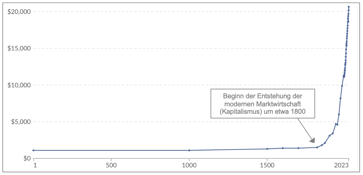
► Source: www.ourworldindata.org, Maddison Project Database 2023. ► All figures in 2021 USD = adjusted for inflation
Figure 1 shows that global GDP per capita (approximately comparable to average private household income), adjusted for inflation, increased by about 1,300% from the emergence of capitalism to the present, a fourteen-fold increase.
In the approximately 1,800 years from the birth of Christ until 1800 before the emergence of the market economy, global economic output per capita had practically not grown at all. In view of this, it is hardly surprising that the British philosopher Thomas Hobbes (1588–1679) described existence for ordinary people in his political philosophy treatise in 1651 Leviathan described as “solitary, poor, nasty, brutal, and short”. Only with the emergence of the market economy could parents realistically hope that their children would one day be better off than themselves.
Just as important as the growth in national economic income and thus the strong, lasting improvement in the economic lot of people across all classes was the increase in the life expectancy of the average citizen. This was a paltry 29 years in 1820 compared to 73 years in 2023 - in western countries, where the market economy tends to be established earlier and more comprehensively than in the rest of the world, it is even around 79 years.
These developments illustrate how dramatically the market economy has improved the well-being of people on planet Earth over a long period of time.
Let us now come to the eleven toxic beliefs that prevent many of us on a personal level from trusting the market economy and its important subsystem of the stock exchange and stock market in order to build wealth through market economy institutions and methods.
Toxic Belief About Money #1: “Money is the root of all evil.”
The fact that people's evil actions are often motivated by greed for money as a symbol of wealth is undisputed and banal. However, the belief that money is the root of all evil is simply wrong. The very wording is a meaningless, manipulative modification of a statement from the Bible: “Greed for money is the root of all evil” (New Testament, 1 Timothy 6:10). However, greed and money are two different things.
Money emerged evolutionarily from the uncontrolled, spontaneous interaction of humans around 4,000 years ago in Mesopotamia. [6] It was one of the most important innovations for the development of humanity at the transition from the Stone Age to the Bronze Age. In terms of its cultural and historical significance, money is on a par with other key innovations of the same era (6000 BC to 500 BC): the invention of writing, the formulation of the basics of mathematics, the invention of the calendar, the compass, paper, the use of coal to generate heat, metal processing (bronze, iron), the wheel, concrete/cement and the plow.
Money was necessary in human history in order to replace the inefficient and prosperity-inhibiting barter trade of the Stone Age, which is hard to imagine today, with a more efficient, simpler mode for the exchange of goods and services and thus to dramatically improve the “economic capital allocation”, i.e. to reduce waste and facilitate creative specialization. Efficient, economical capital allocation means directing social capital resources where they provide the greatest collective benefit. Without the invention of money, humanity's civilizational exit from the Stone Age could not have taken place and without money, today's global economy would literally collapse in a short time with catastrophic consequences for humanity. Money is not an evil, but a brilliant cultural-historical innovation.
Money is also morally neutral per se. It is not to blame if individuals crave it, it triggers envy or motivates a minority to commit evil acts, just as it is not to blame for a kitchen knife if it is used to commit murder.
➔ Books/specialist articles:
- Ferguson, Niall (2008): “The Ascent of Money: A Financial History of the World” [Book]
- Rieck, Christian (2025): “Prince’s money, fiat money, Bitcoin – How money is created, gets a value and disappears again” [Book]
- von Mises, Ludwig (1922): “The Impossibility of Economic Calculation under Socialism” (1922); Internet reference here [specialist article]
Toxic Belief About Money #2: “Money corrupts character.”
There is no reliable scientific evidence to support the thesis that rich people are more often and somehow demonstrably of worse character than poor people. Although there are numerous scientific studies on this topic, their results are overall contradictory and ambiguous.
What is not unclear, however, is that violent crime statistically decreases with the level of people's income. The fact that the fiction of the last 500 years and “Hollywood” in their fictional stories very often link wealth with villainy is trivial, but it proves nothing, except that literature and the film industry - as we all know - do not represent reality and that literature and the media have a perfect nose for what sells well.
Unfortunately, similarly foolish statements about the fundamentally “evil rich” can also be found in the Bible. The most famous is: “It is easier for a camel to go through the eye of a needle than for a rich man to enter the kingdom of God.” [7]
In our opinion, behind the common belief that “money spoils character” is ultimately envy of the rich minority, especially in cultures with a high level of general envy. A survey in 13 countries showed that only in France is social envy against the rich stronger than in Germany, while Poles and Japanese, for example, are much less envious (see the following literature). Envy is an emotion that has negative connotations in all cultural value systems. In Christianity, envy is one of the “seven deadly sins”. In order to make our envy subjectively more tolerable to our own conscience, we project bad qualities onto the group of people who are the object of envy, the rich. We do this even though we have no hard evidence of the substance of this projection (“money corrupts character,” “rich people are evil”).
➔ Specialist article:
- Zitelmann, Rainer (2020): “Prejudice and stereotyping against the wealthy”; In: Economic Affairs 40 (2); June 2020; Internet reference here
- Zitelmann, Rainer (2024): “Popular perceptions of the rich in 13 countries”; In: Economic Affairs 44 (2); June 2024; Internet reference here
- Zitelmann, Rainer (2020): “How Hollywood stereotypes the rich”; Internet reference here
- Beig, Stefan (2020): “The Rich – A personally unknown and hated minority”; Internet reference here
Toxic Belief About Money #3: “Capitalism means exploitation.”
Since “exploitation” is a term whose exact definition and interpretation is difficult to reach agreement on, we replace “exploitation” here with the more easily verifiable, related terms “extreme poverty,” “slavery,” and “child labor.” If you do that, the data shows that the market economy has probably contributed more than anything else in the world to the dramatic and largely continuous decline in poverty, slavery and child labor, forms of exploitation, over the last 200 years or so.
Extreme poverty: The proportion of the world's population living in poverty according to the UN definition of poverty extreme poverty lives has declined from 91% in 1820 to 10% in 2024. This is a double victory because, despite the rapidly growing world population, not only the percentage of extremely poor people, but also their absolute number has been falling since 1970.
In 2023, the lowest-income 10% of the population in the 40 “economically freest” of 165 states (countries where market freedoms are least restricted) earned an average annual per capita income of $9,770. The poorest 10% of the population in the 40 economically unfree countries earned an average of just $1,260.
➔ The data listed comes from the websites www.ourworldindata.org and from www.fraserinstitute.org.
slavery: In 1800 there were 50 to 60 states worldwide - depending on the source and definition. At that time, slavery or arrangements similar to slavery (e.g. serfdom) were permitted in all of these states. Today there are around 200 states and slavery is prohibited by law in all of them. The non-profit Australian anti-slavery NGO Walk Free estimates that today - despite official bans - around 50 million people worldwide live in illegal, slavery-like conditions. This corresponds to around 0.6% of the world population. Over 95% of these 50 million people live in Asia and Africa, i.e. in countries where the market economy was introduced later and is now less established than in the West. (The so-called Crony capitalism In many African countries there is a perverted pseudo-capitalism hijacked by the respective corrupt political elite without the rule of law and with severely restricted freedom of trade.)
➔ The data given comes from the website www.walkfree.org.
Child labor: Although the data regarding the development of the global prevalence of child labor is patchy, [8] The available figures show clearly enough that child labor has continued to decline globally over the past 170 years and also in the recent past. In 1851, the child labor rate (KAQ) for boys in Great Britain was 28.3% (global data only exists since 2000). By 1911 it had already fallen to 14.4%. In 2000, the KAQ globally was still 23%, in 2012 it was just under 17% (more recent comparative figures are currently not available). In the “rich” “capitalist” countries of the West, the KAQ has fallen to almost zero.
The lot of children has also improved in other dimensions over the past 200 years: The proportion of children who die in the first five years of life fell globally from 42% in 1800 to 4% in 2020. The proportion of children who have a basic education (as defined by the UN) rose from 17% in 1820 to 87% in 2020. Girls have outperformed boys on this metric in recent years The gap has been caught up significantly over the past 40 years and the gap that still exists is largely due to Islamic, more anti-market countries.
➔ The data given comes from the website www.ourworldindata.org.
Toxic Money Belief #4: “The rich are rich because the poor are poor.”
Behind this socialist thesis lies the false idea that the market economy is a “zero-sum game” and that the wealth of one part of the population is based on the poverty of another. In a zero-sum game, the profit or benefit of one participant must be “financed” (compensated) by the loss or damage of other participants. [9]
In reality, the market economy is not a zero-sum game, but a positive-sum game. The almost breathtaking increase in prosperity for the average person on planet Earth since the beginning of the spread of the market economy, as shown in Figure 1, would not have been possible in a zero-sum world. The fact that this enormous global increase in prosperity from around 1820, relative to the previous millennia, also included the poorer half of the world's population becomes clear in our refutation of toxic belief 3: The global decline in extreme poverty, slavery and child labor. The sharp increase in life expectancy described above in practically all countries on earth can only be explained in a world in which one does not lose when the other wins.
Zero-sum thinking in relation to the market economy is probably the biggest conceptual error in thinking, which contributes to the rejection of the market economy and market-based solutions for wealth creation, which is particularly widespread in Germany.
➔ Books:
- Mokyr, Joel (2018): “A Culture of Growth: The Origins of the Modern Economy”
- Aghion, Philippe et al. (2023): “The Power of Creative Destruction: Economic Upheaval and the Wealth of Nations”
- Zitelmann, Rainer (2022): "The 10 errors of the anti-capitalists. On the criticism of the criticism of capitalism"
- Scruton, Roger (2015): “Fools, Frauds and Firebrands: Thinkers of the New Left”
Toxic Belief About Money #5: "Earth's resources are limited. Therefore, there must be more and more violent conflicts over scarce resources."
The claim that raw materials are inevitably becoming increasingly scarce or are fundamentally finite is an ineradicable false claim that prophets of doom have been spreading for a good 200 years - for the first time in 1798 in a famous essay by the British economist Thomas Malthus (1766–1834), the spiritual ancestor of all professional pessimists.
At the beginning of the 1970s, a group of authors who called themselves the “Club of Rome” published a then-sensational study entitled “The Limits of Growth,” [10] essentially a “Malthus Thesis 2.0”. The main message in "The Limits of Growth" was: "The world's raw materials are finite and will run out in the next 20 years due to the increasing consumption of raw materials due to the 'population explosion'. The result is probably wars over raw materials and famine." A false forecast that was “of course” based on a “new complex computer model”.
Energy raw materials are not finite because the sun radiates gigantic amounts of energy to the earth for free every day. Oil can be produced from coal, which will last at least 300 years. There are no relevant quantitative limits for electricity from nuclear energy. Agricultural raw materials are also not finite.
With regard to the vast majority of other raw materials, we have probably not yet searched for or mined the majority of the quantities available on this planet because this has not yet been necessary or technically and economically possible, e.g. B. Mining at great depths. Mining on asteroids will probably also become possible in the next few decades.
The vast majority of “finite” raw materials can and are substituted by alternatives at correspondingly high prices. This substitutability will become easier and more common to implement over time due to technical progress.
When it comes to global population growth, we now know with a high degree of certainty that the world's population will begin to decline over the next 30 to 70 years. Today no one talks about the “population explosion” as a threat, as was discussed in the 1970s and 1980s. Population growth, which has been falling worldwide for decades and the global population will soon decline overall, together with technical progress, will ensure that humanity's consumption of resources will decline sharply in the future.
In fact (in contrast to purely theoretical considerations), there is no shortage or finiteness of raw materials because the market economy sets in motion the forces and mechanisms that “eliminate” or compensate for finiteness.
Toxic belief about money #6: “Economic inequality is increasing, the rich are getting richer.”
Of the eleven beliefs discussed here, this may be the one whose rejection or relativization is the most controversial and causes some readers to gasp. Reason: Many of us see the constantly growing economic inequality allegedly caused by capitalism as a fact whose clear truth no one should doubt or relativize.
A look at the numbers shows a more differentiated picture:
If one calculates economic inequality not within individual countries such as the USA or Germany, but across more global level, then inequality has clearly fallen in recent decades. The so-called GINI coefficient of disposable income, a mathematical measure of income inequality, shows more economic equality or less inequality at a global level (i.e. including all countries) today than in 1960. Compared to 1990, inequality has fallen particularly sharply. The main reason: household incomes in developing countries have grown faster overall than in industrialized countries. (In Germany, too, the GINI coefficient of income in 2023 was at the same level as in 2009 and only slightly higher than in 1990. So one certainly cannot speak of a “permanent increase”.)
In general, inequality research is overloaded with enormous research problems, problems of data quality and methodological problems and, last but not least, ethical and ideological complexities. This makes it easy for ideologies to “prove” a supposed increase in inequality, and this is exactly what activist journalists, politicians and economists exploit. All you have to do is to selectively pick out individual countries, short periods of time or just very specific inequality indicators from among many possible ones.
Keyword: different measures of inequality or poverty: From our point of view, anyone who talks or reports about inequality without ideological propaganda intentions should make it clear that the development of “extreme poverty” on this planet is measured in absolute Sizes - i.e. how much income the poor have at their disposal in a month or a year - is at least as important and actually more important than development relative Poverty, i.e. inequality. With the more important one absolute Poverty has improved drastically worldwide in the last 100 years and also in the last 50 or 20 years - see our comments on belief 3. Main cause: The market economy reforms in many developing and industrialized countries since the 1980s.
Only in the most anti-market countries, such as North Korea, Venezuela, Cuba and some Islamic dictatorships such as Afghanistan or Iran, extreme poverty is likely to have increased in recent decades.
➔ The data quoted comes from the website www.ourworldindata.org, the website of the World Bank as well as publications by the economist Branko Milanović.
Toxic Belief About Money #7: “An economic system built on growth or compound interest cannot function in the long term.”
This idea is based on the unrealistic interpretation of simple exponential growth functions in economies, e.g. B. interest calculations or other financial mathematical growth formulas and key figures. The basic mistake that those who proclaim the supposedly destructive effect of compound interest in particular, but also the growth rates of individual companies, industries or technologies, make is to “extrapolate” such exponential growth functions/formulas into absurd, unworldly dimensions over unrealistically long periods of time. Time periods and dimensions that have never occurred in human history and the history of the market economy and will not occur either.
This can be illustrated with a simple numerical example. Let's assume that a small German Volksbank has a loan portfolio of a modest 100 million euros in its starting year 1. If the small bank were to succeed in expanding this "credit book" by just 10% annually for 100 years - by acquiring new customers and the infamous compound interest effect, the bank's loan volume after 100 years would be around 70 times as large as that of the ten largest banks in the world today. This calculation shows how absurd it is to extrapolate even seemingly moderate growth rates for more than just a few years into the future. In reality, the average life expectancy of a company, like ours, is only around 20 years here show. Our Volksbank's loan book would at some point stagnate and/or shrink again. Most banks don't exist for 100 years.
Political systems – states, empires – also have much shorter life expectancies than most people assume. States and empires grow and prosper for a limited time. Then they stagnate, shrink or “die” again. The “bankruptcy estate” is absorbed into other, new state structures. Ultimately, every book about the history of the last 3,000 years shows this. This law applies even to the most successful, temporarily rapidly growing civilizations, as the Norwegian historian Johan Norberg shows in his book “Peak Human” (see below).
In addition, the interest rate level in the world's wealthy countries has been falling for around 500 years, which is economically linked to the decreasing level of political risk and increasing levels of prosperity [11] can be explained in the states concerned (Schmelzing 2020). The compound interest effect tends to become weaker and weaker as long as it lasts at all.
Furthermore, there is little doubt that thanks to technological progress, economic growth is becoming increasingly resource-efficient and the “ecological footprint” of this growth is improving. The amount of CO2 emissions per capita has been falling in the group of economically developed countries for about ten years and will also begin to decline in the emerging countries in the next few years. In addition, many indicators show that air and water pollution are already declining on a global scale, despite the world population currently still growing. This in turn – as shown above – will also begin to shrink in the medium term.
➔ Books, specialist articles:
- Norberg, Johan (2025): “Peak Human: What We Can Learn from History’s Greatest Civilizations” [Book]
- McAfee, Andrew (2019): “More from Less: The Surprising Story of How We Learned to Prosper Using Fewer Resources and What Happens Next” [Book]
- Ritchie, Hannah (2024): “Not the End of the World: How We Can Be the First Generation to Build a Sustainable Planet” [Book]
- Pooley, Gale/Tupy, Marian (2022): “Superabundance: The Story of Population Growth, Innovation, and Human Flourishing on an Infinitely Bountiful Planet” [Book]
- Schmelzing, Paul (2020): “Eight Centuries of Global Real Interest Rates, R-G, and the ‘Suprasecular’ Decline, 1311–2018”; SSRN/Social Science Research Network [Article]
Toxic belief about money #8: “Money doesn’t make you happy.” Alternative formulations: “Money creates worries and problems” or “there are more important things than money”.
Of course money doesn't make you directly and immediately happy and of course there are more important things than money, e.g. B. Health, but money in the form of income and assets clearly helps people alleviate worries, problems and deficiencies.
There is extensive scientific research from the last 20 years that shows that poor people are statistically less satisfied with their lives than correctly comparable wealthier (richer) people or people with higher incomes. Nevertheless, journalists and intellectuals are still constantly repeating outdated theses from the 1970s and 1980s that have long been refuted by recent research, which erroneously prove that there is no positive connection between increasing income and increasing subjective feelings of happiness or - the weaker version - that increases in income above a plateau of around 75,000 dollars or euros per year practically no longer have a positive effect on people's subjective feelings of satisfaction would have. Both are wrong, as we now know from science.
➔ Specialist article:
- Stevenson, Betsey/Wolfers, Justin (2013): “Subjective Well-Being and Income: Is There Any Evidence of Satiation?”; in: American Economic Review; Volume 103; No. 3; 2013
- Killingsworth, Matthew (2024): "The Price of Happiness. What is the shape of the relationship between money and happiness, and what are its implications?"; Working Paper, 03 Oct. 2024; Internet reference here
Toxic belief about money #9: “Our times are particularly uncertain and risky.”
“We live in times of unprecedented uncertainty – economically, politically and socially.” This is a claim from a recent newsletter by well-known finfluencer Marc Friedrich. She couldn't be more wrong.
In fact, our security, measured by objective, truly important criteria, has increased globally and in Europe over the last 50 years and over the last 20 years. What are these criteria? These are statistics about the correctly measured percentage frequency of, for example, (a) violent crime, (b) serious accidents in traffic, at work and in the home, (c) most fatal diseases, (d) child mortality, (e) the number of war victims worldwide, (f) poverty measured in absolute financial terms, (g) unemployment, (h) water quality and (i) air quality.
In all of these fields, the available data shows a trend decrease in important uncertainty indicators as soon as sufficiently large regions and sufficiently long time periods are taken as a basis. This development is documented in detail and with hard data, among other things, in the three books mentioned below. The fact that we in Germany are rightly dissatisfied with the economic and political developments of the past 10+ years does not change the basic facts presented here regarding the trend decline in fact-based uncertainty.
➔ Books:
- Rosling, Hans (2018): “Factfulness: How we learn to see the world as it really is”
- Pinker, Steven (2018): “Enlightenment now: For reason, science, humanism and progress”
- Schröder, Martin (2019): “Why things have never been so good for us and we still talk about crises all the time”
Why do we have the opposite impression? Why do we intuitively want to agree so strongly with the above-mentioned quote from Marc Friedrich?
The explanations for this are simple.
— The “Negativity Bias” in the Media: The media, both traditional media and social media, practice a strong, one might say manipulative, bias in their reporting towards negative events. This creates a distorted picture of the world - not because actual reality is so negative, but because it is portrayed in a one-sided, negative and selective way.
— The “diagnostics problem caused by technical progress”: Our information about the existence and extent of many medical, environmental, economic or political problems is now becoming increasingly precise and granular - causing these problems to be perceived as larger than they once were, even though they may or probably are not larger. An example: There are more diagnosed cases of colon cancer in Western countries today than there were 20 years ago. From this fact we erroneously conclude that the frequency or risk of colon cancer has increased. In fact, the probability of dying from colon cancer at a given age, i.e. the risk of colon cancer, has decreased in Western countries over the last 20 years. Our reasoning error: From “more cases found” we incorrectly conclude “there are more cases”. [12] Due to technical progress, this “diagnostic problem” affects almost all socially important fields and leads the majority of us to incorrectly conclude that uncertainty and problems have increased.
— Pessimistic statements tend to sound more credible and “smarter” to us than optimistic statements: There is little doubt about this often confirmed psychological phenomenon. (Here the link to an English-language article on the topic.)
— Our false focus on very short term periods rather than longer term developments and on local areas rather than large areas: Of course, deteriorations in the criteria mentioned at the beginning can be proven with numbers - if you proceed selectively. This “data cherry-picking” typically consists of selecting sub-periods and/or small territories, e.g. B. only the last twelve months instead of the last 20 years or only a single large city instead of the whole of Europe.
— Our egocentric psyche: We have an innate, psychological need to view our own time and our own personal existence as particularly difficult, dangerous, and uniquely significant for the broader history of the world relative to past times and generations. Because we do this, we are “very willing” to overlook or underestimate actual improvements.
But even if the assumption about “our ever-uncertain times” were true, a broad investment in a globally diversified stock portfolio would be one of the most effective means of financially countering this uncertainty.
Toxic belief about money #10: “Money makes the world go round.”
The vast majority of historians and political scientists employed at universities would probably smile at this thesis. If there are social forces and institutions that have historically ruled and dominated the world in a mean way and today rule and control the world in a mean way, then these are primarily fundamentalist religious beliefs, radical political ideologies from the left and right and quite simply real political striving for power in all political shades without exception, but not companies or individual rich people.
Even the largest companies in the world and their boards of directors are now more than ever subject to the control of their respective governments and generally stricter laws combined with more efficient, tougher law enforcement. The last ten years have shown this and it applies to the USA, to China, to Russia, to Germany and to almost every other country. If super-rich corporate leaders in the West can be blamed in this regard, it is that they - even over the last 20 years - have rushed to the obedience of the respective left or right governments and have served them favourably, in order to protect the growth of their companies.
In dictatorships like China or Russia, there is no doubt about the ongoing influence, adaptation and subjugation of large companies and the rich, including billionaires and “tech bosses,” by an overpowering state.
➔ Books, specialist articles:
- Bagchi, Sutirtha/Fagerstrom, Matthew (2023): “Wealth inequality and democracy”: In: Public Choice; 197; 2023 [specialist article]
- McCloskey, Deirdre Nansen/Carden, Art (2022): “Leave Me Alone and I’ll Make You Rich: How the Bourgeois Deal Enriched the World” [Book]
Toxic belief about money #11: “The stock market is gambling and a casino.”
The stock market is not a casino for the rich. It is an indispensable component of the market economy - the economic system that has almost continuously improved the standard of living and life expectancy of humanity for 200 years, including the living conditions of the poorer third of humanity.
Investing in stocks provides companies with equity that they can use to produce goods and services that the eight billion people on this planet need every day for their very survival and also to improve their living conditions. In many respects, listed companies are also far more transparent to outsiders than unlisted companies.
Today's two main alternatives to a market economy - socialism and religious fundamentalism - have a far worse record than a market economy in both improving the economic lot of humanity and protecting the environment.
For people who want to build or maintain wealth, there is hardly a better, easier and more cost-effective option than investing at least a portion of their liquid assets in a broadly diversified global equity ETF.
➔ Books:
- Desai, Mihir (2017): “The Wisdom of Finance – Discovering Humanity in the World of Risk and Return”
- Niemietz, Kristian (2021): “Socialism: The failed idea that never dies”
- Kuran, Timur (2010): “The Long Divergence: How Islamic Law Held Back the Middle East”
Finally, three wise quotes about money and wealth creation:
"There is a kind of snobbery among some elites to believe that money is not necessary to be happy. That is stupid, that is wrong, that is vile." – Albert Camus, 1913–1960, French philosopher, writer and winner of the Nobel Prize in Literature.
"I have been rich and I have been poor. Believe me, rich is better." – Beatrice Kaufmann, 1895–1945, American writer.
“For a miserable life, I recommend you: Don’t waste any thoughts on money.” – Rolf Dobelli, entrepreneur, studied philosopher, best-selling author on lifestyle issues.
Conclusion
Building long-term wealth and securing your retirement provision is difficult enough. However, anyone who makes this task more difficult through negative, toxic beliefs about the market economy, money, prosperity or the stock market reduces their chances even further - and that is unnecessary.
Free yourself from harmful beliefs about money. Make money your friend. You have to treat a friend well. If you do that, the likelihood increases that over the years and decades he will give you back double or triple what you gave him before.
Endnotes
[1] In a recent blog post, we showed that renting combined with a simple ETF stock market investment on a buy-and-hold basis statistically results in higher final wealth than purchasing an owner-occupied property. See Kommer/Jerschensky: “Rent or buy – which is more financially attractive?”
[2] Net worth = assets minus liabilities. The “median” is an alternative “mean” to the arithmetic average. The median is the middle value in a sorting of all values from large to small.
[3] Rainer Zitelmann: “Attitudes towards capitalism in 34 countries on five continents”; September 6, 2023, In: Economic Affairs; 43; Issue 3; Oct. 2023.
[4] These are essentially the so-called “four basic freedoms” for employees and companies within the EU.
[5] The gross domestic product (GDP) of a country is the sum of all domestic income within a calendar year: wages, salaries, entrepreneurial income (e.g. profits) and capital income (e.g. interest, dividends). This avoids double counting. Wages and salaries make up the largest share of GDP.
[6] The area of today's Iraq as well as parts of Syria, Iran and Turkey.
[7] This sentence can be found in three of the four Gospels (Mark 10:25, Matthew 19:24, Luke 18:25), each worded slightly differently.
[8] For many countries there is either no data available or their reliability is limited due to inconsistent definitions and poor data quality.
[9] “Zero-sum game” and “positive-sum game” are terms from mathematical and economic game theory.
[10] “The Limits to Growth”.
[11] This leads to a decreasing “time preference” (also called “present preference”) in individuals – see Wikipedia entry “time preference”.
[12] For most types of cancer and many other diseases, the increase in life expectancy alone explains a large part of the increase in diagnosed cases. However, such diagnoses do not represent an increase in the real risk of cancer - despite an increase in absolute cancer cases or cancer diagnoses.
The post Toxic beliefs that sabotage your financial success appeared first on Gerd Kommer.
]]>The post Renting or buying – which is more financially attractive? appeared first on Gerd Kommer.
]]>Of the 41 million households in Germany, 43% = 17.6 million own the property in which they live. 57% (23.4 million) are renters. Two thirds of renter households aim to purchase a home (an apartment or a house) in the future. If you ask homeowners aspirants about their motives for purchasing a property, financial motives are mentioned much more often than lifestyle motives, e.g. B. “good retirement provision”, “living rent-free in old age”, “good returns”, “concrete gold”, “material value”, “safe investment” and “inflation protection”.
In Gerd Kommer's book published in 2021 "Buy or rent? How to make the right decision for yourself" The financial and non-financial arguments in a buy-or-rent decision in Germany were compiled and analyzed. The purely economic part of the analysis therein is based on historical data from 1970 to 2020 (51 years). Since then, more than four years have passed, during which a lot has happened in real estate prices, interest rates, rents and capital market returns. Time to bring the financial buy-or-rent comparison in the book up to date with updated figures by the end of 2024.
Due to space limitations, we will not go into this blog post non-financial Arguments, i.e. emotional and lifestyle considerations, which - depending on the argument - speak for either buying or renting. The non-financial arguments are comprehensively covered in the book mentioned above.
Which comparison method leads to truly reliable findings?
Do you want for one? specific Purchase object and one specific Rental situation - i.e. an individual case - to carry out a buy or rent calculation looking into the future, there are numerous useful buy or rent calculators on the Internet. We list links to ten free online calculators at the end of this blog post under point 1 in the appendix. However, such a prognostic case-by-case calculation cannot be used to draw any generalizable conclusions for the purchase or rent consideration.
If you want to formulate generalizable statements about the fundamental economic attractiveness of buying versus renting combined with a simple capital market investment (an ETF portfolio on a buy-and-hold basis) beyond non-representative individual cases, individual case calculations will not help. Structural conclusions can only be reached by calculating with representative statistical data and over sufficiently long, representative periods of time.
If you do that, another basic methodological question immediately arises: Do you want to carry out the comparison on the basis of historical data or on the basis of forward-looking forecasts? Prognostic calculations are inevitably based on subjective assumptions about the future development of home prices, interest rates, rents, capital market returns and taxes. Although forward-looking assumptions for time frames beyond a few months are uncertain and will later turn out to be mostly wrong, the media and real estate finfluencers still predominantly use forecast calculations for their general buy-or-rent analyses. Here are three examples:
- “Buying is cheaper than renting in these seven cities” – Wirtschaftswoche, March 18, 2024, print article
- "Rent or buy? Which strategy is worthwhile in your region" – Handelsblatt, July 5, 2018, print article
- “Is real estate worth it in 2025?” – Finanztip, August 27, 2025, video
The use of forecasts to answer the generalThe question, which is not specific to an individual household, as to whether buying or renting + an ETF portfolio is more financially attractive seems strange when you think about it more closely. To assess the economic attractiveness of Financial market investments - stocks, interest-bearing investments, raw materials, precious metals and cryptocurrencies as well as the financial products derived from them - are practically without exception historical Data series used. So no forecasts, which are based on uncertain, subjective assumptions and will probably not come true as formulated.
Therefore, we base our buy-or-rent analysis in this blog post on this Best practices science and do not calculate on the basis of predictions and assumptions, but on the basis of historical market data. Because we use historical data, because we go back 55 years to 1970, and because we compare our results with academic studies for other countries, our calculated numbers allow fundamental, structural conclusions to be drawn.
What should you consider when making a correct buy or rent comparison?
Here are three basic principles that a reliable comparison of buying and renting + capital market investment must meet:
- Buyers and tenants + ETF investors live in an identical property.
- Buyers and tenants have identical “cash outflows” initially and every month, i.e. they invest the same amount in their wealth creation, i.e. they forgo consumption for wealth building purposes are the same. What exactly is meant by “identical cash outflows” becomes clear in Table 1 below. There, the cash outflows in lines 1 and 2 for the homeowner (EHB) and the tenant/ETF investor amount to the same amount. This equality is achieved by the tenant investing the difference between his monthly rent and the EHB's total expenses in an ETF savings plan.
- The observation period (the analysis period) must be sufficiently long, typically longer than 15 years. Shorter time periods are too distorted by random, temporary market conditions. In addition, most real estate financing takes over 20 years to be completely paid off.
Table: Comparison of cash flows between homeowners (EHB) and tenants in an objective rent-or-buy comparison
Reading note: Cash outflows (from the perspective of the EHB or the tenant) are shown in the table in red and with a minus sign, while cash inflows are shown in black with a plus sign.

► [A] Additional purchasing costs for real estate: real estate transfer tax, broker fees, notary fees, land registry fees. ► [B] If the observation period is shorter than the time until the loan is fully repaid, the existing remaining loan debt is deducted from the sales price of the property to arrive at the net final assets. ► [C] It is assumed that all current income (e.g. dividends) minus taxes are immediately reinvested (investment).
If you design an economic buy-or-rent comparison like in the table, then the party with the higher net assets at the end of the observation period (final assets) has the “investment race”. EHB against tenants won.
We summarize the results of such a calculation over the entire period from 1970 to 2024 (55 years) in Germany in the following figure. The tenant's capital market investment consists of a simple ETF portfolio on the MSCI World stock index on a buy-and-hold basis. [1] The real estate investment for homeowners is the average residential property in Germany. We accept initial 70% credit financing from the EHB.
We look at eleven different time windows, each lasting a maximum of 30 years, since a typical 70% real estate financing is fully repaid after around 28 years on average. We describe the further assumptions and inputs in the calculation at the end of this blog post in the appendix under point 2 for those readers who want to know exactly how we calculated. Readers primarily interested in the results may ignore the additional explanations in Appendix 2.
Figure: Comparison of the final wealth of homeowners/buyers versus renters/ETF investors in 11 different time windows between 1970 and 2024 (55 years)
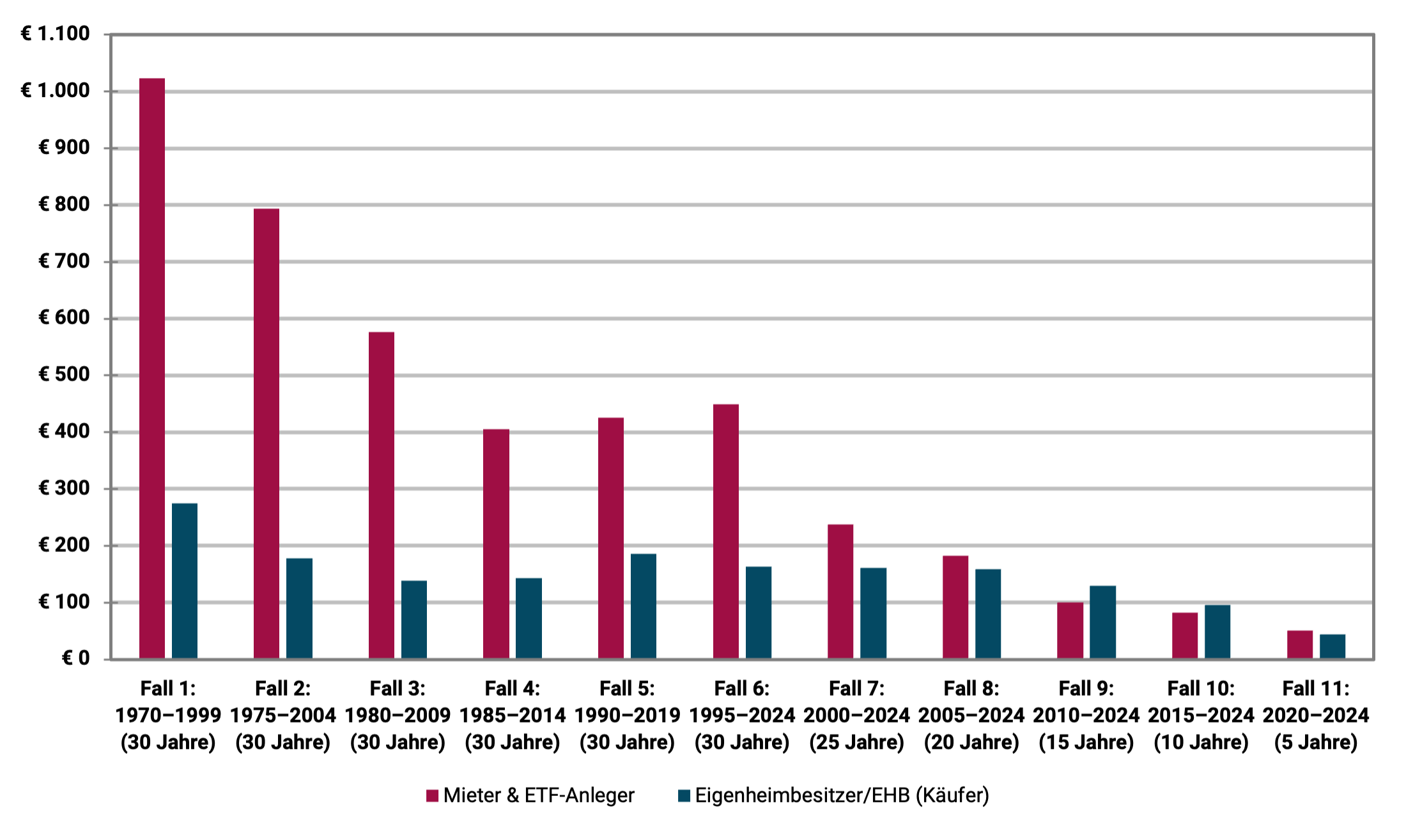
► Final assets in EUR thousand.
The interpretation of the results in the figure: Why is the tenant in the lead in the majority?
In nine out of eleven cases, the tenant/ETF investor achieved a higher final net worth at the end of the second period under consideration. Only in the two cases 9 and 10 is it the other way around. However, the EHB advantage in absolute monetary units is small in these two cases: only 19 and 14 thousand euros, respectively.
In general, cases 10 and 11 have to be classified as less important for our conclusions compared to cases 1 to 9. Firstly because they only represent relatively short periods of time and secondly because of the rather insignificant absolute differences in final wealth between EHB and tenant. One could therefore speak of “draws” in “yield races” 10 and 11. A clearer result in one direction or the other would probably only emerge after another five to ten years.
The main reason why the tenant + ETF investor wins our buy or rent race nine out of eleven comparisons is that the equity global asset class produces noticeably higher total returns in the long term than the residential real estate asset class. This applies to German residential properties and it also applies to other countries for which corresponding total return data for residential properties is available. Nevertheless, it must be noted that residential property returns in Germany have been particularly low compared to other countries since 1970 to the present day.
But why is the tenant's final asset advantage in cases 1 to 6 so spectacularly high? (In case 1, for example, 748 thousand euros in favor of the tenant.) There are four reasons for this.
Cause #1: Cases 1 to 6 last the full 30 years, cases 7 to 11 do not. Due to the compound interest effect, differences in returns between two investments A and B have a greater impact on the final assets, the longer the observation period is.
Cause No. 2: German residential real estate recorded disastrously low increases in value in the 44 years from 1970 to 2013. At the end of these four and a half decades, the average German residential property, adjusted for inflation, was worth 16% less than at the beginning - the worst value among around 20 western countries for which such data is available.
Cause No. 3: From 1970 to 2013, real estate loan interest rates were significantly higher at an average of 7.4% p.a. than from 2014 to today at 2.2% p.a.
Cause No. 4: Rents and rent increases in Germany were comparatively low from 1970 to around 2015. During this time, this also favored the tenant/ETF investor side (as did causes 1 to 3).
What influence does the amount of the loan share, the “credit leverage” have?
In our calculation for the illustration, we assumed an initial loan financing of 70% for the EHB. If 100% equity financing had been used (i.e. zero credit), nine of the eleven time window cases would still have been in favor of the tenant, although the distribution of winners and losers and the absolute final asset values would have shifted.
A higher credit percentage than 70%, e.g. B. 85% would also have coincidentally resulted in a 9-to-2 overall result in favor of the tenant as shown in the figure, while this modification would in turn have changed the specific winner-loser distribution across the eleven cases.
In general, it can be concluded that it is popular in the real estate fan community Credit leverage [2] On balance, the EHB was rather detrimental to returns. The lack of financial benefit of the credit leverage effect on the final assets and return on equity of real estate investments contradicts the prevailing opinion in the real estate fan community and among those who make money from selling and financing real estate, i.e. brokers, banks and real estate coaches. In our separate blog post “The credit leverage myth in real estate” we show that and why loan financing (leverage) in commercial real estate financing - where there is better data regarding the effect of debt financing - is statistically detrimental to returns.
What impact would variable loan interest rates have had?
In many Western countries, private real estate loans mostly have variable interest rates, while in Germany long-term fixed interest rates of ten years or more dominate. Would variable interest rates have significantly changed the results in the figure? The short answer: Only marginally and more in the tenant's favor. He would have won the final wealth race in the case of variable interest rates in ten out of the eleven cases. Reason: The interest rates, which have risen sharply since the beginning of 2022, had a less favorable effect on the EHB.
Why does the media regularly report that homeowners are, on average, richer than renters in old age?
How do our results fit in with the statement that has been made repeatedly by the real estate industry, journalists and real estate influencers for decades, that pensioner households that own their own home have, on average, higher wealth than corresponding renter households? On the surface, the statement in question is true, but it is still a case of “lying with statistics”. For these households, home ownership is not the cause of their higher wealth, but rather the consequence - more precisely, the consequence of higher income, typically over decades, combined with a permanently higher propensity to save. [3] In addition, there is a statistically larger and/or earlier increase in assets through donations or inheritances for EHB households relative to tenant households.
Here is an illustration of the real estate industry's manipulative swapping of cause and effect in the situation just described: The average wealth of all Ferrari-owning households in Germany naturally exceeds that of non-Ferrari owners. Now the question: Was the Ferrari the cause of this wealth advantage? Of course not. If anything, the Ferrari did damage. Either way, the Ferrari ownership was the result of the wealth advantage. It's the same with home ownership. He is the one Consequence the above-mentioned causes (primarily higher income, higher propensity to save and therefore higher wealth). If one were to compare renters with homeowners who had the same long-term income and the same propensity to save, and if inheritance effects were taken into account, it would be shown that renters statistically achieve higher final wealth in retirement. However, such empirical studies do not exist for Germany.
What about the home ownership advantage of the “positive compulsory savings contract”?
Earlier we mentioned the higher propensity to save among home-owning households. A higher propensity to save can have two causes: (a) A higher income. It falls e.g. B. It is easier to save 20% of 10,000 euros of net income per month than 20% of 2,000 euros. Furthermore, the absolute savings amount in the former case is 2,000 euros and in the latter case only 400. (b) A purely psychologically caused higher “savings affinity”, i.e. if two households A and B have an identical net income, but household A saves 30% of it and household B only 5%, then household A has a purely psychologically caused higher propensity to save. In plain English: Household A is more economical and cuts down on consumption more.
If a home is financed with debt with a debt ratio of around 60% or higher, then this household will have to incur higher real estate-related expenses per month from loan annuity and other real estate expenses (average maintenance, insurance, property tax) than a comparable renter household. This difference exists until the annuity loan is fully repaid, usually 25+ years. Now the crux of the matter: Such an EHB household has no choice in making these expenses month after month until the loan has been fully repaid, otherwise it would lose the property to the bank through a seizure and would also perceive this loss as a social stigma. The comparable tenant household, however, is not under such pressure and risk with its ETF savings plan. He can stop saving every month and instead consume more without any short-term negative consequences. The tenant therefore needs a good deal of self-discipline in order to spend the same amount every month on financial training as the EHB for 25+ years. The latter, on the other hand, “is forced to do so by the circumstances” and is subject to a “positive compulsory savings contract” because of his real estate loan.
This effect - which is nothing other than the statistically higher propensity to save among owner-occupier households mentioned above - contributes to the fact that EHB households are actually statistically wealthier in old age than renters. But again: the statistical asset advantage of EHBs has nothing to do with the high profitability of the property. If anything, it can be said that this asset advantage despite of the home, not because of it. If a renter household has the same saving discipline as a home-owning household, the renter household will statistically have achieved a higher and often significantly higher final wealth by the age of 50, 60 or 70.
What if you don't use a 100/0 stock portfolio for the tenant, but rather a 60/40 stock-bond portfolio?
We based our rent-versus-buy comparison with a tenant on a 100% equity portfolio (an MSCI World ETF) because we believe that a globally diversified equity ETF on a buy-and-hold basis is less risky than a debt-financed investment in a single property. [4] (The fact that it is easier to observe and measure the ongoing fluctuations in the value of an ETF portfolio than the ongoing fluctuations in the value of the equity position in an individual property does not change this basic fact.)
If the tenant were to be based on a 60/40 portfolio consisting of an MSCI World ETF and a bond ETF (medium-term high-quality bonds), the final asset race in the eleven cases would no longer be 9 to 2 for the tenant, but only 7 to 4. The change in the result illustrates what we all ultimately know: stocks produce far higher returns in the long term than interest-bearing investments.
Two biases in favor of homeownership in our calculations
In two ways, our buy-or-rent calculation is biased in favor of buying.
Aspect 1: The calculation assumes that only one property purchase takes place during the observation periods. Although there is no data on the average holding period (median holding period) of a home in Germany, it is likely to be less than 30 years. Such figures are available for the USA. There, the median holding period for a home is around twelve years. In Germany it will be longer, but probably shorter than 30 years. Due to the very high transaction costs (additional costs of buying and selling) in real estate, the return on a home decreases as the holding period decreases. In addition, if a loan-financed home is sold “early,” there may be an expensive prepayment penalty on the loan.
Aspect 2: When taxing the tenant's stock ETF portfolio, the tax advantage that buy-and-hold has under the German withholding tax was not taken into account. We quantified this tax advantage in a separate blog post (“Save taxes through buy-and-hold”).
The academic literature on buying versus renting
Our buy-or-rent results for Germany presented here are consistent with the basic trend from a number of similar historical buy-or-rent studies or general real estate yield studies for other countries and time periods. At the end of this blog post we list 18 such academic studies in the appendix under point 3.
Conclusion
In the 55 years from 1970 to 2024, renting combined with a simple, broadly diversified stock investment on a buy-and-hold basis was statistically more profitable in Germany than buying a home. This is what our empirical calculation shows and which is confirmed by a large number of comparable analyzes by researchers for other countries and time periods.
These results contradict what most Germans believe about the relative economic attractiveness of buying or renting.
The fact that banks, brokers and real estate influencers claim otherwise can easily be explained by the conflicts of interest of these parties.
The fact that many journalists and media outlets have been repeating the “buying is predominantly more profitable than renting lie” for decades is probably the combined result of “parroting prevailing opinions” and “not wanting to do strenuous research”. In addition, the mainstream media is reluctant to mess with wealthy advertising customers from the real estate and banking industries.
Attachment
Appendix (1): Free Buy or Rent Calculators on the Internet (in alphabetical order)
- Financial flow, independent finfluencer
- Financial tip, consumer protection organization (non-profit)
- Frankfurter Allgemeine Zeitung (daily newspaper)
- Gerd Kommer, author, asset manager (that “Buy versus rent tool” for the book “Buy or rent” by GK can be downloaded free of charge as an Excel file from Campus Verlag under the menu item “Additional material”)
- fmh financial advice, real estate portal (owner: private individuals)
- immoscout24, real estate portal (owner: Scout24 SE)
- real estate world, real estate portal (owner: Axel-Springer-Verlag)
- Dr. Small, credit broker (owner: Hypoport AG)
- Lazy Investors, independent finfluencers
- Stiftung Warentest, consumer protection organization (owner: non-profit foundation)
Appendix (2): The assumptions and data used in the calculation in the figure/graphic
On the real estate side (homeowner/buyer): The property costs 100,000 euros in all eleven cases. (For reasons of simplicity, we use the unrealistically low purchase price of 100,000 euros for a home today, but not in the 1970s, in order to calculate with “round numbers”. If one were to assume 400,000 or one million euros instead, for example, this would have no influence on the relative final result.) The additional costs of the purchase (including property transfer tax) are assumed to be 8%, those of the sale to 8% 1.7%. [5] The purchase and additional purchase costs are financed 30% from equity and 70% from a loan. The loan interest rates are the interest rates for annuity loans to private households with a ten-year fixed interest rate (the interest rate is adjusted every ten years). It is assumed that it will take 30 years for full repayment. The increase in value of the property corresponds to that of the average German residential property during this period. The ongoing additional costs (maintenance, insurance, property tax) correspond to 1.3% p.a. of the current property value. [6] The underlying statistical data comes from the BIS Basel and Bundesbank websites.
On the tenant side (tenant + ETF investor): The tenant initially invests the equity share of 32,400 euros initially spent by the EHB in a world portfolio consisting of an MSCI World index fund (ETF), as such a portfolio is comparable to a debt-financed individual property in terms of its long-term risk. Assumedly he lives in an identical property as the EHB. The rent for this property is based on the historical rental yields for residential properties (apartments) in Germany. Since the tenant's monthly or annual rent is below the EHB's total cash outflow, the tenant saves the difference every month in his ETF portfolio, so that both always spend the same amount on housing and wealth creation. The underlying statistical market data comes from Bulwiengesa and MSCI.
At the end of each of the eleven cases/periods under consideration, both EHB and tenants sell their investments. The tenant pays tax on his ETF investment continuously (dividends) and at the end when it is sold (price gains). Price gains from stock investments were tax-free for private investors in Germany until the end of 2008, after which they will be subject to capital gains tax. [7] Capital gains on homes are tax-free in Germany. In the five cases 7 to 11, the observation period is shorter than 30 years. Therefore, you will have a remaining debt balance with the EHB at the end of the period. To simplify matters, we assume that it will be repaid from the property sale proceeds without any early repayment penalty.
The payments (initial equity deposit and subsequent payments) for the buyer and tenant for the eleven cases are as follows. Case 1: €333 thousand, Case 2: €306 thousand, Case 3: €313 thousand, Case 4: €279 thousand, Case 5: €281 thousand, Case 6: €245 thousand, Case 7: €212 thousand, Case 8: €160 thousand, case 9: 119 thousand euros, case 10: 84 thousand euros, case 11: 54 thousand euros. (Cases 1 to 6 have the same length and should therefore have approximately the same amount of deposits. The existing differences result from different interest levels.)
Appendix (3): List of scientific studies on empirical comparisons of returns from buying or renting
The studies mentioned in the following table come to the conclusion for different time periods and countries that either real estate has lower total returns than stocks or that renting + capital market investment is overall more profitable than purchasing a home with or without debt financing.
Scientific studies on historical returns on residential properties or on buy-or-rent comparisons for different countries or major cities and different time periods
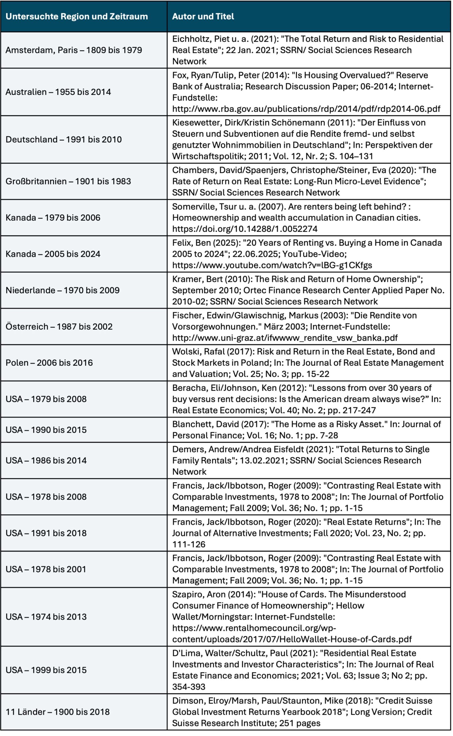
► This literature evaluation primarily took into account scientific studies that cover sufficiently long historical periods, as periods of less than approximately 25 years are only of limited or no significance. ► Not taken into account were (a) publications from the banking or real estate industry that were obviously burdened by conflicts of interest; (b) studies that represent only long-term historical appreciation rather than total returns on residential real estate; (c) buy-or-rent studies that formulate purely model theoretical conditions under which either buying or renting is more attractive; (d) Forward-looking, purely predictive buy-or-rent analyses.
Endnotes
[1] In the 1970s, index funds/ETFs were not yet available for private investors in Germany, but even then a private investor could have easily acquired a broadly diversified stock portfolio on a buy-and-hold basis.
[2] “Credit leverage” = The effect of partial debt financing on the return on equity of an investment (leverage effect).
[3] The propensity to save means the percentage of a household's net income that it does not consume, i.e. invests in wealth creation.
[4] If the property is at construction risk (in the case of a new build or major renovation), the property is even riskier.
[5] The sum of these transaction costs is likely to be at the lower end of what is usual in the market.
[6] In our separate blog post “Maintenance costs – how to calculate real estate investments” let's make this assumption plausible.
[7] We did not take into account the fact that price gains from so-called “old cases” – ETF shares that were acquired up to the end of 2008 – remained tax-free to a limited extent even after 2008, to the detriment of the tenant.
The post Renting or buying – which is more financially attractive? appeared first on Gerd Kommer.
]]>The post How banks withdraw customers – a case study appeared first on Gerd Kommer.
]]>The story begins with a person I have never met - my fiancée's grandmother. For the purposes of this description, let's call the grandmother Dagmar. Dagmar died in 2021 at the age of 83. She was a widow and had a daughter, we call her Britta, my partner's mother. Dagmar lived in a small town in the Ruhr area. Dagmar was what you often imagine an older lady from this generation to be: disciplined and reserved. She had had a long life and, together with her husband, who died in 2010, had built up a considerable fortune through hard work, discipline and thrift. The liquid part of it, several hundred thousand euros, had – “of course” – been with “their” savings bank for decades.
After her death, Britta, the daughter, inherited Dagmar's depot. In it: securities, funds, investments. For someone who is not concerned with financial products and investments - and Britta was one of these people - this portfolio initially looked impressive: valuable, complex and competent.
My fiancée, Britta's daughter, asked me, a financial advisor at Gerd Kommer, to take a look at the whole thing. And what I saw was so typical that it was almost textbook-like: an investment structure that was not built for the customer, but for the bank. A strangely structured portfolio of actively managed funds with high fees and low performance, closed-end investments, high-yield bonds, mixed products with "ambitious" names - the whole thing framed by an asset management mandate that skimmed off painful amounts of fees every year without providing any discernible added value in the form of a sensible risk-return combination. It was not asset management, not financial advice, but a form of creeping asset reduction or, to put it another way, the sneaking transfer of Dagmar's money to the savings bank - the whole thing disguised as "support".
And as luck would have it, the disaster became visible not only through the deposit itself, but also through the reaction of the responsible savings bank employee to a few harmless questions that are completely normal in the context of an inheritance. This reaction activated a red light on my fiancée.
When we asked what fees the depot had generated in the past, the savings bank advisor's initially friendly tone quickly turned into gruff irritation. Instead of numbers, he now came with empty phrases, and instead of transparency, a mixture of justification, appeasement and denial.
So what began as a simple request for self-evident information became a case study about ripping off old people by a public bank, about bank “advice,” about power relations between small customers and a large institution, about fee models and about a business model that thrives on customers simply accepting and dutifully enduring poor returns and high fees.
In this post I tell that story. First we look at the depot, then the fees and then the communication. And finally, how we ended the tragedy and replaced it with a sustainable solution.
The depot
Looks like structure, but it's just sales
Before we get into the details of the individual portfolio positions, let us first provide an overview of the initial situation. I would like to say in advance: The customer advisor did not provide us with documented coordination of specific target figures for expected returns, risk and liquidity.
The portfolio consisted of four actively managed funds, an open real estate fund, a closed real estate fund and a corporate bond (see table below). Overall, the composition indicated a portfolio that had grown haphazardly over the years, with new additions and holding decisions and the overall structure clearly not being made on the basis of a consistent investment plan that was suitable for the portfolio holder's specific circumstances.
The documents and reports presented to us by the “advisor” lack meaningful information on the long-term performance of the overall portfolio, e.g. B. since the depot was opened or at least in the last five or ten years. As far as we can tell based on the unsystematic and sparse information presented by the advisor, the return was well below a passive ETF benchmark on a buy-and-hold basis. At the same time, the running costs were in a range that is above average for private investor portfolios.
The reporting provided was limited to static portfolio overviews and individual value statements. There is a lack of aggregated evaluations of performance (return and risk), fluctuation range or portfolio structure, as well as indications of rebalancing, reallocations or strategic adjustments.
During the course of the analysis, there was a fairly extensive email exchange with the consultant. We asked questions about costs and the composition of the depot. The answers were evasive and formalistic and became more and more pat with each new email. There was no open discussion about the structure or purpose of the portfolio.
Since the consultant did not provide any comprehensive, systematic documents and no such documents were found in Dagmar's estate, our subsequent analysis must be limited almost exclusively to the current portfolio status and the associated portfolio overview for the period between the portfolio transfer to Britta as part of the execution of the will, September 8th, 2021, and today, the end of July 2025. But even this almost four-year period speaks volumes. The securities account statement also showed that there have been no reallocations, product swaps or rebalancing since the securities account transfer in 2021 to date, i.e. h. The savings bank no longer managed the deposit but left it untouched.
For these reasons, the following assessments relate exclusively to current parameters such as ongoing costs, liquidity or the role of individual positions in the overall structure. Even though the analysis is based on a limited period of just under four years, we can assume that the identified structural weaknesses - particularly with regard to diversification, cost efficiency and portfolio architecture - probably already existed before the start of the analysis period.
The following table summarizes the structure of the depot:
Table: Britta’s savings bank deposit as of July 21, 2025
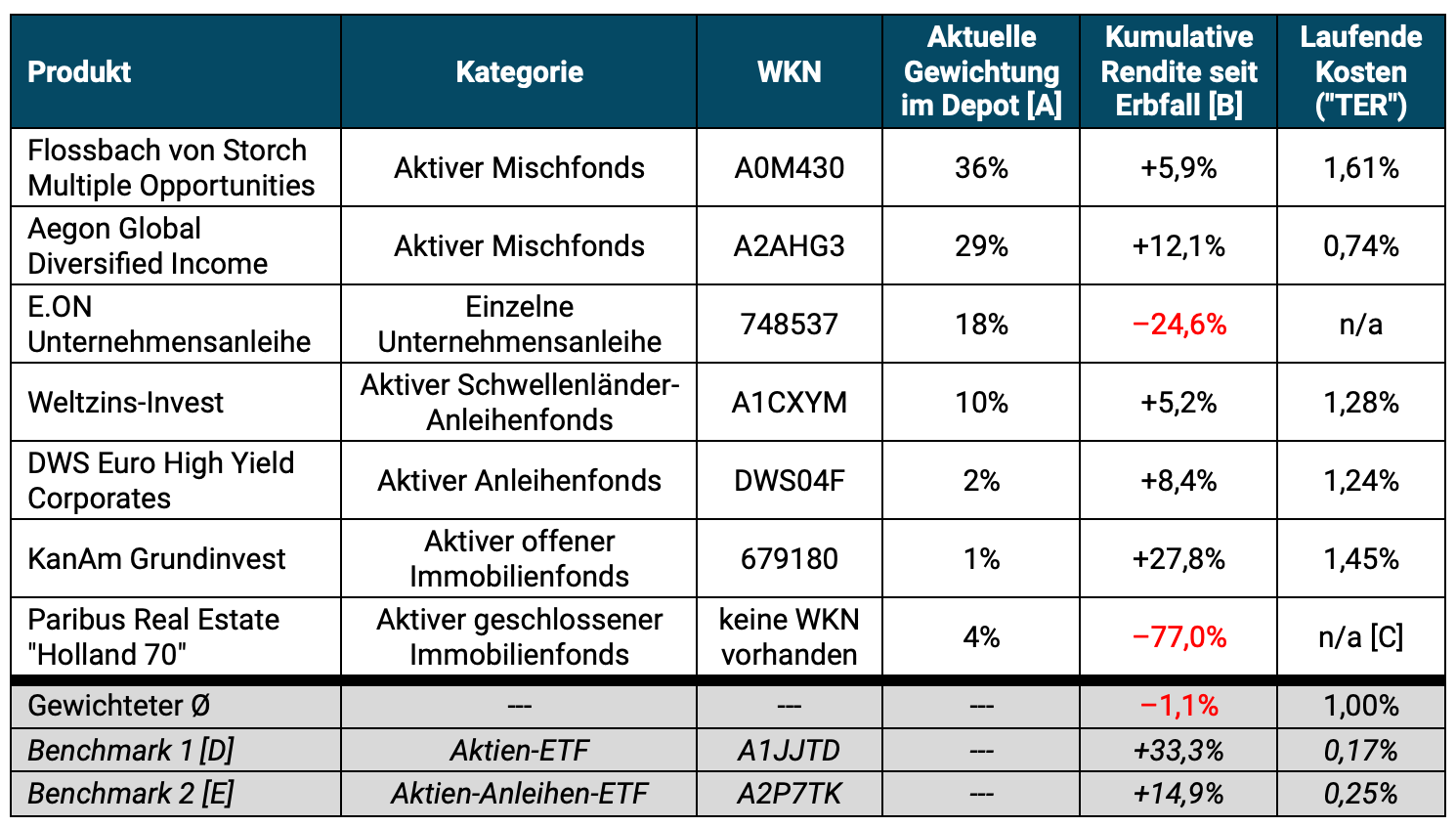
Return data: comdirect.de /// All information on returns and costs without the separate, additional mandate fee (see ongoing text below). /// Returns including any distributions (total returns) from the portfolio transfer on September 8th, 2021 after the deceased grandmother's inheritance until July 21st, 2025 (~3.9 years); only return on the “Holland 70” position due to a lack of data availability since subscription. /// [A] Current weighting in the overall portfolio as of July 21, 2025 /// [B] Cumulative return since portfolio transfer after inheritance (September 8, 2021) to today (July 21, 2025) /// [C] The fund is being wound up/liquidated, therefore no information on ongoing costs is available; In general, the running costs of closed real estate funds are above 5% p.a. a. of the invested equity. /// [D] Passive Benchmark 1 (stocks): SPDR MSCI All Country World Investable Market UCITS ETF /// [E] Passive Benchmark 2 (stocks and bonds): Vanguard LifeStrategy 60% Equity UCITS ETF /// All information to the best of our knowledge and belief, but without guarantee.
This overview suggests what characterizes many managed bank deposits: diversification on paper, inexplicable complexity or lack of transparency and high-priced financial products. There seems to be a lack of a well-thought-out structure tailored to the specific circumstances, living conditions and investment goals of the portfolio holder.
The largest individual positions and a brief return assessment at a glance:
- Flossbach von Storch Multiple Opportunities: An equity-heavy, actively managed mixed fund. Cumulative return of the fund over the period under review (3.9 years): 5.9% compared to the return of a passive ETF benchmark with a similar equity allocation, the Vanguard LifeStrategy 80% Equity UCITS ETF (WKN: A2P7TF) of 24.9%. Ongoing annual costs of the Flossbach fund: 1.61% vs. 0.25% for the benchmark.
- Aegon Global Diversified Income: Also a mixed fund, but slightly less stock-heavy than the Flossbach fund. Cumulative return over the period under review was 12.1% compared to the return of a passive ETF benchmark, the Vanguard LifeStrategy 60% Equity UCITS ETF (see table) of 14.9%. Ongoing annual costs of the Aegon fund: 0.74% vs. 0.25% for the benchmark.
- World interest rate investment: A medium duration global bond fund investing in foreign currency bonds of emerging market countries. Cumulative return over the period under review: 5.2% compared to the return of a passive ETF benchmark, the L&G Emerging Markets Government Bond (USD) 0-5 Year UCITS ETF (WKN: A2QFQ5) of 9.8%. Ongoing annual costs of the Weltzins fund: 1.28% vs. 0.25% for the benchmark.
- DWS Euro High Yield Corporates: A bond fund that invests in Eurozone companies with low credit ratings. Cumulative return over the period under review was 8.4% compared to the return of a passive ETF benchmark, the iShares EUR High Yield Corporate Bond UCITS ETF EUR (WKN: A2DUCZ) of 9.9%. Ongoing annual costs of the DWS fund: 1.24% vs. 0.50% for the benchmark.
- E.ON corporate bond: As an individual position with a relatively large portfolio share of 18%, this bond represents a strange foreign element of risk in the portfolio. The return of -24.6% speaks for itself. Only the gods know what this bond is supposed to do in the portfolio of an 80-year-old widow.
- KanAm Grundinvest: An open-ended real estate fund that stumbled after the turbulence of the financial crisis and the Euro crisis in 2011. It has been in liquidation ever since. Surprisingly, the fund achieved a cumulative return of 27.8% over the period under review - significantly better than its passive counterpart, the iShares European Property Yield ETF (WKN: A0HGV5), which lost 18.7% in value over the same period. It is difficult to say whether this was a temporary recovery or a late recovery. However, it remains unclear why the fund was included in the portfolio with less than 1% weighting - this mini position hardly made strategic sense.
- Paribus Holland 70: A closed real estate fund that has also been in liquidation for years due to large losses. A return of the shares is not possible. On the secondary market, the fund is trading at a 77% discount to the last reported share value. Putting such a highly complex, structurally illiquid financial product - a company investment - in an old lady's portfolio seems downright negligent.
The relative underperformance of the portfolio would be of a similar magnitude if one had not looked at the last 3.9 years (the period from which the portfolio was transferred to Dagmar's daughter Britta) as in the table, but rather the longer period of five years. We didn't calculate any further back because, due to a lack of information from the savings bank, it was not clear whether there were any significant portfolio changes in the period before Dagmar's death.
What is striking about the portfolio is that, with the exception of the E.ON corporate bond (which is a problematic component of the portfolio for risk reasons), it was all high-cost products. They were not bought into the portfolio because they fit each other, but because they bring high commissions to the custodian bank. The fact that apparently neither issuing surcharges nor excessive trading were charged is a small consolation - but it does not change the basic problem: the product selection was not independent.
The obvious solution would be a compensation system that is completely independent of specific product selections - and therefore free of sales interests and harmful conflicts of interest. In this case, product selection was only half the story. In addition to the funds' internal cost burden, there was another layer of fees on top - the bank's mandate fee.
The fees
“There are no costs” – said the “advisor”, and meant: “no costs other than the ones I’m not telling you”
In addition to the internal costs of the funds - which were already around one percent in weighted average - Dagmar's portfolio added a second layer of fees: the mandate fee. An administration fee that goes directly to the bank for supposedly ongoing management of the portfolio. According to the price list, between 0.7% and 1.5% per year based on the portfolio volume - in addition to the ongoing costs (TER) of the funds.
Our question to the savings bank advisor was simply: “What ongoing costs arise from the depository mandate?”
His answer was:
"There are no custody fees and half of the mandate fees are offset against tax. With the exception of the Storch Flossbach, all positions are charged at 0.7% (see also the list as a PDF). This is a special condition as part of the support for the entire family group."
Sounds caring – almost like a loyalty bonus. But something crucial is missing between the lines. The largest position in the portfolio, the Flossbach from Storch Multiple Opportunities, is priced according to the model with a mandate fee of 1.5% per year - in addition to the fund's already high TER of 1.61%. This number does not appear in the email text, but only in the attached PDF. If you don't open the attachment, you get the impression: "0.7% for everything". Anyone who opens it will see that more than a third of the depot is being charged twice as much as claimed.
The mentioned “tax credit” simply means that the actual fee is a quarter lower than the stated fee due to tax credit. Three quarters of the fee still remains with the investor.
This selective transparency is no accident. It is method. And it follows a familiar pattern: first simplify, then trivialize, then keep quiet.
Similar with the issuing premiums, which the bank advisor lovingly refers to as “premium”, probably because that sounds less negative. For several funds, additional fees were charged upon purchase, which were then fully refunded. That sounds like a fair deal - and that's how it was communicated by the consultant:
“The issue surcharges were fully credited back to the customer, so that she did not incur any costs.”
That sounds generous. In reality, it is a rhetorical trick: an unnecessary and high fee is charged, only to then waive it again as a service. You could also say: you trip up the customer and then help him up again.
The whole thing was crowned by the following passage:
"If you then take into account the fact that no custody fees are charged, half of the mandate fees paid are counted as a tax allowance and all of your own transaction costs are not calculated, we would actually be in the black with this model. So we are talking about no fees."
A remarkable sentence. The bank charges product costs of around 1% on average, plus mandate fees of between 0.7% and 1.5% (depending on the product) - and then claims that the customer pays "no fees" but that the bank adds money.
It becomes particularly bitter when you ask what was actually paid for all these fees. The depot has not been adjusted for years. No reallocation. No rebalancing. No recognizable controls. Just a return that was significantly below that of a passive benchmark, at least during the period under review.
The advisor
Communication as a defense and concealment tactic
Products can be expensive. Fees can be concealed. But in the end, it's the tone that decides whether you're dealing with a service provider - or with a system that doesn't tolerate any questions. In this case the latter was clearly noticeable.
We asked politely: about the running costs, about the structure of the mandate, about the background to the composition of the portfolio. The answers did not really help in assessing whether the savings bank had met its customer's legitimate goal: to achieve a return-risk combination that was at least at the same level as that of a passive ETF benchmark on a buy-and-hold basis.
The advisor's defensive, defiant attitude became clear when he defended his "non-communication" and poor portfolio performance by pointing out that he had "been looking after clients for decades." In reality, the length of the customer relationship is of course no quality criterion, especially in such a case. This became even clearer in the next sentence - a kind of oath to one's own infallibility:
“For decades, it has been our obligation for the entire family group to ensure the security of investments, value development and trusting cooperation, and this also means that everyone can rely on us to ensure the best possible option, also with regard to advice and the associated costs.”
Full of pathos, full of self-assurance - but empty of content. What is “the best possible option”? Who decides what “trustworthy” means? And what’s left of “performance” if the portfolio has made poor returns?
In truth, it's not about advice, but about interpretative sovereignty. Criticism is not answered, but rather framed morally. And when we finally asked for concrete figures, for documents and for plain text, there was an attempt to stall the conversation:
“I hope that we can finally answer this annoying topic with this email.”
“Sore topic” – this is not how we talk about transparency, but rather about disruption. It's framing that turns a legitimate question into a problem. It's not the fees that are the problem - it's the fact that someone wants to know them. And the word “final” is not a factual conclusion. It's a rhetorical cover.
At this point you finally understand that it's not just about costs, but about fear and control. Not about numbers, but about the power over their interpretation. It's not about service, but about sovereignty in interpretation. And it's about who makes the rules - and who has to tacitly accept them.
The solution
Get out of the high-priced lack of transparency
Since neither the communication nor the portfolio structure or performance were right, we decided together within the family to sell all positions and put an end to this tragedy.
We invested the proceeds in a simple, globally diversified 60/40 portfolio of stock and bond ETFs. Specifically: For the equity part we chose the L&G Gerd Kommer Multifactor Equity UCITS ETF (WKN: WELT0A), for the bond part we chose the iShares EUR Ultrashort Bond UCITS ETF (WKN: A3DJQJ) made of short-term corporate bonds with a high credit rating and no currency risk.
Outro
Dagmar's unspeakable deposit was not the mistake of her individual advisor, but the almost inevitable result of a bank business model with a decades-old remuneration system in which conflicts of interest are structurally embedded. As long as banks and consultants are controlled by product commissions, in-house products, margin targets and commissions, the result for their customers in the long term will most likely look like Dagmar's Depot: high-priced, non-transparent and with lousy returns.
If you want to avoid this, you have two options: invest in do-it-yourself mode without an “advisor” or asset manager or choose a service provider who consistently avoids commissions, in-house products, sales charges and income from unnecessary back-and-forth in the form of trading. Everything else would be bogus solutions.
Dagmar's case seems particularly bitter because the bank was a savings bank. A publicly funded institute. Although savings banks do not have a public welfare mandate, for obvious reasons they are even less likely to be seen as ripping off their customers.
The post How banks withdraw customers – a case study appeared first on Gerd Kommer.
]]>The post The resilience of the global stock market appeared first on Gerd Kommer.
]]>As we know from over 125 years of historical return data, stocks are the most profitable of all asset classes, but also one of the most volatile with a high temporary drawdown risk. In this blog post we address the question of how resilient an investment in the global equity asset class is, i.e. how low share prices can fall, how long it takes to recover after deep declines and what the prerequisites are for actually participating in sustainable recoveries.
The worst stock market crashes since 1900
Table 1 shows various downside metrics for the six worst global stock market crashes in the last 125 years. The criterion for these six stock crashes was a maximum cumulative loss (maximum drawdown) of at least 45% adjusted for inflation (in real terms).
For the period 1900 to 1970, the table considers U.S. stock market data rather than global data because only annual return data is available for the global stock market before 1970, not monthly data. However, in order to measure maximum drawdowns in a crash with sufficient accuracy, monthly data is required. Using annual return data results in less extreme, smaller drawdown numbers. Since the global stock market is relatively highly correlated with the US market, US data for this period represents a methodically justifiable - although not perfect - replacement. We also compared the drawdowns calculated on the basis of the US data with the global annual data values and verified them as plausible.
Table 1: Selected risk indicators for the six collapses of the US stock market or global stock market in the period from 1900 to 2024 with a maximum cumulative loss (maximum drawdown) of 45% or more in real terms
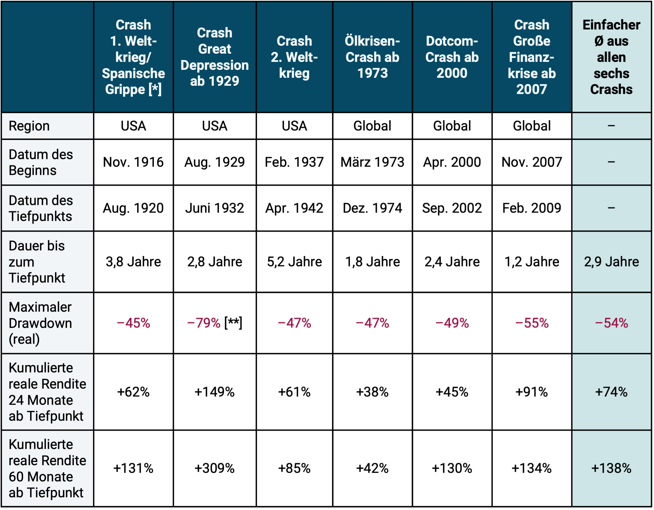
► In USD, adjusted for inflation, excluding costs and taxes. ► USA stock market in USD from 1900 to 1969 (S&P Composite Index 1900-1926, CRSP 1-10 Index 1927-1969), as no monthly returns are available for the world stock market before 1970. 1970 to 1987 MSCI World Standard Index, 1988 to 1995 MSCI ACWI Standard Index, from 1996 MSCI ACWI IMI Index. ► [*] Spanish flu pandemic: It lasted from February 1918 to April 1920. It is estimated that between 1% and 5% of the world's population at the time died. ► [**] The maximum drawdown shown here for the Great Depression Crash based on US stock market data is an overstatement/exaggeration (see explanations in the ongoing text below).
Table 1 illustrates that severe stock market declines have not been all that rare over the past 125 years - there have been six, including one during a dramatic pandemic. If the drawdown filter criterion had been chosen to be “softer” (e.g. real minus 30% instead of minus 45%), then there would naturally have been more than six stock market crises.
The Corona-related global stock crash from February 20, 2020, which is not included in Table 1, led to a collapse in world stock indices (e.g. the MSCI ACWI Index) of just under 40% on a daily return basis. However, in this case, the market only needed a short ten months after reaching the bottom to fully recover.
Myths about the 1929 crash
For the Great Depression Crash in the USA from 1929 onwards, representatives of the financial industry, in many advice books and by finfluencers regularly give incorrect, negatively exaggerated figures - both in terms of the depth of the stock market collapse and in terms of the time it takes for the collapse to fully recover. It is often said that the complete recovery took 25 years until 1954. In fact, six to seven years is correct, depending on which currency you use. The depth of the 1929 crash is also regularly misrepresented and exaggerated. The repeatedly claimed 89% slump is exaggerated by at least ten percentage points and, if you analyze a little more closely, probably even by around thirty percentage points. My colleague Felix Großmann and I go into this fascinating issue in more detail in a separate blog post (Link here).
In the global stock market - in contrast to the US stock market as a mere sub-market - the crash from 1913 to 1924 was the deepest since 1900, as well as the longest to complete recovery, and not the 1929 crash. However, as explained above, for the global stock market, data for this period only exists on an annual basis, not a monthly basis. The main causes of the 1913 crash are explained below. However, the crash of 1913 does not seem to exist for the majority of “experts” who generally comment on the risks of stock crashes. That gives you a deep insight.
How do major wars affect the stock market?
Judging from experience since 1900, major wars (major military conflicts involving at least one world power) have a less damaging impact on the global stock market than major economic crises. This is shown by the data in Table 2.
Table 2: Global stock market returns during what are believed to be the seven largest international wars in the last 125 years – real in USD
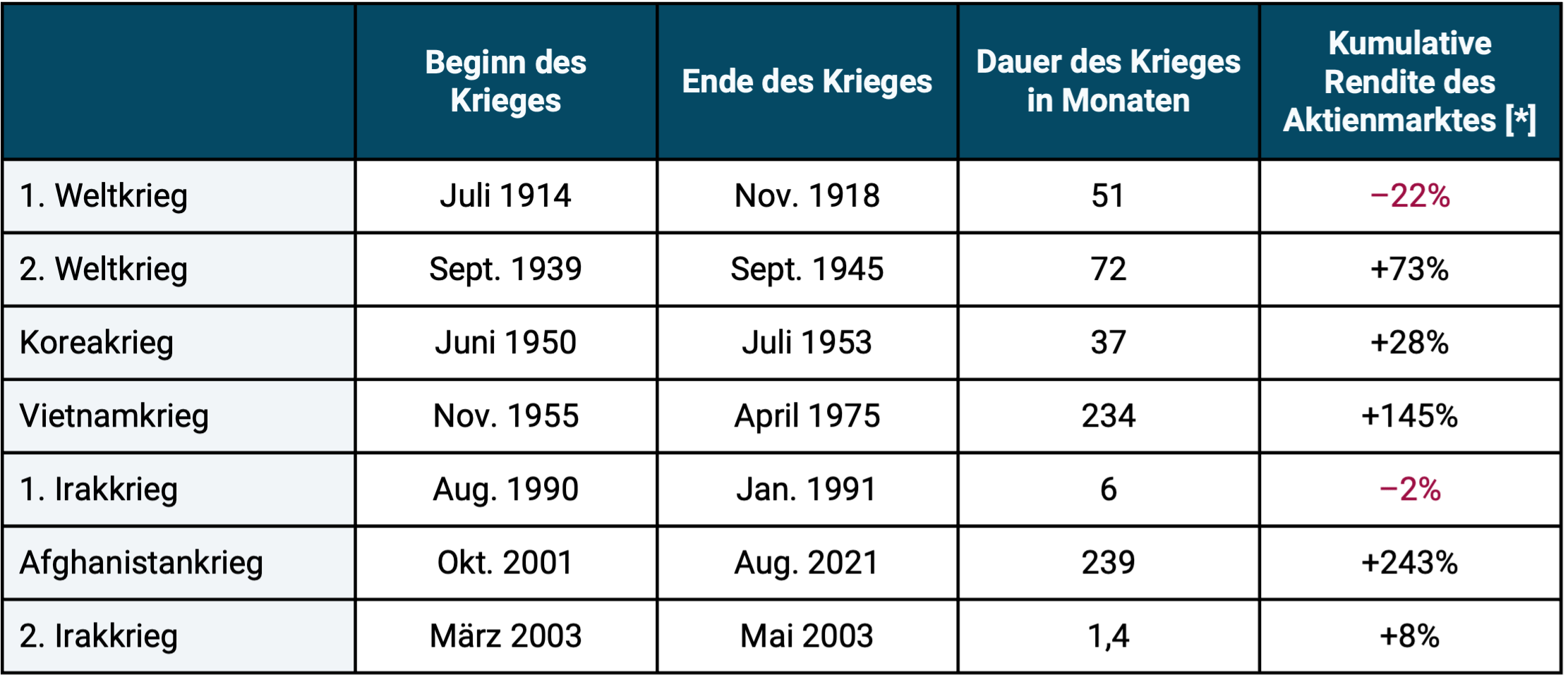
► In USD, adjusted for inflation, excluding costs and taxes. ► Data as in Table 1. ► [*] Initially US stock market, later world stock market ► Return calculated at the end of the month following the last month of the war.
With the exception of the First World War, there was no significant negative return on the global stock market over the entire duration of any of these terrible conflicts. If the conflict lasted longer than a few months, prices on the world stock market rose by double or triple digits by the end of the war. The particularly long-lasting wars, such as the Vietnam War and the Afghanistan War, show that these do not stop the long-term upward trend of the global stock market.
The Russia-Ukraine war, which is currently ongoing, led to a relatively moderate decline in the global stock market of around 10% when it began in February 2022. Later in 2022, the stock market experienced another sharper drawdown due to a sharp rise in global interest rates, which was probably due to general macroeconomic causes rather than this conflict. Either way, in September 2023, the world stock market, calculated in euros, had made up for all losses since February 2022.
What the return figures in Table 2 do not show: At the beginning of the seven wars examined, there were often clearly double-digit losses on the stock markets. However, these were usually completely made up for quite quickly as the conflicts progressed. In the majority of cases there were even significant price gains by the end of the war relative to the price level at the beginning of the war. This pattern should not be surprising: If the end of the war becomes sufficiently clear for investors, this will normally boost the stock market because the optimism of market participants will then increase again and the previously priced risk expectations will decrease.
The exception of the First World War in terms of the complete stock market recovery by the end of the war is likely to be explained by two special factors. On the one hand, the most serious pandemic in the last 100 years, the Spanish flu, began in February 1918, ten months before the end of the war (see footnotes to Table 1). Strictly speaking, this pandemic had nothing to do with the war, but it coincided with its final phase. The major monetary policy mistakes made by the central banks at the time may have had an even more serious impact. Depending on the country, between 1914 and 1933 they left the classic gold standard, a currency system in which the central bank guaranteed a fixed exchange rate for gold for all or most of the banknotes issued. [1] This state-initiated exit was amateurish and downright chaotic in many Western countries, which certainly had a negative impact on the stock market. (If you would like to read about the history of the gold standard and its disadvantages, you can find a separate blog post by my co-author Felix Großmann and me - link here.)
The bounce-back effect in the stock market
In Table 3 we carry out a slightly different analysis for the global stock market in the shorter period from 1970 to June 2025 (55.5 years). During these five and a half decades, the world stock market produced a real return of an average of 5.4% p.a. (in DM or euros). In the table we look at what happened in the subsequent periods after a real drawdown of at least 25%.
Table 3: The “bounce-back effect” in the global stock market from 1970 to June 2025 after a real drawdown of at least 25%

► In DM or Euro, adjusted for inflation (real), without costs and taxes. ► Real average return over the entire 55.5 years: 5.4% p.a. ► Data: MSCI World Index.
Here, too, we observe that in the average (but not every individual) subsequent period, be it two, five or ten years, there was an above-average return, a “bounce back”. This effect is likely related to the so-called “regression to the mean,” a statistical “reversion to the mean” phenomenon that exists in many markets, including the stock market.
Incidentally, it is likely that book losses (drawdowns) in the event of, for example, B. a 50% stock market collapse would be lower for a given investor with a globally diversified stock investment on a buy-and-hold basis based on his personal, case-specific constellation. You can never be higher. Reason: The profits that may have accrued before the crash began, as well as potential non-stock investments within the overall portfolio. Only very few broadly and globally diversified B&H investors will have invested their entire assets in stocks and will have purchased this stock investment exactly at the start of the crash, which is what all the considerations in this blog post assume. Our calculations therefore take a somewhat unrealistic worst-case perspective.
Conclusion
As the past 125 years show, the global stock market has demonstrated remarkable resilience, despite many “extreme stress tests” occurring over this long period. This is why the world stock market is also referred to as an “antifragile system”. This should give anyone who invests the way Gerd Kommer has been advocating for over 25 years, namely globally diversified on a buy-and-hold basis, the knowledge and peace of mind not to throw in the towel, even in difficult market phases. For example, throwing in the towel could mean selling in a sharp downturn, turning mere book losses into likely terminal losses.
Unfortunately, the “mathematical consolation” presented in this blog post does not apply to investors who engage in stock picking or market timing. Anyone who invests speculatively in individual stocks, individual sectors or individual countries - generally in an insufficiently diversified stock portfolio or who tries to beat the market by going in or out - will not see an inevitable recovery. Neither the compelling economic logic nor the calculations in this blog post apply to this investor. Final 100% losses are possible for individual values. A “soon” bounce-back after a severe drawdown can never be expected with sufficient certainty for individual stocks or other stock portfolios that are not systematically broadly diversified. The same goes for market timing with asset classes.
If you don't want to experience a maximum drawdown (MDD) of around 50% in your own portfolio, you can set the MDD limit of your portfolio to any extent "softer" with a correspondingly more conservative asset allocation - i.e. a higher proportion of low-risk investments - which of course has an impact on the expected return of the portfolio. How exactly this can be implemented is shown in Gerd Kommer's books.
Endnotes
[1] Pure book money - money that had no physical banknotes - did not exist at that time, if you exclude “bills of exchange” (short-term promissory notes from companies).
The post The resilience of the global stock market appeared first on Gerd Kommer.
]]>